
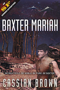
 Author of two classy science fiction novels (covers designed by Chameleon), Cassian Brown has put together a website to showcase his work. Apart from excerpting an exciting sequence from Baxter Mariah, he links to the many ebook and print purveyors of his work, offers signed copies, a newsletter signup and biographical information. A next step might be to link to other writers and science-fiction oriented websites, to locate himself in the online sci-fi ecosystem. A link to his twitter account (EllameinePress) might also be useful.
Table for Eight
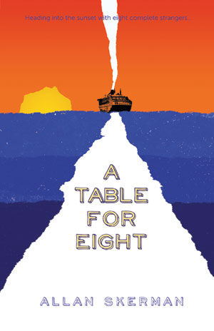 An elderly man takes a cruise to re-start his life after the death of his wife. He discovers that he cannot escape from the reality of his situation, but gains some solace in the company of often fractious strangers. We wanted to convey the basic concept of 'sailing into the sunset' with a simple geometric composition, torn edges, informal type and bright contrasting colours.
Festivals and Type
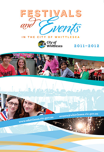 For this draft of a local Festivals program we needed to adhere to a certain corporate colour palette and also make reference to a corporate 'swirl' (see the base of the image). We took elements of the swirl and employed them throughout the A3 double-sided brochure, and set some type to follow the curving lines and thus add visual interest. The typeface used is the elegant HF&J Archer, mentioned before on this blog.
A Great Ocean Road
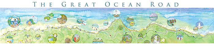 Drivers have a hard time on the Great Ocean Road — torn between vistas of forest and sea and keeping their vehicles on the road. The Road runs from just south of Geelong, past Apollo Bay and Cape Otway, alongside the Twelve Apostles and on into the windswept cliffs and beaches of Western Victoria. Our client painted a panorama of the Road and its attractions, and wanted to sell it at information centres in the region. We scanned and stitched together the metre long artwork, adding circular images of attractions and trying not to obscure any important information.
Sacred Space
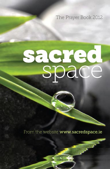 Our task was to convey the contemplative mindset of prayer without resorting to overt displays of religious symbolism. Sacred Space is a book of prayer published each year by the Irish Jesuits. After a long search through uninspiring imagery, we finally found a beautiful, tonally balanced photograph ready for the addition of type. We used Museo Slab at a variety of weights for both impact and delicacy.
Face Book
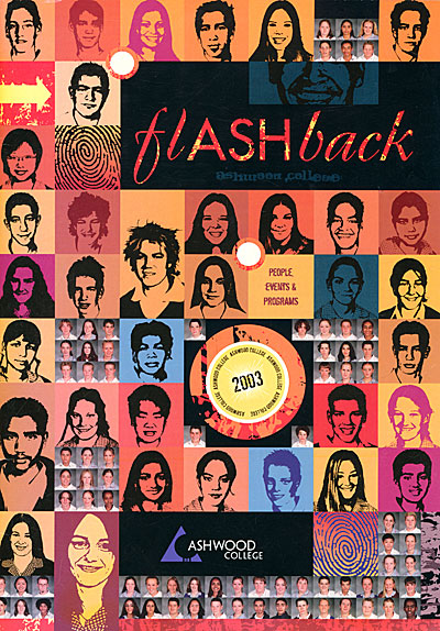 For departing Year Twelve students, their yearbook has sentimental significance — the last memento of thirteen long K-12 years of education. We tried for an unusual effect — the face of every single student in the entire school (the back cover had another few hundred faces), some converted into black and white and others still in colour. The layout took quite a while, but our clients were happy with the result.
Four new book covers
One of the joys of book cover design is diversity. In the small batch below, authors tackle vampires, historical drama, financial advice and job hunting for travellers. We welcome esoteric topics and unusual requests -- they make designing life a lot more interesting.
 Four new cover designs
Read more Four new cover designsGetting Your Portfolio Online
Artists, photographers, illustrators, cartoonists and designers all need to get their work seen by as many eyeballs as possible. Many do not have specialist web design skills, and balk at the cost of having a web designer put together a customised folio for them. Fortunately in the new world of free cloud services, several businesses offer simple but elegant online folio solutions. My personal favourite is Behance, a business best known for offering services and conferences to "creatives". Their folio service has a strong social media focus, encouraging users to follow other designers, rate their work, give detailed feedback and generally promote themselves. The upload process is very detailed and offers a reasonable amount of customisation. The whole experience is slick and the aesthetic is pared back and very readable.
Read moreBright, Bold Brochure Design
Located on the rural/suburban edge of Melbourne, the City of Whittlesea works hard to present an extensive series of cultural events, ranging from music festivals to heritage walks and a huge community festival. Chameleon Design was set the task of presenting this diverse range of activities in a bold, colourful and highly readable fashion. Our design incorporated images of festival performances, art installations and fireworks displays, against a graphic motif suggesting the roof of the big tent in which many of these events were held.

Read moreFinding Your Way in Old Parliament House
Though the politicians have moved on to more opulent digs, the historically important Old Parliament House (Canberra) lives on as a museum, exhibition space and function centre. In 2008 Chameleon Print Design was tasked by interpretive design specialists Convergence Design with designing a detailed wayfinding scheme for the sprawling building. Our brief was to reflect and preserve the heritage fabric of the building while at the same time projecting a contemporary, approachable aesthetic. The wayfinding signs/objects were in large part free-standing, as most of the building is heritage listed and therefore off-limits to intrusive fixings.
After two visits to Old Parliament House, extensive long-distance collaboration and many interations, we compiled a comprehensive report spelling out the various wayfinding levels, patternation, colour schemes, type selection and readability. Some samples of the report and other interpretive design may be viewed below and here.
 signage and wayfinding, Old Parliament House
Read more signage and wayfinding, Old Parliament House