

Amazon and other online booksellers are very good at picking up on your searches and purchases to anticipate other items you may be interested in. Of course, the selections are made by algorithms rather than Amazon staff members. Awesome Author Recommender goes in the other direction, using human beings to point the way from one author to the next. Judging from my searches, the site does not go very deep at present, but the authors it did highlight from the searches I made were definitely top drawer.
Displaying Your Fonts in a Browser
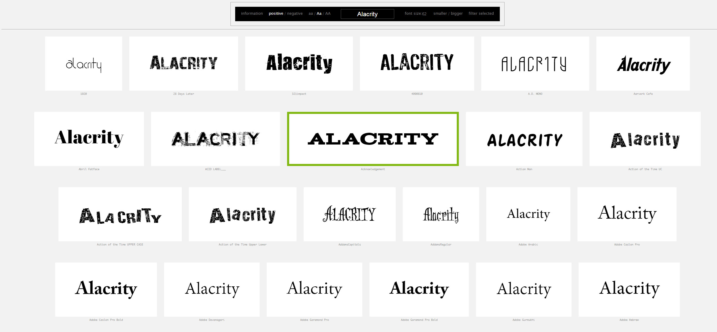
Wordmark gives users a way of displaying the fonts resident on their computer. You can enter your own text string, display black on white or reversed, increase the font size. An excellent way to make font selection a bit easier.
Four Minimalist Covers — Book Design
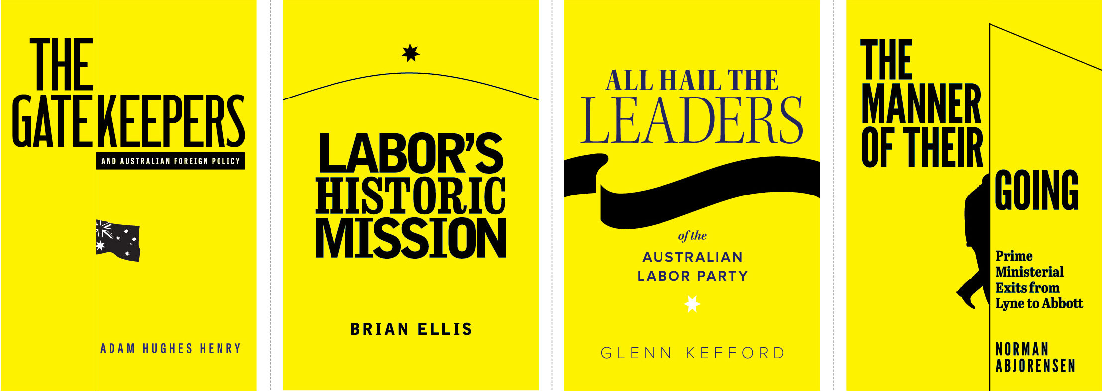
Four covers for the same publisher, each under the same imprint. All yellow backgrounds, strong, simple typography, minimal image content. There is much to be said for paring design back to its absolute essentials. Less clutter, less distraction, more emphasis on the content and the beauty of typography. Typefaces used include League Gothic, Clarendon Bold Condensed and Bell Gothic Black.
Guns, Money and the CIA — Book Cover Design
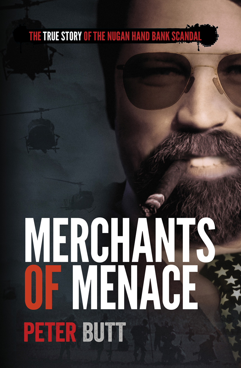
Some banks do more than rip off consumers. The bank covered in this story, for example, delved into drugs, gun-running and financial shenanigans. This soon-to-be-released book lifts the lid on a decades-old murder mystery. Building on a cover design initiated by the author, we aimed for a slightly sinister look and high impact type. Typefaces used are League Gothic and Veneer.
The Road to Follow — Book Cover
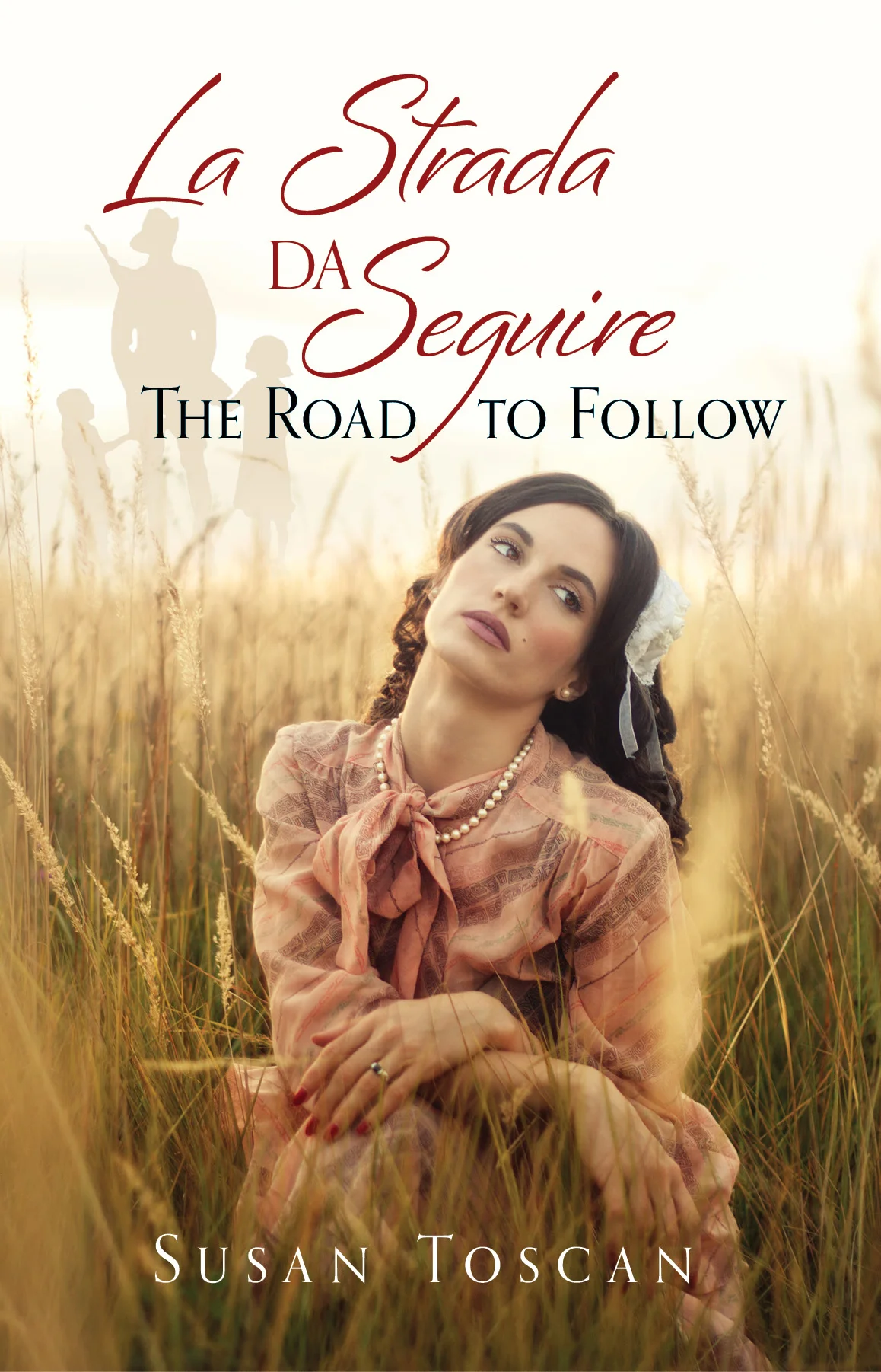
A multi-generational tale of Italian-Australian family life. We wanted to convey the feel of the story through a single image. The story focuses on the female members of the family. Typefaces used: Bianca, Orpheus.
Early Sydney Examined — Book Cover

Our client had access to many interesting artworks from colonial Sydney. The chosen image shows Sydney Cove in a very early stage of development, more a village than a town. The typography is simple and in keeping with typefaces in use at the time.
You Go, Books!
Printed books seem have unexpected staying power. The growth of the ebook segment of the market has slowed dramatically, and independent bookstores have experienced a modest expansion, both in terms of the number of stores and overall sales. Readers cite the tactile aspect of the printed word, along with the aesthetics of a good bookshelf. Not that the digital revolution hasn't changed the book trade — at least 40% of all book sales are now online.
Eaglehawk Press Opens for Business
With two excellent books pubished on aspects of 19th Century Victorian history, Eaglehawk Press are off to a flying start. Their recently created website is very accessible and hopefully will feature more well-crafted books as time goes by. Workingtype Design worked with Eaglehawk Press on the cover and text design of both books, and can attest to the attention to detail and effort behind their creation.
Free Scholarly ebooks
From the ever-active folk at Open Culture, a very long list of free ebooks, many of them the greats of world literature and intellectual endeavour. From Wittgenstein to David Foster Wallace — a lifetime's reading awaits...
Herbert Peabody
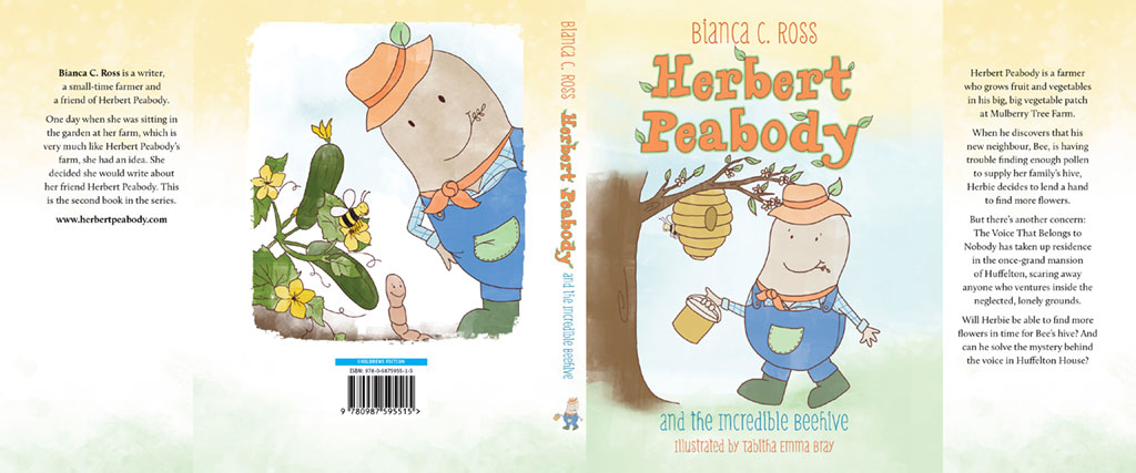
Bianca Ross' charming Herbert Peabody series (typesetting and layout by WorkingType Design) continues with Herbert Peabody and the Incredible Beehive. Authors would do very well to study Bianca's promotional activities as outlined on her Herbert Peabody-themed Facebook feed. Lots of media activity, plentiful, on-point posts, a feeling of positive, targeted activity. And it helps somewhat that the book itself is excellent with very good quality illustrations. Herbert's official website is worth investigating as well. And buy the book!
An Accident of Birth — Comparing Countries

A quick way of checking one nation's vital signs against another, and what they would mean if you relocated from one to another. The relatively minor differences between the industrialised democracies stand in stark contrast to the massive divide when comparing them to under-developed countries afflicted with corrupt and repressive regimes. Overall, a well-designed website that vividly demonstrates the work to be done in ensuring a better outlook for a large fraction of the Earth's population.
Fonts on Fire — Tinder for Typefaces

With the Ashley Madison hack in the news, comparing a font matching service with a dating service is probably not a great move. Fontflame brings the matching aspect of Tinder to typefaces. At present all of the typefaces matched are from the Google stable. This means they are free for any use, but the overall selection is rather limited. Also, the type sample shown on screen is rather small, making it difficult to make an informed selection. A more full-featured service would be great, with typefaces from large and small foundries and the ability to input one's own text string. That would be very useful for designers looking for inspiration.
Surfing Selfie
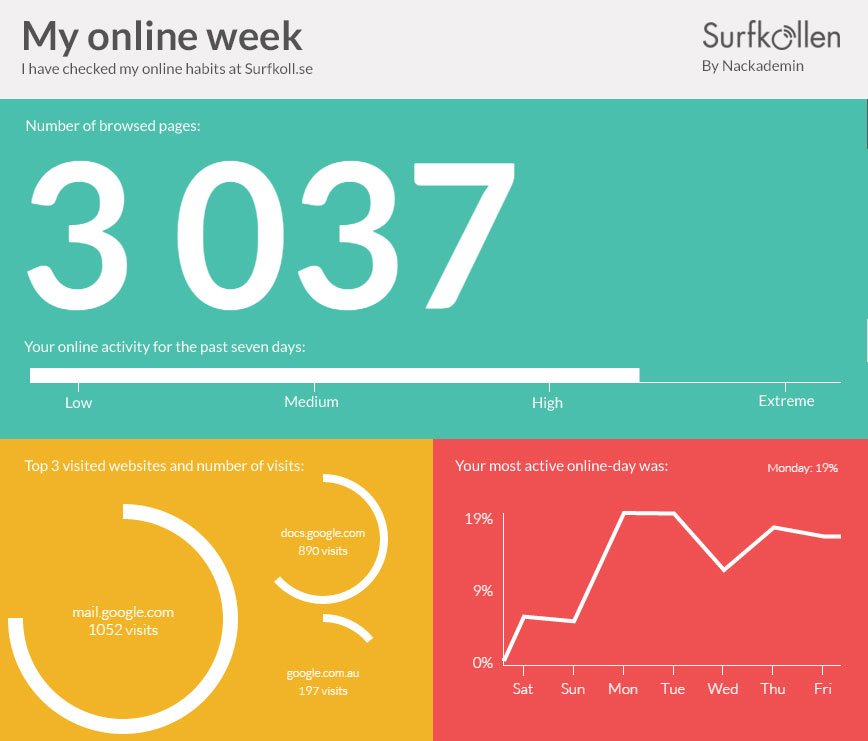
Capture a thumbnail sketch of your freewheelin' web-surfing self. Mine was rather email and work-oriented, perhaps yours will tend toward something more idiosyncratic.
Information is Dangerous to a Dictatorship...
Repressive governments are in the business of keeping secrets from their own people. The Chinese Government has attempted (with much success) to filter the Internet anything critical of their practices and record. To get a sense of the huge repressive enterprise involved in scrubbing the Internet of any inconvenient truths, have a look at some of these sites. And give some thought to the long term intellectual consequences of institutional dishonesty.
Elvis is in the Building — Interpretive Design
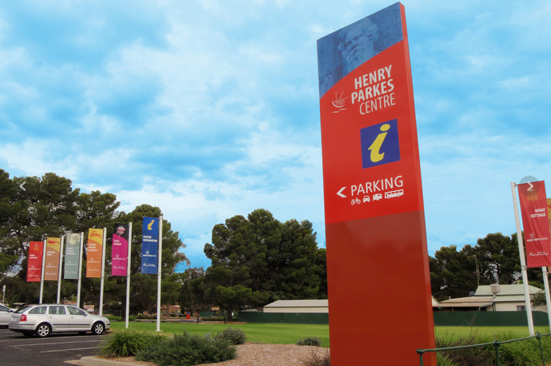
The Henry Parkes Centre is located in Parkes, NSW. WorkingType Design worked on the exterior and interior signage units — the emphasis being on colour, boldness and scale. The Centre houses a rather diverse group of exhibits: The King's Castle Elvis Exhibit, Parkes Motor Museum, Parkes Museum and Antique Machinery collection.
Go Duck Go
If you'd like to search the web without every keystroke being logged, analysed and monetised, try Duck Duck Go, "the search engine that doesn't track you" (and is blocked in China). Of particular interest is escape from the "filter bubble". Many google and Facebook users are unaware that search results are subtly tailored to their user profile and history on that service. So you may miss out on interesting links because Google automatically demotes them according to your perceived preferences.
Large File Transfers: One Time Box
Large file transfer is big business. Anyone who has tried to attach heftier files to an email will soon want a better way. Dropbox is an excellent option, as is ge.tt, wetransfer or hightail. One Time Box represents interesting new look a fresh look at the underlying use-case. Just set up a 'box', upload your files into it and email the link to the recipient. No need to part with contact details or anything else. The service is free, with a total file size limit of 1GB, and uploaded files last one week.
Accidental Terrorist — Book Cover
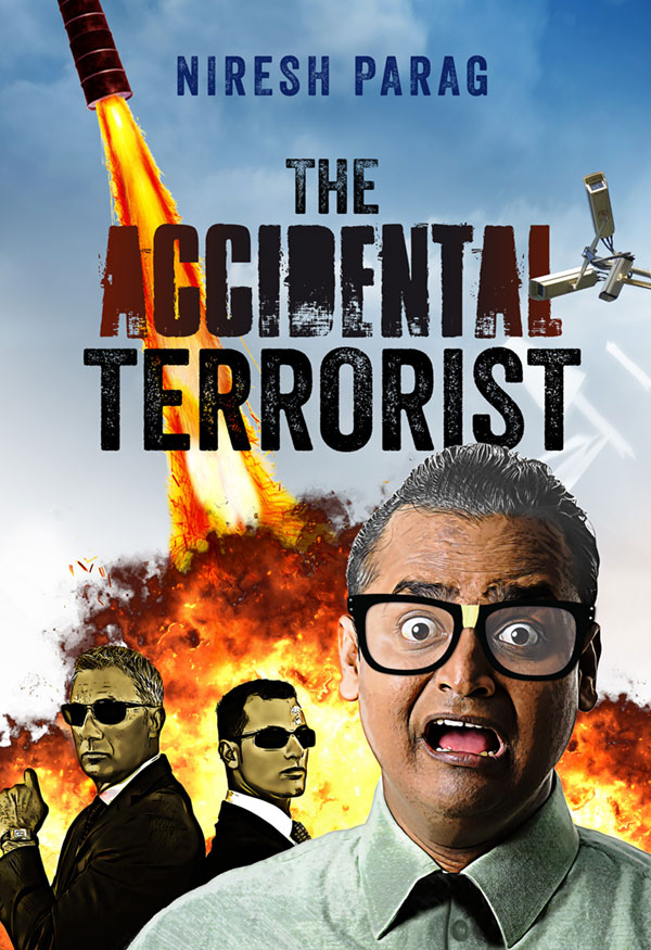
A hapless conman inadvertently attracts the attention of American anti-terror operatives. Niresh Parag follows in the tradition of Tom Sharpe in chronicling Mukeri's misadventures, building up to a literally explosive finale. Our cover incorporates some of the key elements of the story, including a rocket made of 44 gallon drums! Typefaces used: Veneer, Ambulance Shotgun Pro.
Cut to the Chase — Book Cover Design

Writer of mystery and crime fiction, Ray Scott has an impressive website showcasing his work. Unusually, his news page is up to date, with accounts of recent talks and pointers to upcoming events. Cut to the Chase (cover design by WorkingType Design) is available on Amazon.
On Writing for Teen Boys and Getting Your Book into Schools

Some interesting thoughts from Anne Davies, author of Wrath, listed as a notable book in the Children's Book Council Awards. She touches on the school market and writing with boys and young men in mind.
“Well, I was a high school teacher for a long time and found boys particularly hated reading, apart from”The Outsiders” which was written by a 17 year old American girl (S.E.Hinton) back in the ‘70’s .They made a movie of it — the first movie, I think, for Tom Cruise, Rob Lowe and Matt Dillon.
Anyway, I thought I would try to write something a bit more meaty but using her principles which boys liked — minimal description, short chapters, plenty happening,every chapter ending on something which you would want to find out,move the action along.I have certain things which I wanted to add — the whole idea of personal responsibility for your actions; how you need to have some “rules” for yourself — what sort of person do I want to be? How can I not be led by others into doing things I don’t want to without appearing a loser? What things do I admire in other people and want for myself? etc.This allowed me to at least touch on Buddhist concepts of being in control of your own thinking. As I say in the book, take over the steering wheel of your mind, without being too overtly religious but trying to convey the necessity of not just floating along being influenced by others or by random thoughts.One reviewer said, the book “gets a bit preachy towards the end for some.” I have to say, I meant to be preachy.
I approached a few schools which had been sent a copy of the book and bought a class set and offered to talk to the kids.I have only gone to two but both have been great, with the teachers saying some kids said this was the first book they had ever read to the end (we’re talking Year 12 here!). They all wanted to know about how much was autobiographical (lots!), would there be a sequel (no, I don’t think so) and so on. The surprise was that girls liked it too. Both teachers were very enthusiastic because the kids had really gotten into it and were happy to recommend it to teachers they knew so it will roll on hopefully.”