

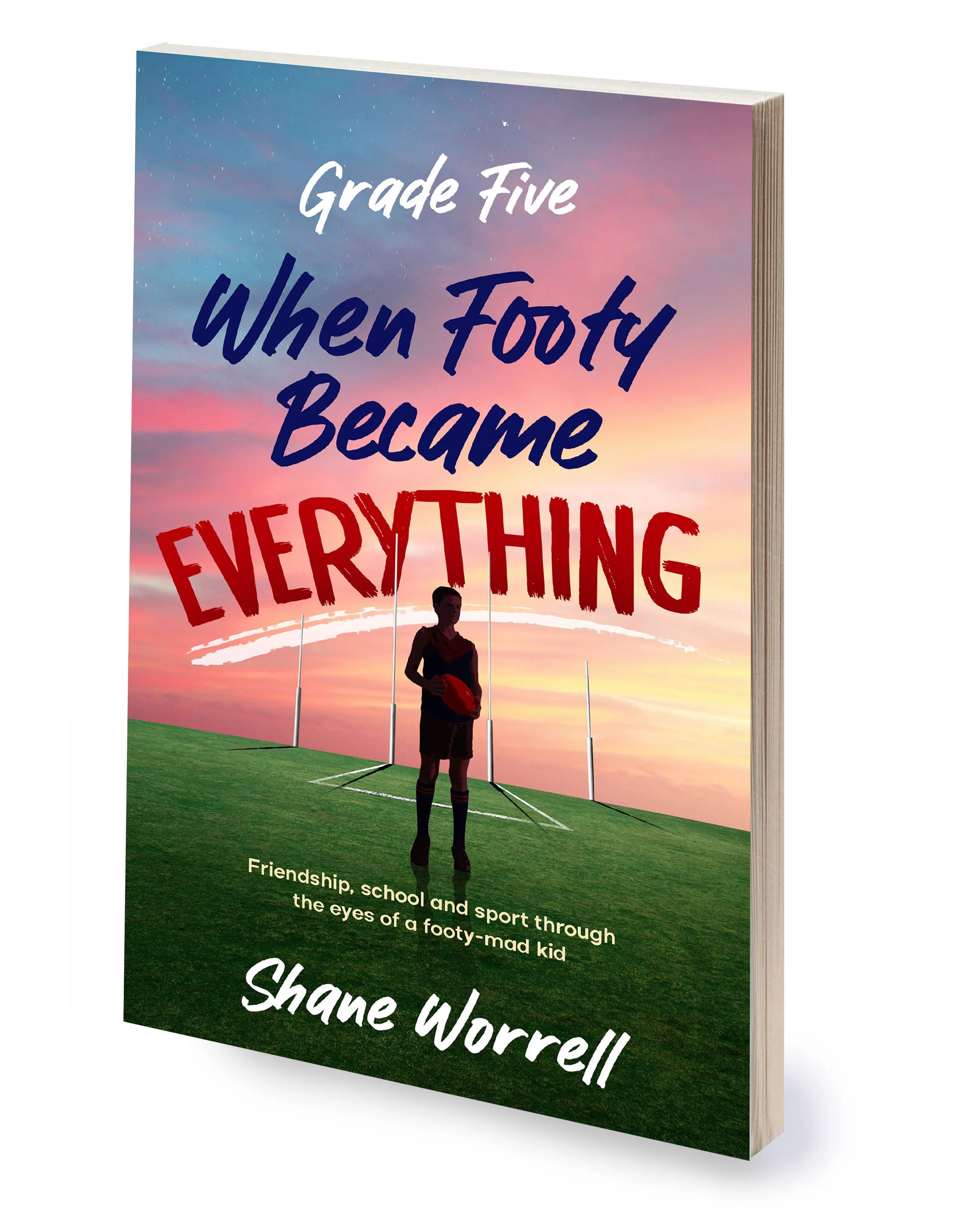
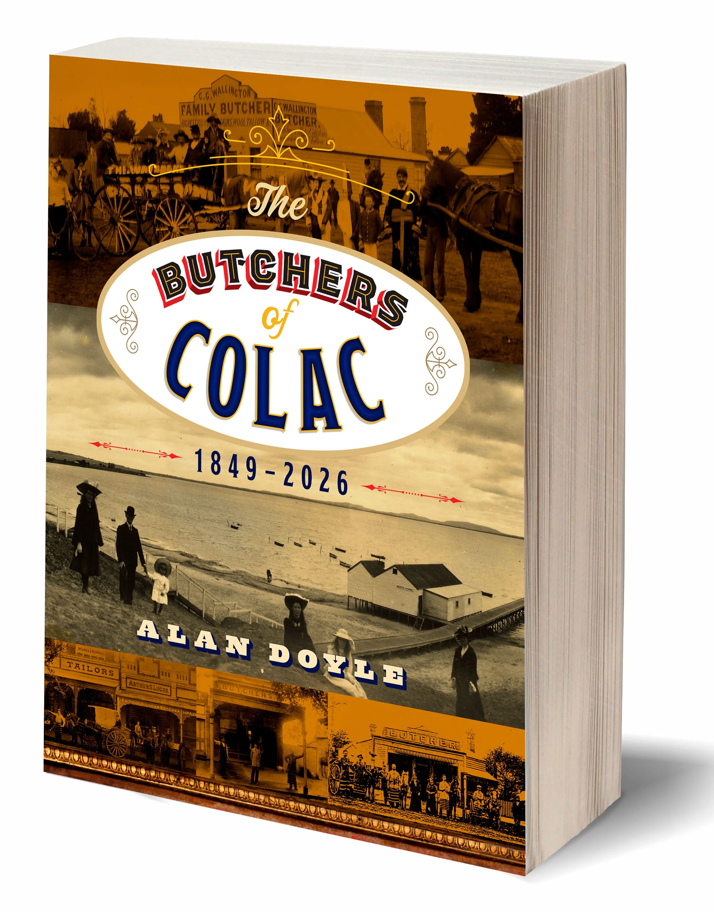
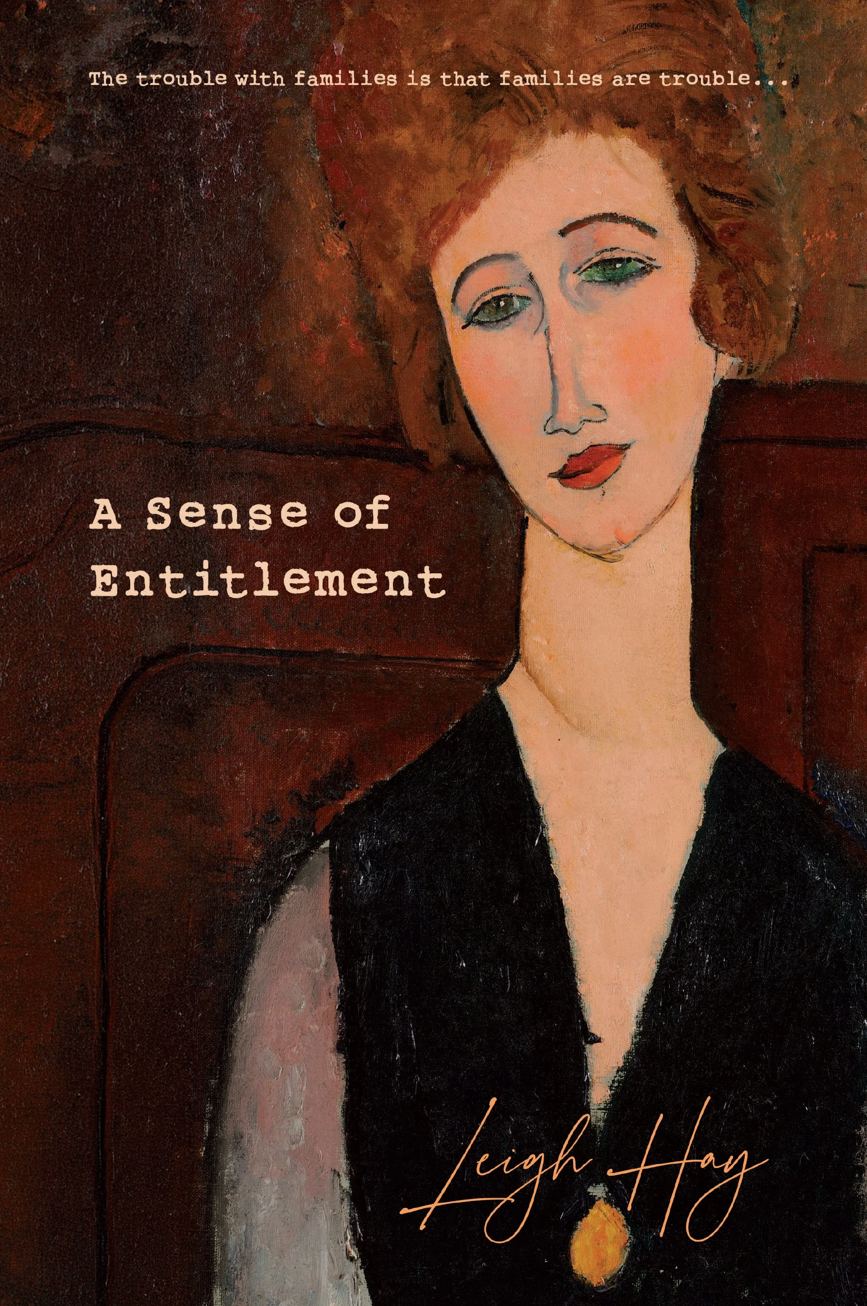
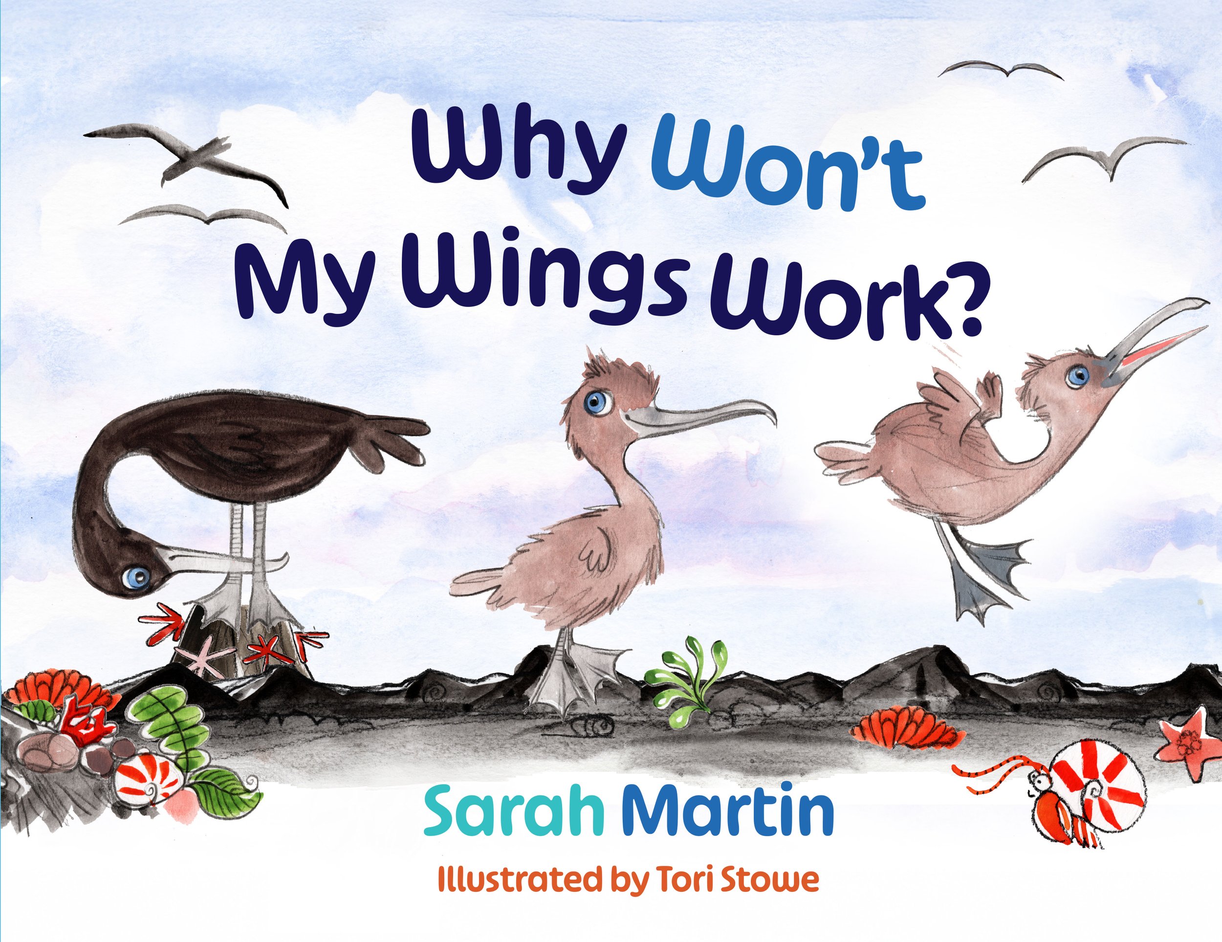
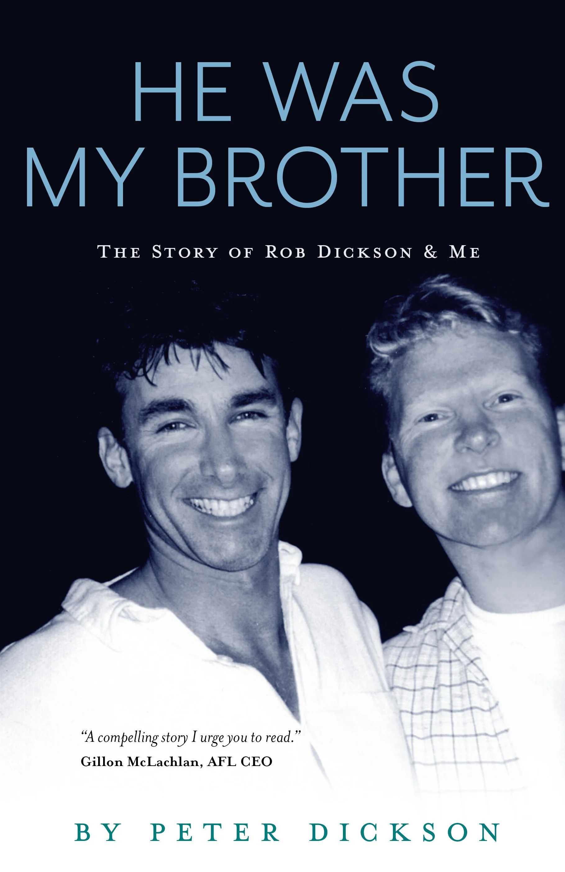
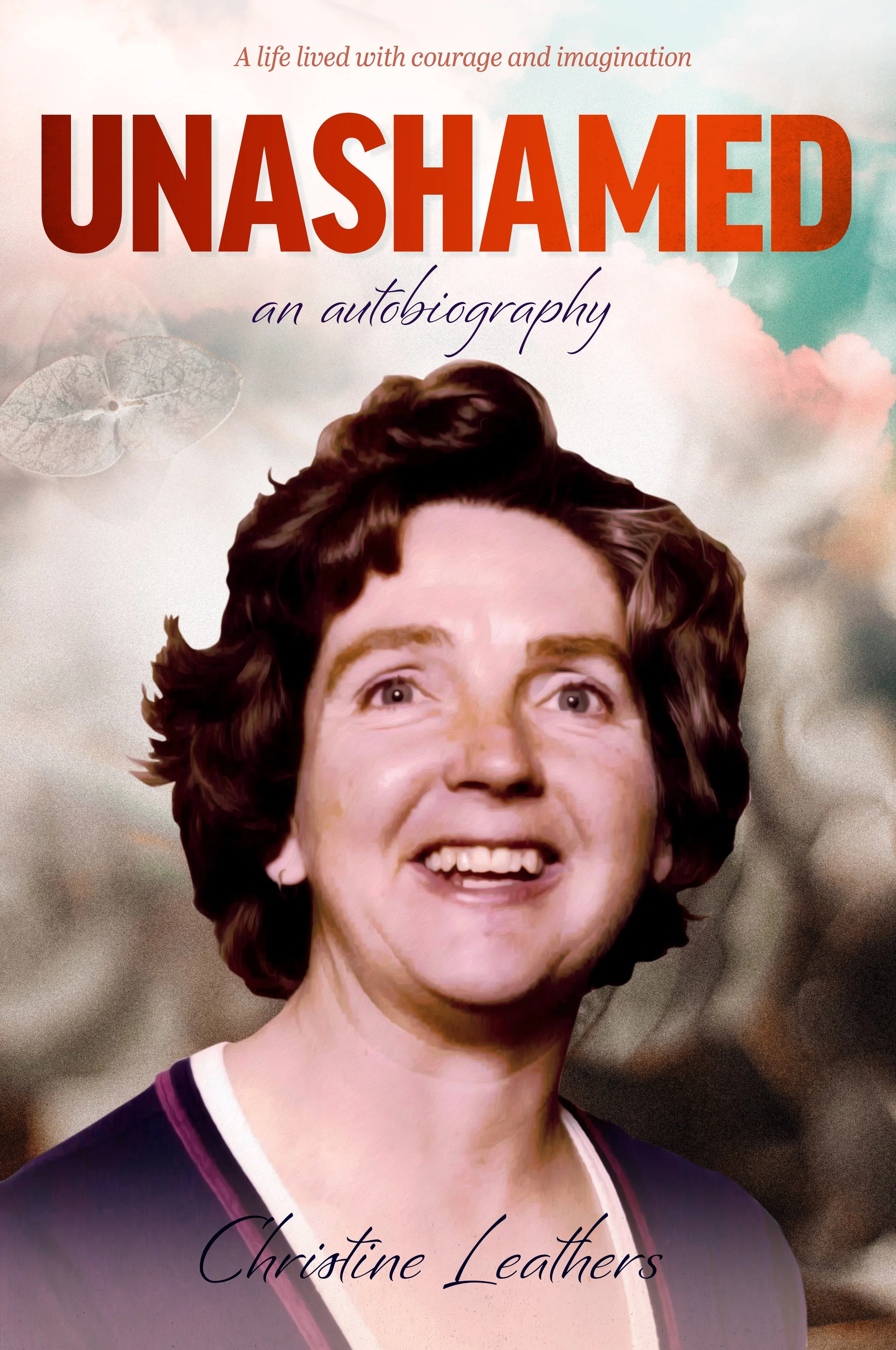
A small selection of recent cover designs, with the usual variety of subject matter.

5 Typesetting Tips for Enhanced Accessibility

Typesetting is crucial in book design because it determines how readers engage with the text and absorb information. A well-designed layout enhances readability, making it easier for readers to focus without distractions. When accessibility is prioritized, books become more inclusive, catering to individuals with visual impairments, dyslexia or other reading challenges.
The Importance of Accessible Typesetting
Accessible typesetting refers to the practice of designing text layouts in a way that accommodates as wide a range of readers as possible, including those with visual impairments — which affect at least 2.2 billion people worldwide — and dyslexia. The approach ensures all readers can enjoy your writing without unnecessary strain or discomfort.
Proper font choices, spacing and alignment can significantly impact how smoothly a reader moves through a page. Focusing on accessibility and readability allows authors and book designers to create a more enjoyable experience that immerses readers in the content.
In fact, this type of customization in book design can be vital for authors who hope to drive a loyal following, as 71% of customers expect personalization when deciding on a purchase. This expectation extends to reading materials, where font choices that are directly chosen with a variety of physical abilities in mind can greatly enhance individual reading experiences.
1. Choose an Accessible Typeface
Choosing between serif and sans-serif fonts is essential, especially in print and digital formats. Serif fonts — like Garamond and Georgia — have small strokes at the ends of letters, which help guide the reader’s eye along a line of text. Research suggests that serif fonts can lead to slightly faster reading speeds, particularly in longer-form content like books.
On the other hand, sans-serif fonts, with their clean and simple letterforms, are often easier to read on screens. Regardless of style, font size also matters — 12-point is generally considered large enough for comfortable reading without straining the eyes.
Authors and book designers should avoid decorative or overly stylized fonts, as these can make text harder to decipher and reduce overall readability. Prioritizing classic, well-designed typefaces ensures a smoother reading experience for all audiences.
2. Optimize Line Spacing and Margins
Proper line spacing can greatly influence readability as it helps readers move effortlessly from one line to the next. Tight spacing can make text feel cluttered, while too much space disrupts the reading flow. Generous margins also prevent paragraphs from feeling cramped and give the eyes room to rest.
Moreover, white space guides the reader’s focus and makes content easier to digest. A well-structured page encourages readers to stay engaged. Balancing spacing, margins and white space creates an inviting, stress-free reading experience.
3. Ensure Proper Line Length and Paragraph Width
The ideal line length for readability falls between 45 and 75 characters per line, striking the right balance between comfort and efficiency. When lines are too long, the eye has to work harder to track from the end of one line to the beginning of the next, leading to fatigue and slower reading speeds. On the other hand, shorter lines create frequent breaks in the reading flow, which makes the text feel choppy and disconnected.
Adjusting paragraph width based on the format is crucial. Print layouts can afford slightly wider columns, while digital content benefits from narrower widths to accommodate different screen sizes. Optimizing line length lets authors and book designers engage readers without unnecessary strain.
4. Use Hierarchy and Contrast for Readability
Font size, bolding and italics guide readers through content and improve readability. Larger font sizes make the text easier to process while bolding highlights key points without disrupting the low. Italics can add emphasis but should be used sparingly to avoid visual clutter. A well-structured hierarchy with clear headers and subheaders makes navigation seamless, especially for readers with cognitive impairments or low vision.
Headings break up information into digestible sections, which makes content easier to scan. High contrast between text and background is just as important. Dark text on a light background (or vice versa) enhances visibility, reduces eye strain and ensures an inclusive reading experience for all audiences.
5. Avoid Justified Text and Hyphenation Overuse
Left-aligned text is easier to read than justified text because it maintains consistent spacing between words. Full justification — while visually neat — often creates uneven letter and word spacing. This leads to what’s known as “rivers” of white space running down the page. This inconsistency complicates distinguishing between individual words, slows reading speed and causes unnecessary strain.
Excessive hyphenation — often used to balance justified text — further disrupts the reading flow by forcing the reader to pause and piece words together across line breaks. A better approach is to use left-aligned, ragged-right text, which maintains natural spacing and avoids awkward word breaks. If justification is necessary, adjusting word spacing within a reasonable range can help improve readability without sacrificing aesthetics.
Creating an Inclusive and Engaging Reading Experience
Thoughtful typesetting transforms a book from simply readable to truly engaging. This makes it easier for readers to absorb and enjoy the content without distractions. Prioritizing accessibility lets authors and designers create a more inclusive experience that reaches a broader audience and immerses readers from start to finish.
Eleanor Hecks is a writer and web designer who is passionate about helping other writers grow their online presence. Her work can be found on her site Designerly, as well as publications such as IndependentPublishing.com and I Need a Book Cover.
Edge Printing Design by Selina Fenech

Illustrator and writer Selena Fenech is offering an interesting embellishment technique for authors (see image above)
“Popular paper edge design accessible for indie authors! With this technique, designs are printed into the page formatting, not sprayed after printing. Can be applied to any print on demand title in black and white or colour. BYO design or custom illustration available.”
Visual Storytelling for Authors

How to Engage Readers Through Graphics and Design
Eleanor Hecks discusses the importance of graphic design in enhancing the reader experience:
Authors live in an age where attention spans are dwindling and competition for readers is fiercer than ever. Today, readers crave stories that capture their imagination while captivating their senses.
For writers and book designers, this is where visuals become a must-have tool for deepening engagement and enhancing the storytelling experience. Whether through a book cover or carefully crafted book opener, graphics and design can amplify a narrative’s impact, making it linger long after the final page.
What Visual Storytelling Is and Why It Matters
Visual storytelling is the art of conveying a narrative through images, typography and design. It goes beyond the written work, enhancing a story’s emotional impact and immersing readers in its world. For authors, visual storytelling is the connection between content and experience. It creates a richer, more engaging passage for readers.
In publishing today, this system has become increasingly important. Consider that publishers and independent authors sold over 767 million print books in 2023. When you factor in e-books, the figure climbs even higher. With so many options available, authors must find ways to stand out, and designs are one way to achieve that.
Visual storytelling is crucial because it fits the human brain’s natural preference for visuals. Humans prefer graphics over text because of a phenomenon called picture superiority, which psychologist Allan Paivio studied. According to Paivio’s dual coding theory, humans store visuals in two ways — as an image and as a word or phrase that describes the image.
In contrast, humans only store words as verbal representations. This means images are inherently more memorable, making visual storytelling better for capturing and holding readers’ attention. By integrating visuals into books, authors can create more relatable narratives on multiple levels.
Key Components of Visuals in Books
When adding images to content, authors create an experience that complements and enhances the narrative. Understanding the key components of graphics can create lasting impressions on readers. Success depends on the type of experience created, as 80% of consumers now consider it to be just as important as the quality of the product when making future purchasing decisions.
To give readers what they want, the visuals must contain various components, including:
Typography
Illustrations and graphics
Color theory
Layout and white space
Cover design
Carefully combining each of these elements enables writers to produce books that are visually appealing and emotionally impactful.
How Authors Incorporate Graphics and Design
Today's authors find creative ways to weave graphics and design into their storytelling, making books more dynamic and engaging. In fiction, many successful authors add maps to orient readers in complex fantasy worlds or use character illustrations to breathe life into protagonists.
In nonfiction, authors leverage images like infographics, charts and diagrams to simplify complex ideas and present data in a digestible format. For memoirs and biographies, authors typically include personal photos or handwritten notes to add authenticity and emotional resonance. By incorporating visuals strategically, they can enhance the reader’s connection to the content while making their books distinctive.
Ways to Engage Readers Through Graphics and Design
The following strategies offer ideas for authors and designers to use graphics and design elements to captivate readers.
1. Leverage Beautifully Illustrated Covers
An evocative cover is a great way to capture potential readers at first glance. The new Game of Thrones covers’ design perfectly exemplifies this. The series “A Song of Ice and Fire” uses traditional linocut art to create intrigue about the world the reader is about to enter. The covers perfectly capture Westeros and the danger that lurks within it, garnering attention and setting the tone for the epic narratives.
2. Design Immersive Chapter Openers
Whimsical chapter headers or illustrations can provide readers with visual cues. Such elements offer a glimpse into upcoming events, building anticipation and enriching the storytelling experience.
3. Add Visual Easter Eggs
Inconspicuous visual elements that follow the story’s plot or characters can delight attentive readers. These hidden gems encourage deeper engagement, as readers feel rewarded for their attention to detail.
4. Use Pull Quotes and Decorative Elements
Impactful lines with elegant designs draw the reader’s eye to significant moments. This technique spotlights key passages, amplifying their emotional connection and making them more memorable.
5. Experiment With Text Layouts
Creative typography can accentuate pivotal moments or emotions within the narrative. Authors can deliver intensity, urgency or tranquility by varying text placement and style, adding another dimension to the reading experience.
Turning Stories into Immersive Reading Experiences
Authors must use visual storytelling through graphics and design to connect with today’s readers. Visual storytelling elevates a book from a story to an unforgettable reading experience. As readers increasingly value the experience a book provides, investing in visual storytelling is a strategic creative choice. Start experimenting with visuals to convert stories into ones that readers will cherish.
Eleanor Hecks is a writer and web designer who is passionate about helping other writers grow their online presence. Her work can be found on her site Designerly, as well as publications such as IndependentPublishing.com and I Need a Book Cover.
Advice to Myself That I do not Necessarily Take

An acquaintance recently asked me to write some advice for her just-staring-out graphic designer daughter. This was my take, and I am not sure how good it is, or if I missed something important.
Make sure you put aside at least one quarter to one third of incoming payments to cover future tax / GST obligations. Super important to do this from the beginning, or you will be forever in the stressful position of playing catch-up.
Consider operating as a company – there are some tax advantages to this, but also more paperwork and accounting expenses. And you will have to pay the state workplace insurance fee each year, which has jumped to almost 1K per year.
Referrals are very, very useful, and they keep working for years. The bigger your network of contacts, the more chances that new jobs keep coming up. A client is much more likely to accept a quote from a business to whom they have been referred. You are in a sense a known quantity to them
Every author is a potential source of future work. It may be years in the future, but an author often writes a second or third title – if they had a good experience with you, they will come back. I have found it good practice to keep in touch with them by emailing newsletters with useful information for authors, new tools, author news etc.
Keep every testimonial / positive review you receive. Post them to your website, and ask satisfied customers to leave reviews on your google profile
Consider joining the Australian Book Designers Association or the Small Press Network
Make sure you refer your clients to other trusted suppliers – in your case, to printers, editors, proofreaders, illustrators, photographers etc. They will often repay your referrals in kind and if your clients have a good experience with one of your referrals, your status as a trusted provider will be enhanced. I have heard this referred to as the ‘honest broker’ role, and it is definitely worth aspiring to
Consider finding a compatible business partner or partners. Being a sole practitioner has its benefits, but also costs – difficult to have down time, difficult to grow past a certain point, becoming stuck in the same role, potentially unable to take on very large jobs or multiple large projects. Perhaps your business partner might specialise in web design, or assisting authors online or some other complementary service. There are services like Fiverr that connect you with typesetters, people who run amazon ads, ebook conversion etc, but I have always preferred to work directly with suppliers rather than through a third party. That said, I have found fiverr very useful for performing one off specialist tasks – creating a 3D rendered object, or a bit of specialist accounting
Consider offering a package service – authors or publishers often have several requirements and it is a ‘pain point’ for them to have to juggle multiple contractors to do them – eg. they may want a print version, ebook version, banners and ads, assistance with online advertising, a round of proofreading, an audiobook version etc.
If you prefer to go it solo, then consider employing an assistant as your business grows – either as a contractor or actual employee, remote or in-house.
Book design is easy to do from home / a home office, so it can be very low-cost. However, it can be good to separate home and work, or the latter will tend to take over the former. I had an office for many years, and it definitely had its pluses. My best setup has been a home office, but in a standalone building. So you leave the house to go to work, and when you are in the house, you are not working.
I got my first client by writing to publishers, and doing some occasional work for them, and then some design projects for councils and libraries, then some printers started referring authors to me to get their books set up properly (it is very important to have good contacts with printers) and it rolled on from there. It took a while to build up enough, and I was also working a day job for a few years.
I had to take on as many jobs as possible, as book projects can suddenly halt while the author messes around with proofreading, or runs out of money for a while, etc.
In terms of pricing – I have always tried to be mid-range, to get as many clients as possible and to give very reasonable prices to independent authors. I have seen designers who charge much more than me and obviously put a great deal more work into each project. That’s a valid approach, but my client base would definitely not bear those kinds of costs.
The book industry is changing fast, and who knows where AI is going to go. I already use it a lot for image generation, but it will no doubt get into layout and design as well. Hopefully there will still be plenty space for human-led design.
You will need to be someone who solves a lot of author or publisher problems in the one service, and to be super reliable and personable, thus justifying your rates. Most authors want to deal with a person, and especially to meet up with them and feel they are being listened to.
Book Cover Designs, May 2022


The Sentinel book cover design
Jacqueline Hodder’s excellent book The Sentinel is out now. She reports satisfaction with the cover design, which was a very interesting task involving lighthouses and persons in period attire. And who doesn’t like working with louring skies and dramatic storm-torn coastlines? Here is the bliurb for Jacqueline’s book:
“Escaping from a disastrous relationship, Kathleen Devine flees to an isolated lighthouse off the Victorian coastline. Taking up the position of Head Teacher to the lighthouse keepers' children, she is ensnared in the lives of those marooned on the lonely outpost and soon realises no-one can escape their past. When the fearsome Head Lightkeeper, Mr Johannsson forms an unlikely friendship with the daughter of one of the keepers, it threatens to destroy their fragile peace. Can Kathleen find the strength to survive and answer the question that haunts them all: what happened to Isabella and why?”
Available here: https://www.amazon.com/Sentinel-Jacqueline-Hodder/dp/0648899403/

What those Weird Little Proofreading Marks Really Mean...
Spotted on the Web…

My personal favourite is “more hypnosis”.
http://www.incidentalcomics.com/2016/10/proofreaders-marks.html
Solving Writing Problems with Euan Mitchell

Euan Mitchell is a highly experienced editor and independent publishing expert who teaches at Swinburne University and also takes on private editing projects. His website provides further background information. He was interviewed on writing and editing for the Garret podcast. He specialises in Story design (all genres of novel and memoir), Young adult fiction (contemporary realism focus), Novel (commercial adult fiction), Memoir, Non-fiction (educational focus) and Short story (all genres). He has written a detailed guide for creating and marketing print and ebooks, available from Amazon. Here are some of his thoughts on authors and editing:
How does a writer know when their manuscript is ready to show publishers or readers?
This is a tough question to answer precisely, but new and emerging writers should not make the classic mistake of submitting unedited work to publishers. Too many new writers think a spellcheck is sufficient because a publisher will want to edit their manuscript anyway. But publishers want to spend as little money as possible on editing. Even though publishers know that a good edit can be the best way to add value to a book, editing takes time and editors typically work for an hourly rate. If you are self-publishing, then you don’t want your readers deriding your editorial efforts as substandard all over social media. There is a world of vocal armchair pedants out there!
Over the two decades I have been helping new and emerging writers to edit or rewrite their work to a publishable standard, I have found that a free sample edit of about 1,500 words from an extended manuscript is a good way to gauge how much editorial work is needed in total. Writers can then make an informed decision about whether or not to engage my services. Writers are usually pleased when I point out specifics that can be improved. This will typically include fixing some spelling, grammar and punctuation; however, often the sample edit will reveal other aspects to address, such as: lack of clarity, awkward transitions, ‘head-hopping’ points of view, weak dialogue, tautologies, clichés, and too much use of summary or stock character descriptions. The good news is that all these problems can be fixed. A careful edit or rewrite will ensure your ideas have the best chance of connecting successfully with publishers and readers. You can email Euan to discuss your writing project via euan@euanmitchell.com
Author Pat Kelly and her books

Pat Kelly writes well-plotted and thoroughly engaging historical novels populated by believable characters. Although her characters often face great challenges, she maintains a touch of humour and optimism. She is skilled at evoking lost eras and the way people saw the world.
Pat Kelly was born in Glasgow in 1938. When she was just over a year old her father was called up to serve his country and she barely saw him until she was about eight years old.
Perhaps as an escape, in early primary school Pat took to writing stories, which her teacher used to read out to the class.
In her teens and early twenties Pat wrote several books, sent them to publishers with a stamped return envelope, but never received any of them back, so had to retype them to send them to the next publisher. None were ever acknowledged or published.
Eventually, Pat married and was too involved with raising children to have time to write. In 1968 she arrived in SouthAustralia, with four children, as a £10 Pom. After divorcing after over twenty-five years of marriage Pat was contacted by a Manxman, Mike, she had known in her teens. They married and returned to the Isle of Man to live.
After Mike retired, in 1993, they followed the summers with six months in each country. While in the Isle of Man they ran a daffodil farm and were well known on the Island for their roadside stall, with an honesty box, selling daffodils and plants.
In 2014, the travel was becoming too much, so they moved to Australia permanently to live in Lakes Entrance, a beautiful, peaceful little town in Victoria.

When she moved to the Isle of Man, Pat left all her family in Australia. Mikes mother Lou, a wonderful lady took her new daughter in law under her wing and they had great conversations.
Lou had grown up in a tiny village in the West of the Isle of Man. The population of this village was around 20, but when the great war started an internment camp was built which eventually housed around 25,000 ‘enemy aliens’. As Lou told Pat about her childhood and this huge camp looming over her tiny village, Pat realised she was listening to history, a lot of which no one else alive could tell – and that if Lou died, all that history would be lost forever. So she wrote it's all down and turned it into a book called ‘Hedge of Thorns’ that was a great success on the island.
The research for this sparked Pat's interest in Manx history And she then went on to write a second book, ‘Smugglers Urchins’, set in the smuggling era on the island.
Her next foray into Manx history was the famous Laxey water wheel, resulting in ‘Shadow of the Wheel’.
Pat is currently working on a story which finds 14-year-old Manx girl being transported for 7 years for stealing a loaf of bread. She sails with the second fleet in a ship that was nicknamed ‘the floating brothel’.
Ellen Hansa and her novel, Esther's Violin

Cover note: The background image is Ellen’s father’s ex libris, flipped to make the letters semi-abstract forms. Typeface is Mostra Nuova. Body text is Arno Pro.
May it be a camera, a lump of clay or a sheet of paper, Ellen Hansa manages to create a story. At the age of fifteen she tried to start a career as a photo journalist, an impossible task for a young woman in the late 1950’is in war-torn Vienna. She studied photography and with her masters’ degree under her collar, tried again. Having been rejected once more, Ellen spends the next years in photographic studios both in Vienna, Oslo and later in Melbourne.
After her marriage and three children, Ellen tried her luck turning clay into pots. A few years later Stanyers’ Pottery was born and for many years the business flourished.
After her husband’s death Ellen withdrew to her bush block. A writing group in the local Neighbourhood House drew her back into society. She started telling stories again and compiled a number of short stories called “Stories around the Table”. Then she gave herself the big challenge to write and publish a fictional novel, Esther’s Violin.
Her work can be viewed here.

Seedpod, ceramic sculpture by Ellen Hansa
The Hodgkiss Mysteries — eleven books of mystery and wry humour

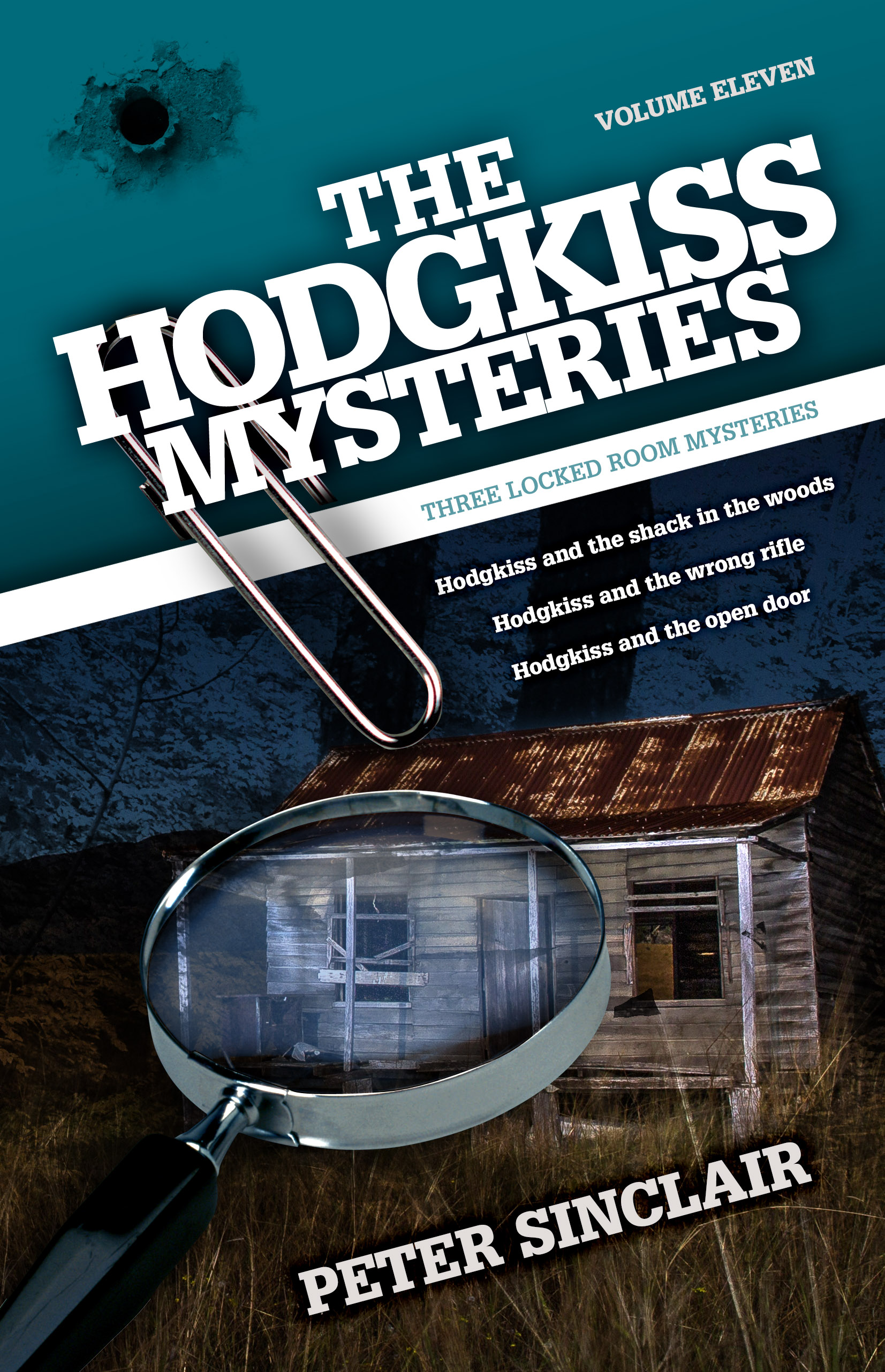
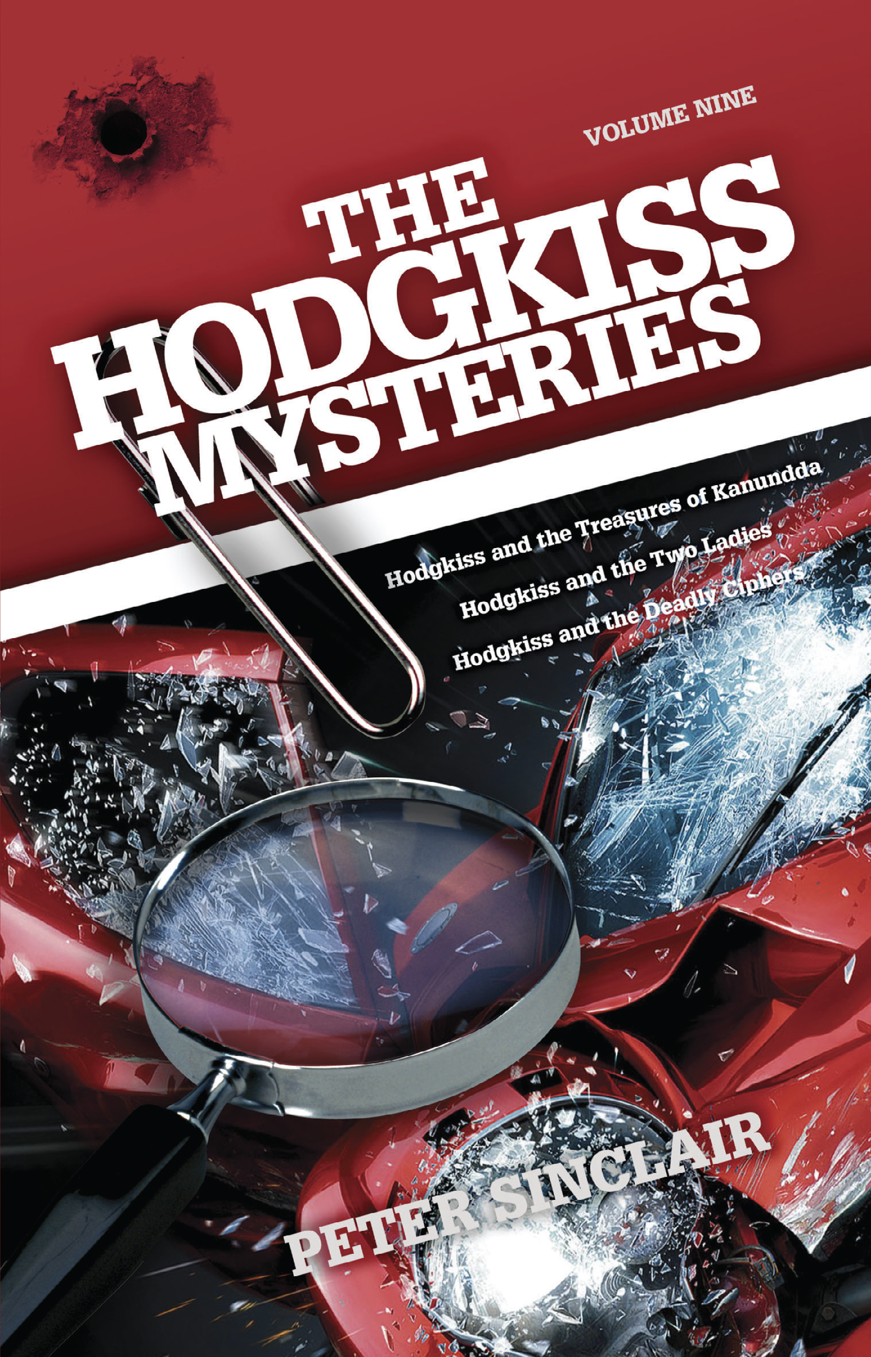

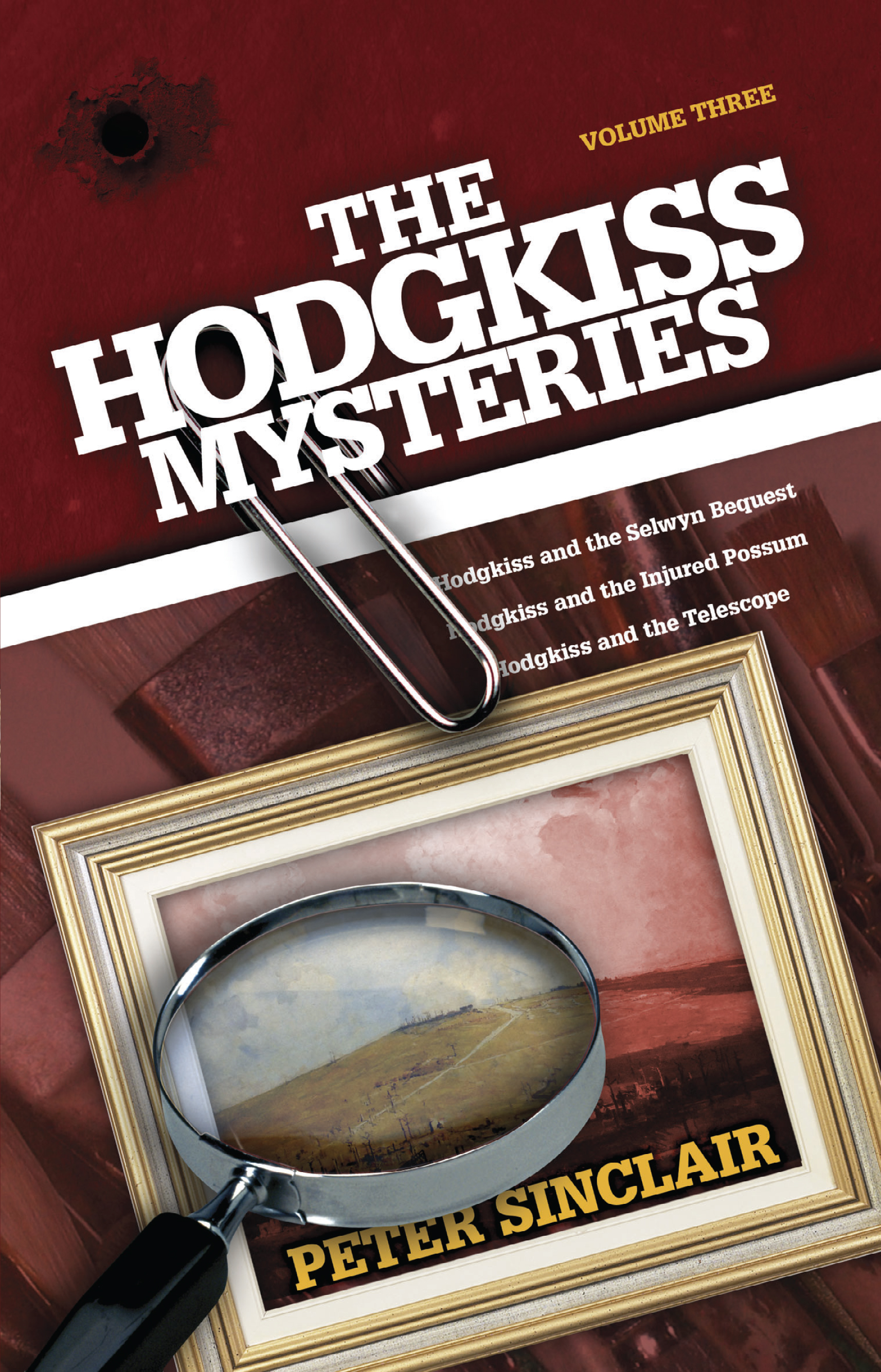
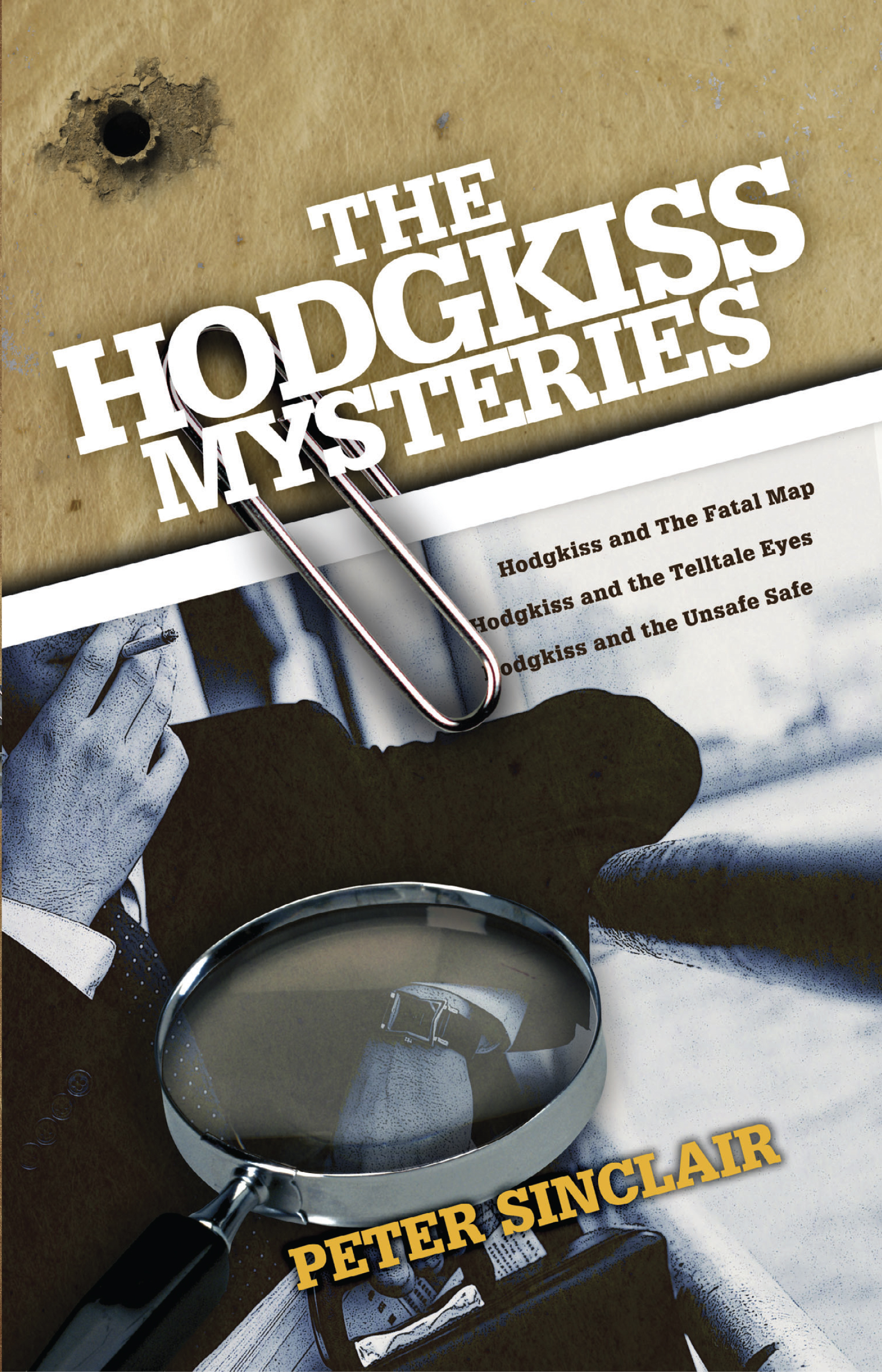
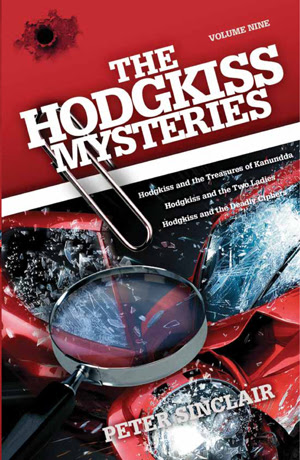
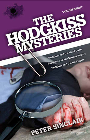
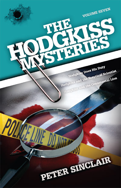
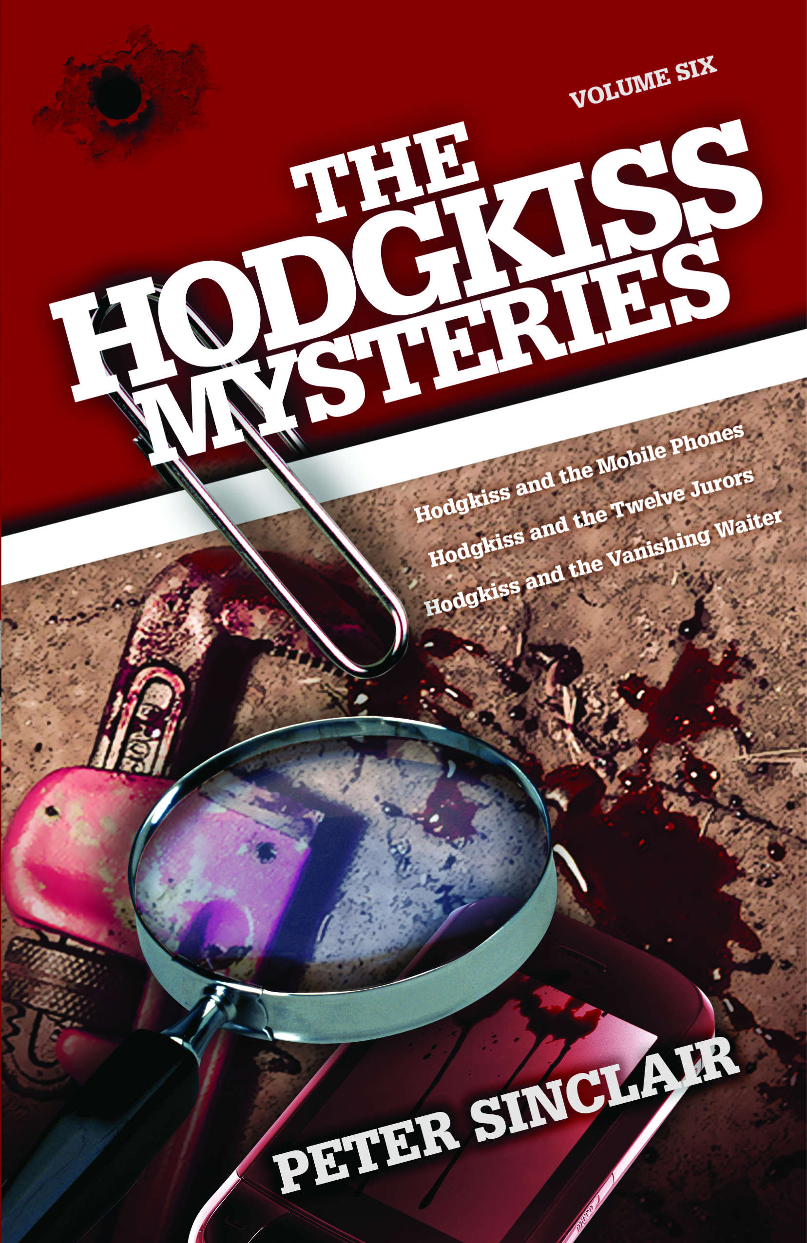
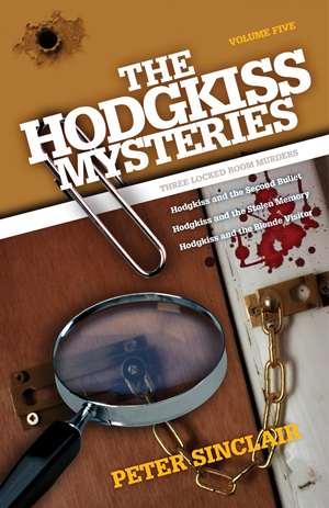
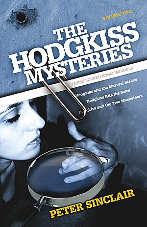
Over the past decade Peter Sinclair has produced a series of droll murder-mysteries featuring the spry and perceptive retiree Edgar Hodgkiss, bane of corrupt politicians and greedy developers. We have kept the same basic design, varying the main image and colour scheme. One can only hope this well-written series will soon receive the kind of attention it deserves. New postings of the print and ebook files will be uploaded shortly, and we will post links when they go ‘live’.
My Designer Profile on Reedsy

Have registered with Reedsy, a service designed to ”connect and collaborate with a worldwide network of authors. “ Reedsy allows designers to apply to become service providers. As all the designers and other service providers have been carefully vetted, the theory is that users will receive professional quality assistance with their book, in contrast to mediocre crowdsourced design interfaces such as Fiver.
Australian Book Designers Association

There's an organisation for everything, even book designers. ABDA showcases the work of a group of designers with diverse approaches and workflows. It even organises awards, a few events and posts interviews with individual designers. Here's my interview from their archives.
Women Illustrators United

Women Who Draw attempts to redress a perceived imbalance of female/male illustrators. According to their website:
“Since its launch, Women Who Draw has become the place to go to discover new talented illustrators from all over the world. It features over 2700 (and counting) professional artists, tools to help users curate their own stables of artists, interviews with industry pros, monthly member collaborations, and a resources page for artists and the people who hire them.”
Whatever the politics of the site, it showcases many excellent designers working in a wide range of styles.
Introducing the Illustrations of Pawel Nowacki
Pawel has illustrated several books with us now, with a range of subject matter. He has adapted well to every request and produces illustrations with personality and energy. Here's an introduction from Pawel:

"My name is Pawel (the Polish cognate of Paul) and I’m a freelance illustrator based in Poznań, Poland. When I was a small boy, my father showed me a ballpen-made portrait — I've been drawing ever since. Being self-taught, I barely ever leave my pencil behind, wanting to be a better artist. Working almost my entire life in IT business has given me an interesting perspective on art, and at the same time equipped me with some skills that are helping me out with my art work. Coming from two such distant worlds is both advantage and a challenge which I take happily, having a great motivation from my family, especially from my beautiful wife Joanna.
I really enjoy black and white drawings. Book illustrations, comics and graphic novels were always something special for me. Being able to actually create book illustrations is like fulfilling my childhood dreams. This is also why I really enjoy working with Luke, for he is a professional, honest and friendly person, giving me the opportunity to do what I really love:)

If you are a book author and want to decorate your book with any kind of illustration I'm more than happy to help you. I always like to research the subject of the illustration to fit it best for authors idea. I usually do hand-drawn, pencil to paper sketches then scan and add some processing work on the computer with use of a graphic tablet. I always like to leave a hand-drawn feeling to the final effect. I can create book illustrations, portraits, caricatures, etc. but I stay open for any kind of drawing / art idea you might have!

You can have a look at some of my previous works on my portfolio archive at pawel-nowacki.tumblr.com/archive and also on my Instagram account: www.instagram.com/nowacki_pawel, (user: nowacki_pawel)"
Safe System Critique — Book Cover Design
Experienced traffic engineer Rob Morgan has written a scathing critique of the current road safety paradigm, the so-called "Safe System". He sums up his argument with the following excoriation: "the Safe System’s demand to abolish the old order of evidence-based road safety and speed management has been a clarion call to action and — unless we put a stop to it — its continuation will put us on an inexorable path to the creation of an unchecked state.

The cover incorporates surveillance, Victorian roads, an image of Stalin and is set in Proxima Nova.
Killing Babies — Book Cover Design
Born and bred in the bush, nineteen-year-old Daryl Bishop's number came up in the tenth National Service Ballot in 1969, and he shipped out to Vietnam in 1971. Killing Babies is his unvarnished account of his training and war experiences. Fortunately, no babies were harmed in the making of his book, but the stigma and after-effects of serving in that unpopular war is honestly related. Published by Sid Harta, and written in an authentic, engaging and very Australian voice. Our cover features Darryl's own necklace of cartridges, jungle foliage and a helicopter used by both US and Australian forces. The title typeface is Eveleth.

“Once again thank you so much for all the help you gave me in getting my first book over the line to be published. BTW the young journo who interviewed me for the local paper was very impressed by your cover design. Am getting help from most unlikely places. A woman rang from North Qld to do a podcast with me on Bindi’s and Bulldust and today a woman from Canberra is spreading the word on some site to do with finding a good book to read, she liked it that much.”

A War of Hearts

Samantha Grosser writes psychologically compelling and sensitive stories of men and women, bringing the eras in which they lived to vivid life. Another Time and Place is set in World War Two and depicts two lovers separated by war, with no news of each other. Our cover design focused on the female protagonist, with a night-time colour palette and a transition from an interior setting to a broader landscape.
When First We Practice to Deceive — Cover Design

Deceit is a political thriller set in Australia. It depicts a parliament dominated by a deeply shady prime minister and surrounded by ambitious and ruthless supplicants. We wanted the cover to convey an air of foreboding and menace, and also of critical decisions to be made.