

Recent cover designs, from High Fantasy to Colonial History, Real Estate to Middle Eastern Politics


Playing Cards at the Poles

Recently we were commissioned to design a set of playing cards featuring legendary Antarctic explorers. The card set was well received and they have made their way to surprising locations at extreme north and south…
Per my client Lewis Levitz:
I received this letter from Sarah.
Our cards are now being sold at a camp in Antarctica and also in Svalbard
Kind regards
Lewis
They have also been used to while away the time during flights over the Antarctic ice cap.

Recent Book Cover Designs
We’ve been busy designing new covers for lovely author and publisher clients, with a very broad range of subjects. Here are a few of them.


Export Driven Cover

Anura Amarasena and Sisira Colombage have written a practical guide to trading with the rapidly expanding Asian economies, using Australia-Sri Lankan trade as a case study. We opted for a bold, colourful design with type conforming to the angles of the image. Typeface used: Proxima Sans.
It's a Gas Gas Gas

Natural Gas Volume 03
Cover design for Volume 3 in a projected 4 volume series on natural gas. Bright primary colours, bold simple typography and industry-related images.
The Silver is Mine — WorkingType Cover
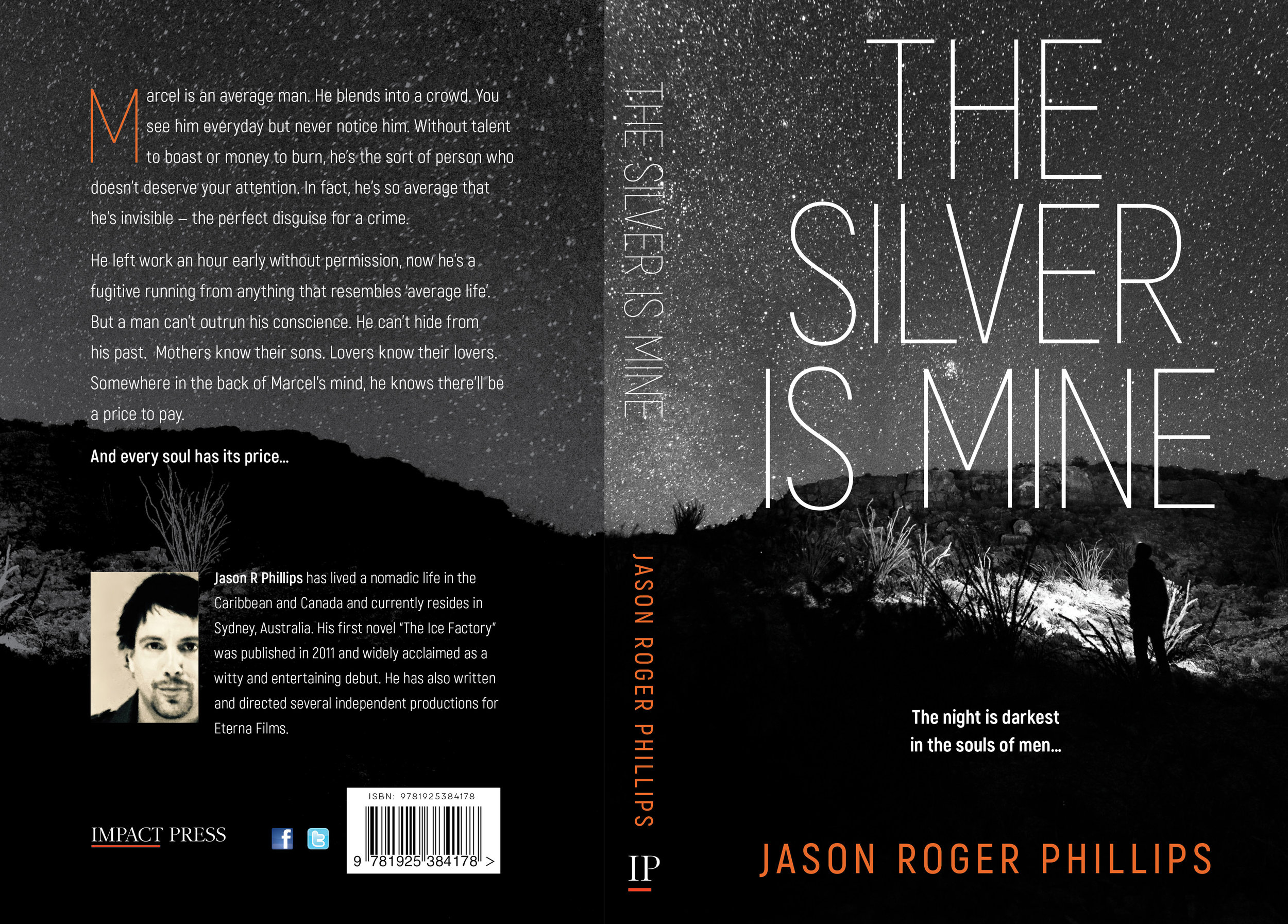
The Silver is Mine is an edgy psychological thriller published by Impact Press. Our client wanted a stark and high-contrast design. We used Akrobat Sans for the title type and a monochromatic starscape with enigmatic figure. The author's name provided the only splash of colour.
Property Finance Made Simple in the Kindle Bestseller List

Andrew Crossley's just-uploaded "Property Finance Made Simple" has immediately debuted on the Kindle bestseller list. Our cover design focused on a strong, straightforward combination of text and iconic image, that would reproduce well as a thumbnail and at larger sizes.
A Man of the Land — Book Cover

Bob Gillespie has taken five decades of farming experience as the basis of this saga of life on the land. He wanted the cover to show some of the character of the land in the southern Riverina, combined with images of the protagonists. Typefaces used: Amberly and Didot.
Faraway Places — Book Cover

In "Faraway Places", Albert Trajtsman writes about strange places and abominable acts. One of the tales dealt with an outpost the wilds of Tsarist Russia, and led us to use the photograph of Siberian windmills in the background, paired with monstrous images from medieval documents.
Famous People Who Have Met Me — Cover Design

Greg Noakes has made a career of photographing musicians and showbiz figures, and "Famous People Who Have Met Me" is the result of a trawl through his extensive photo library, coupled with wry explanatory captions. From Linda Ronstadt to Grace Jones, and Iggy Pop to Cold Chisel, readers will enjoy encountering the famous and infamous of decades past. The cover features Grace Jones and a suitably lurid combination of typefaces. To be released soon, via the Arcadia Imprint of Australian Scholarly Press.
Integrating Work and Life — Book Cover
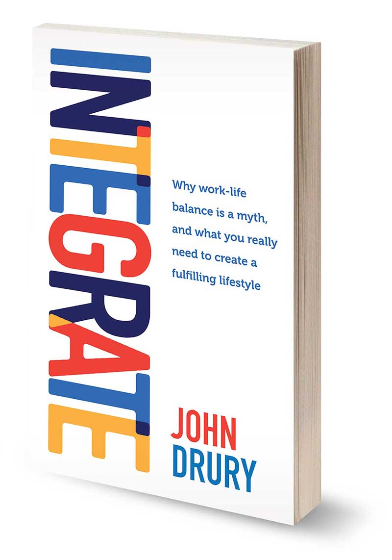
John Drury wanted a bold, simple design that reflected his theme of integrating life and work, and we represented that via overlapping letters, the colours for which were drawn from his web presence. The whole project was turned around in only a few days, including the print run.
Red Dragonfly — Cover Design
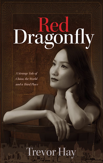
Combining several city skylines, a contemplative Chinese woman and Matteo Ricci's beautiful world map was an interesting challenge. Trevor Hay's book (in the process of being published by Arcadia, an imprint of Australian Scholarly Press) is a fascinating examination of cross-cultural contact and emotional connection.
Recent Cover Concepts — April 2016

As usual, our recent book design projects have featured a wide range of subject matter — a book of sonnets, a novel dealing with a huge telco and a guide for beginning singers. Projects currently in the works include a handbook for stroke sufferers, a novel about cultural contact between China and the West and a history of judicial executions in Victoria.
Lexie London — Book Cover

Our client already had the artwork they wanted for this children's title, but needed to liven up the type treatment. The nature and proportions of the image precluded the use of the middle two thirds of the page, so we utilised overlapping text and text on a path to fit in the rather long title. Typefaces used from the top of the cover: Another Shabby, Seaside Resort and Tommaso. Published by Brolga Publishing.
Ancient Egyptian Saga — Book Cover
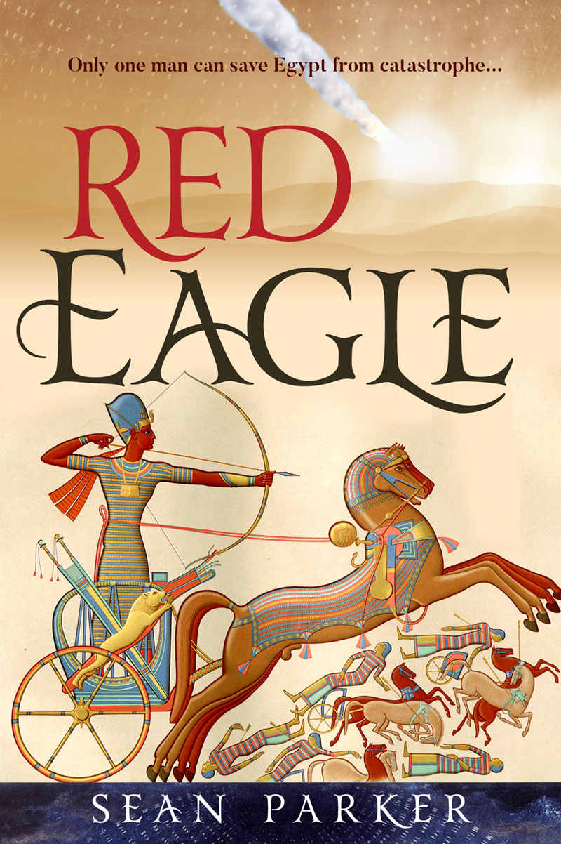
A great catastrophe is afoot in this sweeping saga set in Ancient Egypt. We used a beautiful 19th century illustration with vivid saturated colours and combined it with a hint of the Egyptian desert and a meteorite trail (essential to the plot). Title type set in Yana.
Business Directory for Heidelberg
The latest directory of businesses in Heidelberg Central is out. We have been designing this annual publication for several years, characterised by a simple card-like layout for the traders, colour coding for each category and plenty of white space. It has been interesting to observe the recent evolution of street shopping away from retail towards service industry businesses (food, hairdressing, gyms, consultancies etc). Set in Proxima Sans.


Recent Work: Banner for Eaglehawk Hotel

A banner for a beautiful little hotel in the goldfields region. Modern retractable banners are inexpensive, cheap to print and great for promotional impact.
Re-starting an Important Social Debate
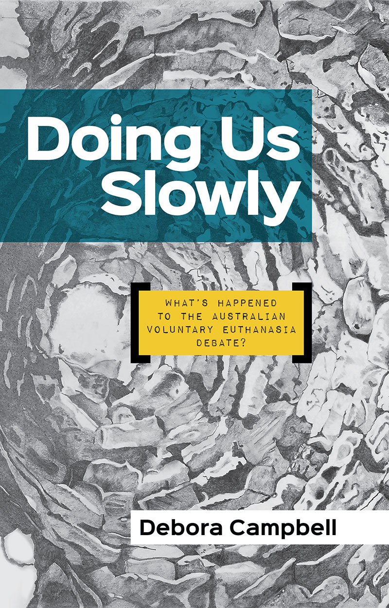
Deb Campbell is a passionate advocate for voluntary euthanasia. She believes that risk averse politicians have quietly kept the issue out of the public debate, despite broad public support for greater patient control over the end of one's life. We used a bold, highly visible sans typeface with a touch of personality for the title and author name (Sinkin Sans) and used Impact Label Reversed for the subtitle. The delicately shaded background artwork was supplied by the author.
A Tale of Two Professions

Joe Reich's latest book is an enjoyable journey through the vanished world of 1970s Melbourne — focusing on the intersecting lives of a doctor at a major urban hospital and an engineer working on the doomed first attempt to build the Westgate bridge. It is a masculine world of prejudice, misconceptions and cigarette smoke. This draft of the cover features an inverted image of the bridge in its incomplete stage and a troubled Melbourne sky.
The Fifth Identity — Book Cover

Investigators trace the many identities of a man with a traumatic and complex past. Our client wanted us to work in the evacuation of troops at Dunkirk in WWII, identity papers and the man himself. We integrated the colour palette to give the overall cover a sense of unity. Typefaces used include Rex Bold, Rex Inline, impact label and Mom's Typewriter.