
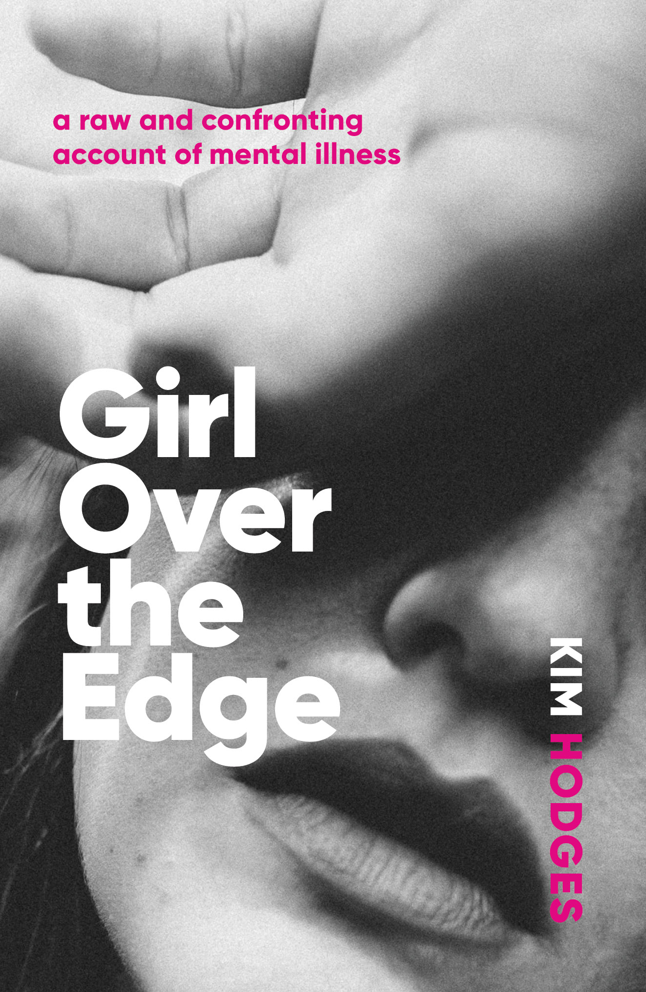
Girl Over the Edge is an honest account of one woman's experience of mental illness. We wanted the cover to look raw and unfiltered, but not melodramatic. The typeface is Gilroy and the image was sourced from www.unsplash.com
Authors and their Digital Presence Explained
A thoughtful and in-depth examination of how authors are not getting the best results from their digital presence. The writer explains why the interests of authors and publishers do not always align, and how a new generation of author-centric services are being created.
“It is ironic that the author brand is foundational — the success of all title marketing depends on it and all publishers depend on title marketing — but how the author brands are developed gets very little professional attention.”
Export Driven Cover
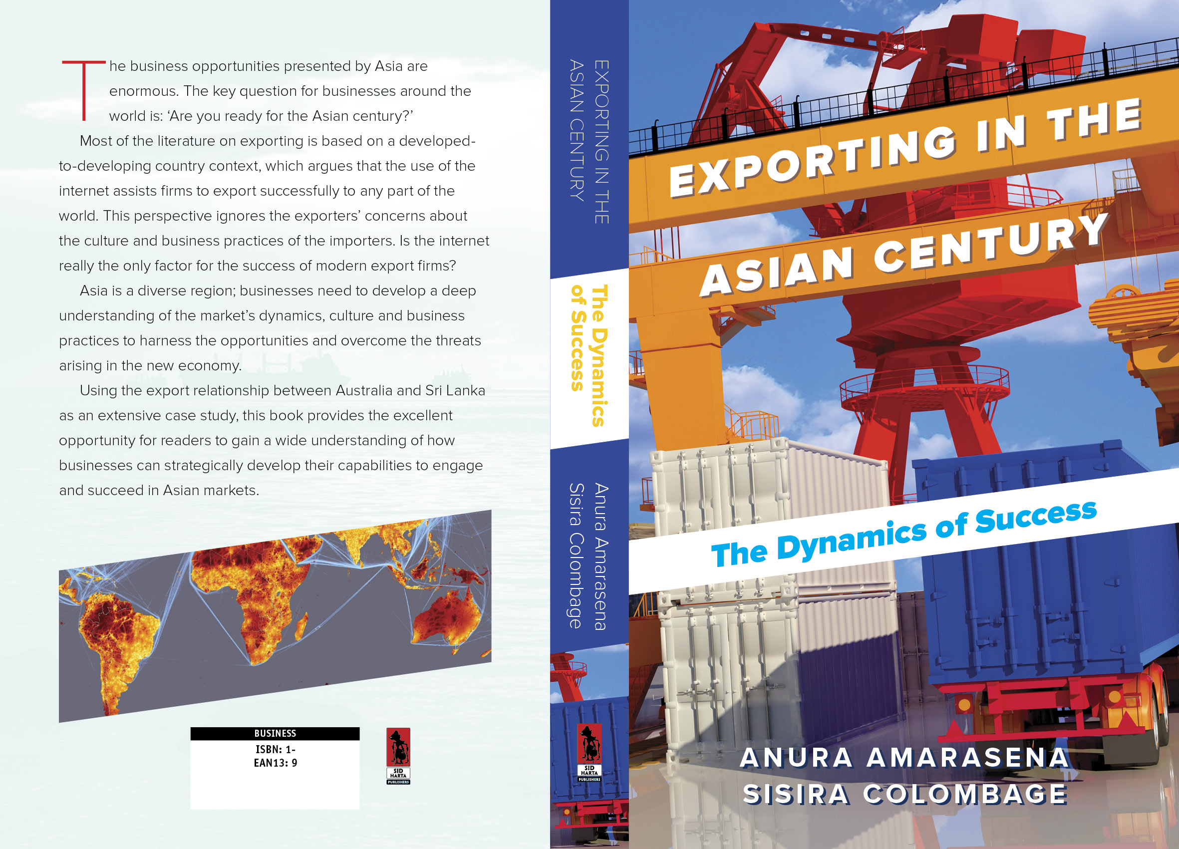
Anura Amarasena and Sisira Colombage have written a practical guide to trading with the rapidly expanding Asian economies, using Australia-Sri Lankan trade as a case study. We opted for a bold, colourful design with type conforming to the angles of the image. Typeface used: Proxima Sans.
Bookbub Explained

Bestselling author Peter J. Ralph has turned his considerable research skills to the secrets behind the most successful promoter of ebooks, Bookbub. Our cover was intended to illustrate the dramatic effect that being selected for the Bookbub newsletter can have on the sales of a particular title. Typefaces used are League Gothic and Marianina.
Waterfalls of Type Colour
Made possible by recent innovations in type software, live chromatic type is creating a bit of a furore in type design. Here's an interview with one of the field's passionate proponents. Of course, Chromatic typefaces are not new -- the spectacular original versions were cast in metal and set by hand.

Chromatic typeface specimens from the 19th Century
It's a Gas Gas Gas

Natural Gas Volume 03
Cover design for Volume 3 in a projected 4 volume series on natural gas. Bright primary colours, bold simple typography and industry-related images.
Banner Year for Author
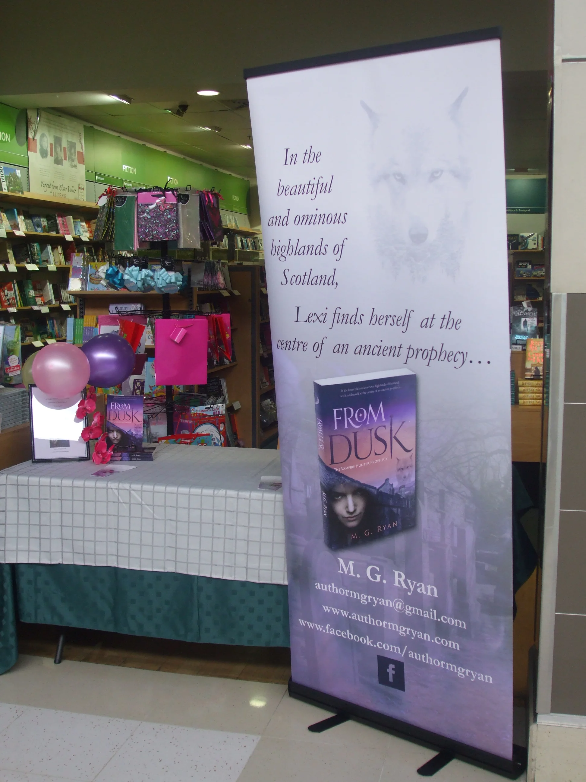
Author M.G. Ryan uses the large banner above for promotional events. She says "it looks great and draws a lot of attention. When I have the second banner made up, they will look awesome next to each other." Her latest book "To Dawn" (sequel to "From Dusk") will be released with the assistance of In-House Publishing.
Grounds for Appeal
Reground is a grassroots initiative to divert the tonnes of coffee grounds generated in Melbourne each week from landfill into people's gardens. I've booked in a consignment, and also pledged their Pozible campaign to help them purchase a van to facilitate collections and delivery. Check out the nicely designed minimalist website and spread the love (and caffeinated compost).
Maps from the Spymasters
The CIA has recently released a large number of formerly classified maps. According to accompanying notes, "The mission of the Cartography Center is to provide a full range of maps, geographic analysis, and research in support of the Agency, the White House, senior policymakers, and the IC at large." In an era of digital online maps and very detaile satellite photography, it is interesting to view these hand-compiled attempts to summarise all known information about a particular area. Many of the maps are rather well designed and aesthetically pleasing.
A Designer's Mantra

The great German designer Erik Spiekermann sometimes hand-prints a series of letterprint posters. The typically clean and pithy example above could be the prayer of all designers for fair recompense, particularly in the era of Fiverr and Ninety Nine Designs.
Classical Poetry — Book Cover Design
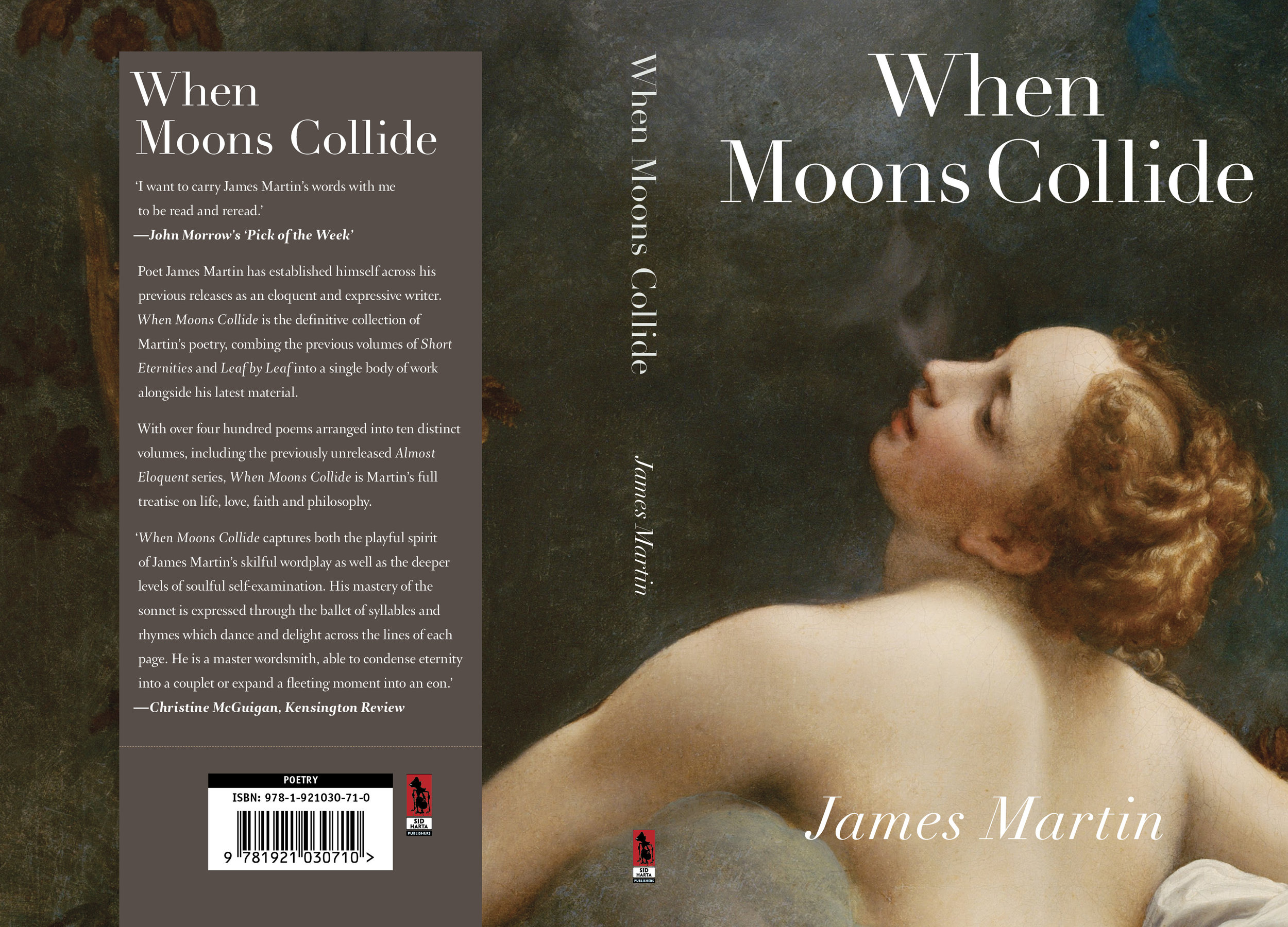
James Martin writes expressive classical poetry about the human condition. His latest book contains 400 poems dealing with life, love, faith and philosophy. Corregio's Jupiter and Io seemed perfect as the cover for this volume. The title typeface is Linotype Didot.
Thriller from the Wimmera — Book Cover
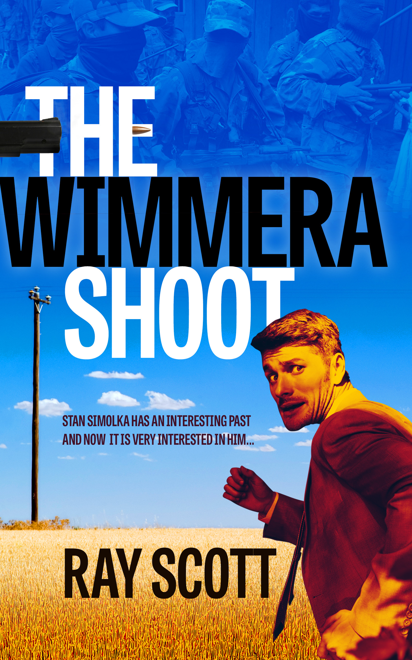
Ray Scott writes hard-bitten thrillers with plenty of action and skulduggery. His latest effort gets going in the sunny Wimmera, with a salesman facing hitmen from his murky past. With a touch of North by Northwest, we depicted a rather worried man against a field of wheat and a merciless blue sky. Typeface used: Tablet Gothic Compressed.
Attunga — Science fiction book cover

Peter Wood has written an engaging and optimistic take on a future solar system. We wanted to depict an advanced interplanetary civilisation, and also bring in dolphins (cetacean intelligence is a major thread in the story) and the asteroid belt. Typefaces used were Trajan Sans, Conduit and Beloved Script. Peter's website is here.
Paper Sizes Old and New
This website does a good job of covering the myriad standard ISO page sizes. The page sizes under the obsolete page size menu are quite entertaining — who wouldn't want to order the Double Elephant, or the Super Royal? Modern rationalised page size series are dull by comparison.
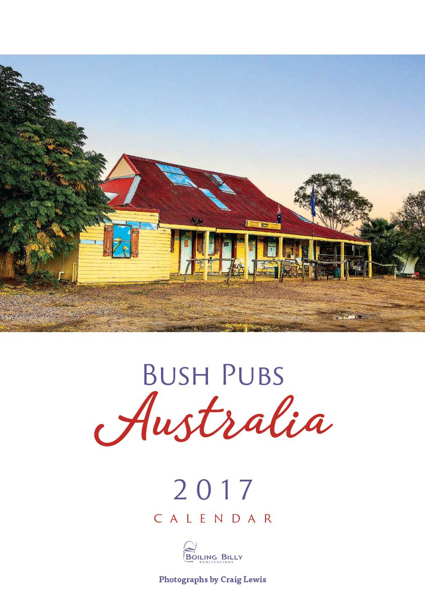
Australian Calendars for 2017 — Cover Design
Craig Lewis' photographs of iconic Australian pubs and huts adorn a long-running series calendars and books. We enjoyed working on the 2017 iterations of his calendars, especially the high country huts. Typefaces used included Trajan Sans, Homestead and Amberly.

Singing as a Science — Book Cover
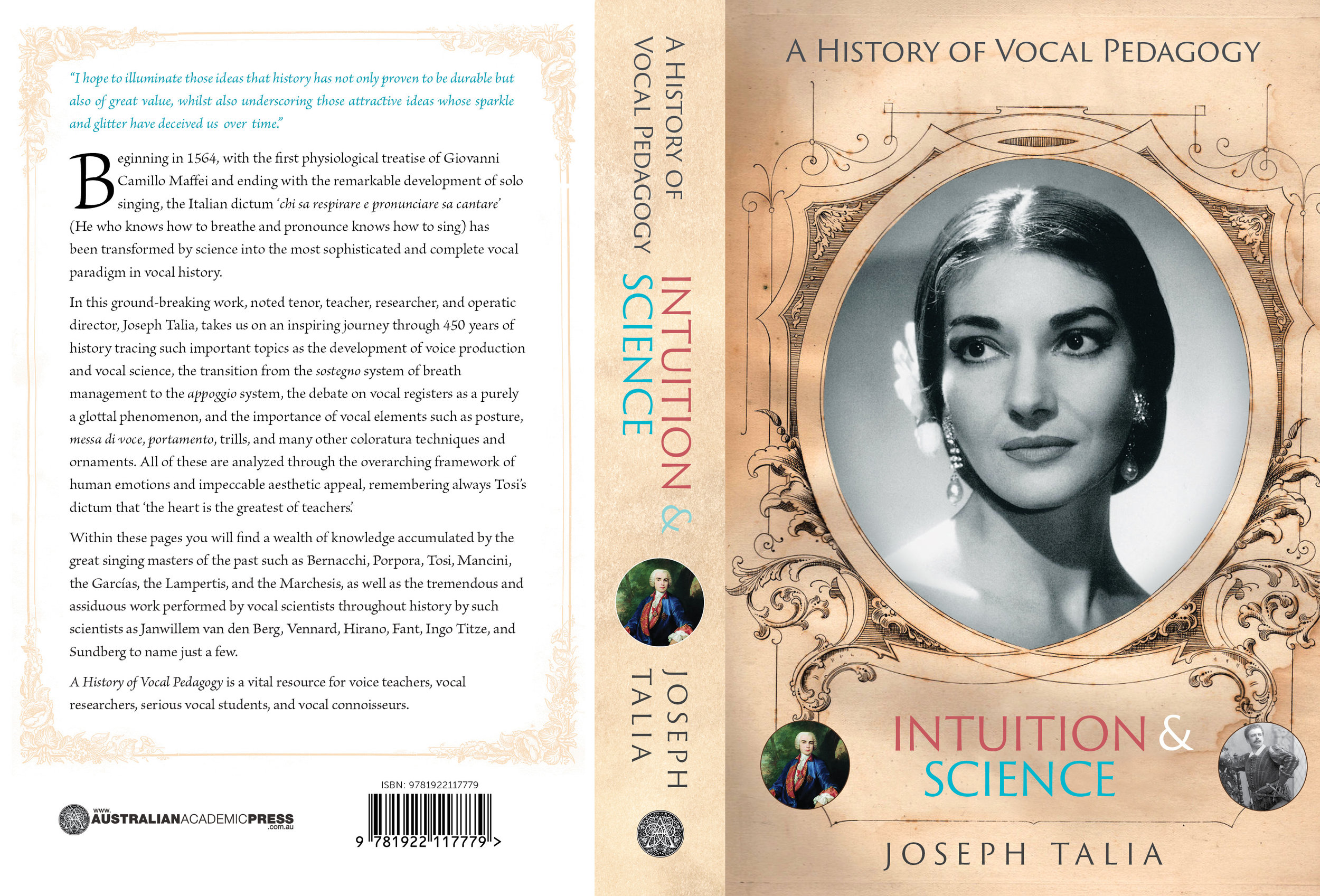
This book details the history of the teaching of singing, and how it transformed from a craft into something approaching a science. We combined an old opera handbill with an image of Maria Callas and used Trajan Sans for the title type.
Back to Paper

It never crashes, it's flexible, requires no power and is stable over several centuries ... yes, it's that old communications stalwart, paper! Most designers still break out a sketchpad on a regular basis, and according to this BBC article, there's a movement afoot amongst even the most digitally literate to keep their pads, pens and pencils in regular use. However, at the same time, PC designers are making it easier than ever to sketch intuitively on screen.
Making it Simple — Book Cover
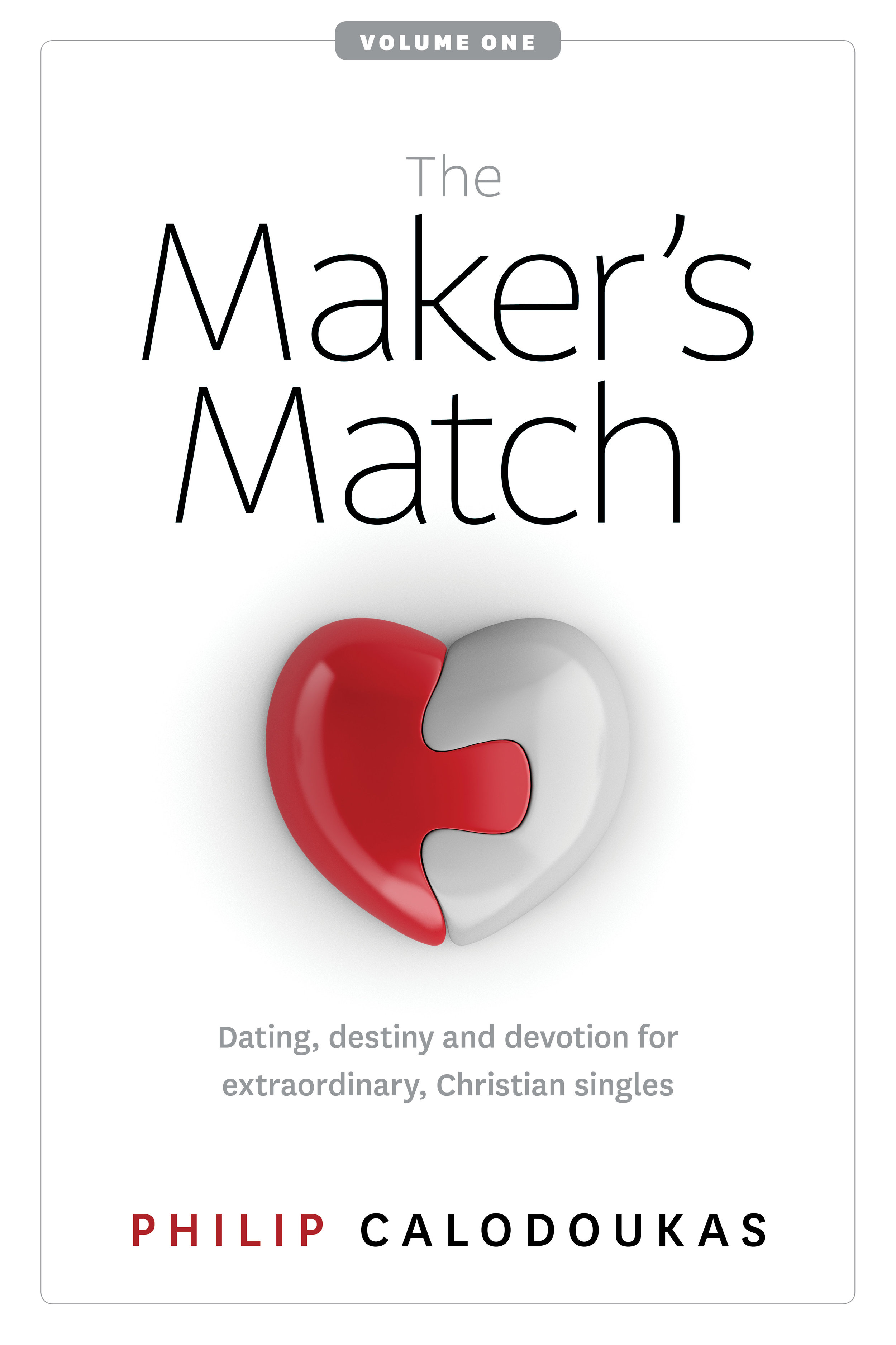
Our client was looking for a cover that appealed to both genders and communicated in a direct, dignified fashion. After much experimentation with a variety of icons and logos, the final draft was characterised by symmetry and white space, with very clean type use. Typefaces used: Latina, National.
Converting Troublesome Files

Stuck with an obscure file you can't open? Cloud Convert supports a huge range of file types in a number of different categories. Conversion for the casual user is free with registration — the service has paid tiers for users with hundreds of files to convert. My own use-case was an old .pages file I couldn't open with any of my software, solved immediately on accessing this site.
Victorian Executioners — Cover Design

The chap pictured is the executioner, not his victim....
Trevor Poultney has put together a comprehensive discussion of all the official executions carried out in Victoria since colonial times. Executioners often worked under false names due to the opprobrium that went with the job. A lovely 19th Century portrait of Melbourne formed a suitable background to the title type and the rather sinister looking image of Walker, a hangman. Available soon.