
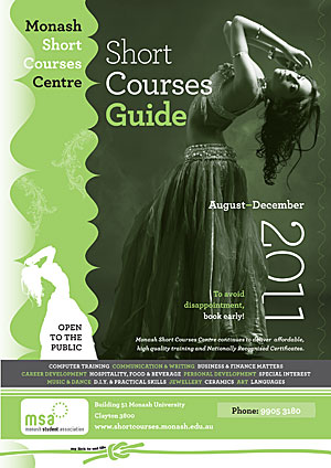
 Our client had selected a striking image for the cover of their short courses brochure. We needed to integrate the image with quite a bit of information whilst keeping their branding very clear. In addition, we only had two colours to work with. As described in other posts, by using duotones, we were able to push the two colour format a bit further and arrive at a high impact solution. The typeface used for this job was HF&J's beautiful Archer.
PO Box 72
Eltham
+61 412 622 138
design + layout + print solutions + ebooks