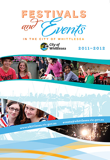
 For this draft of a local Festivals program we needed to adhere to a certain corporate colour palette and also make reference to a corporate 'swirl' (see the base of the image). We took elements of the swirl and employed them throughout the A3 double-sided brochure, and set some type to follow the curving lines and thus add visual interest. The typeface used is the elegant HF&J Archer, mentioned before on this blog.
PO Box 72
Eltham
+61 412 622 138
design + layout + print solutions + ebooks
