

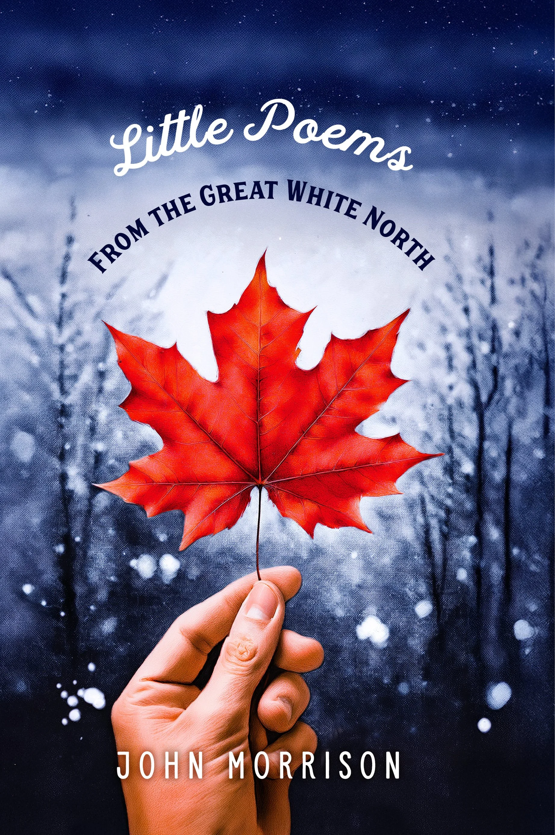
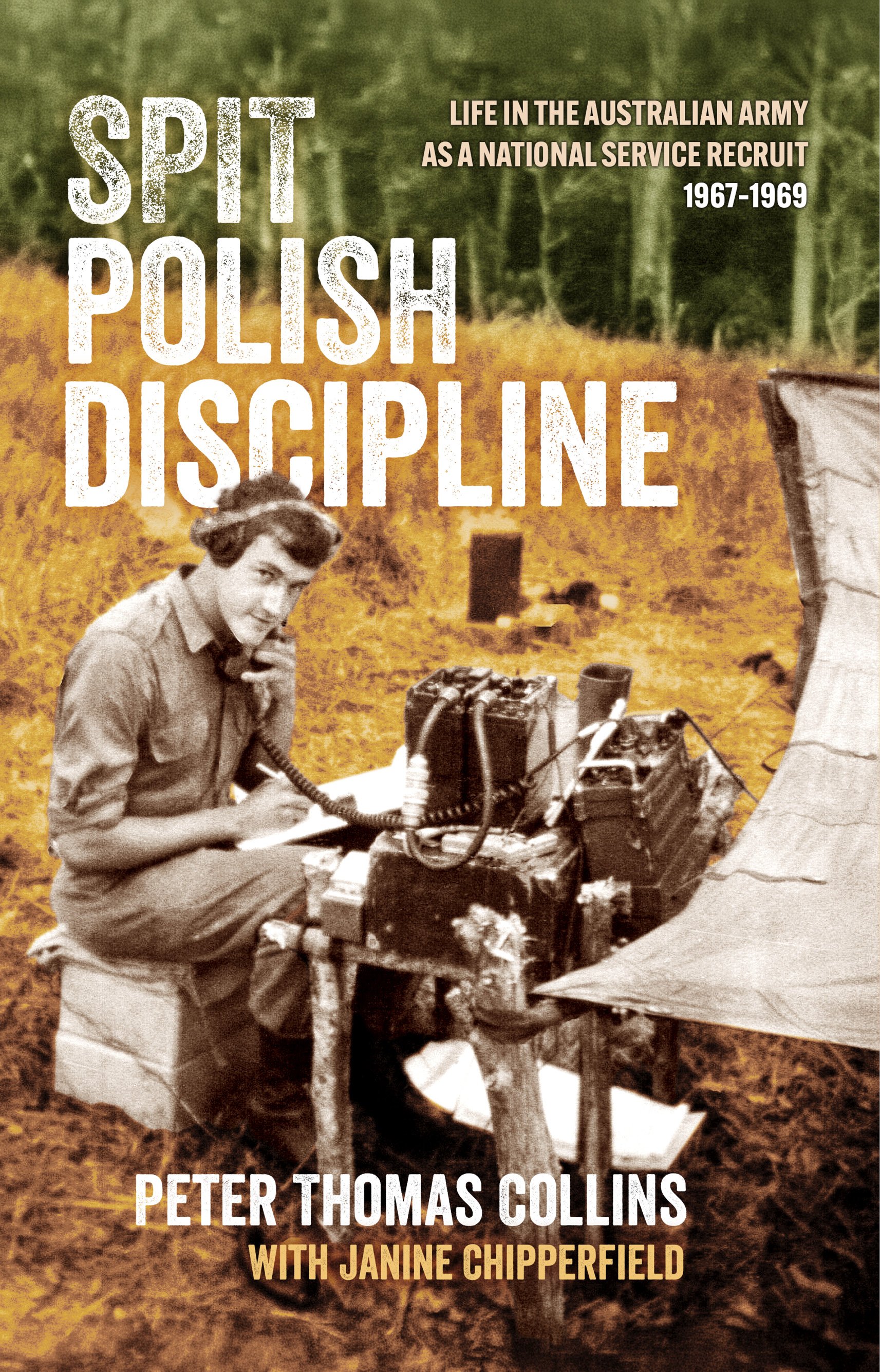
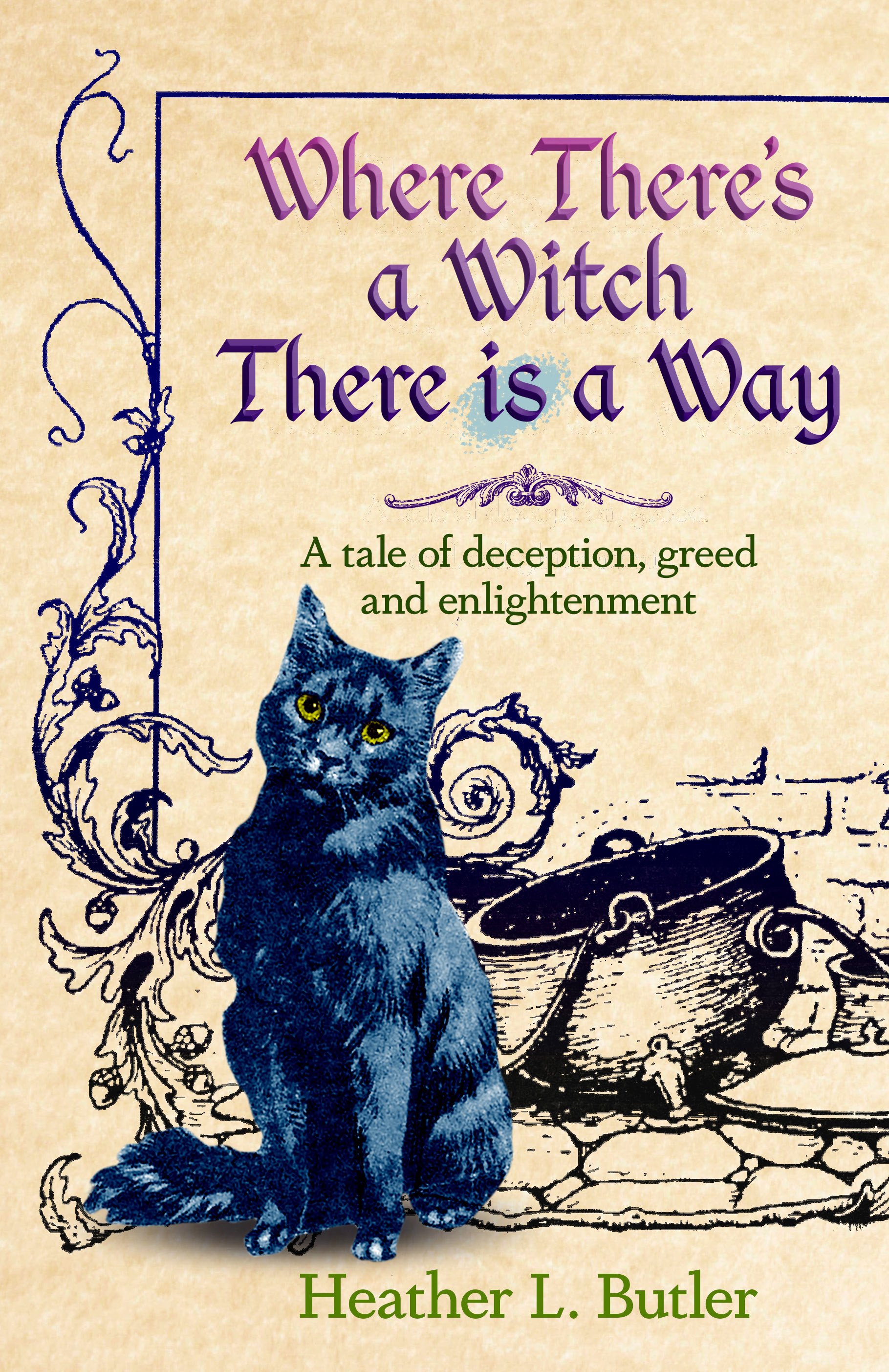
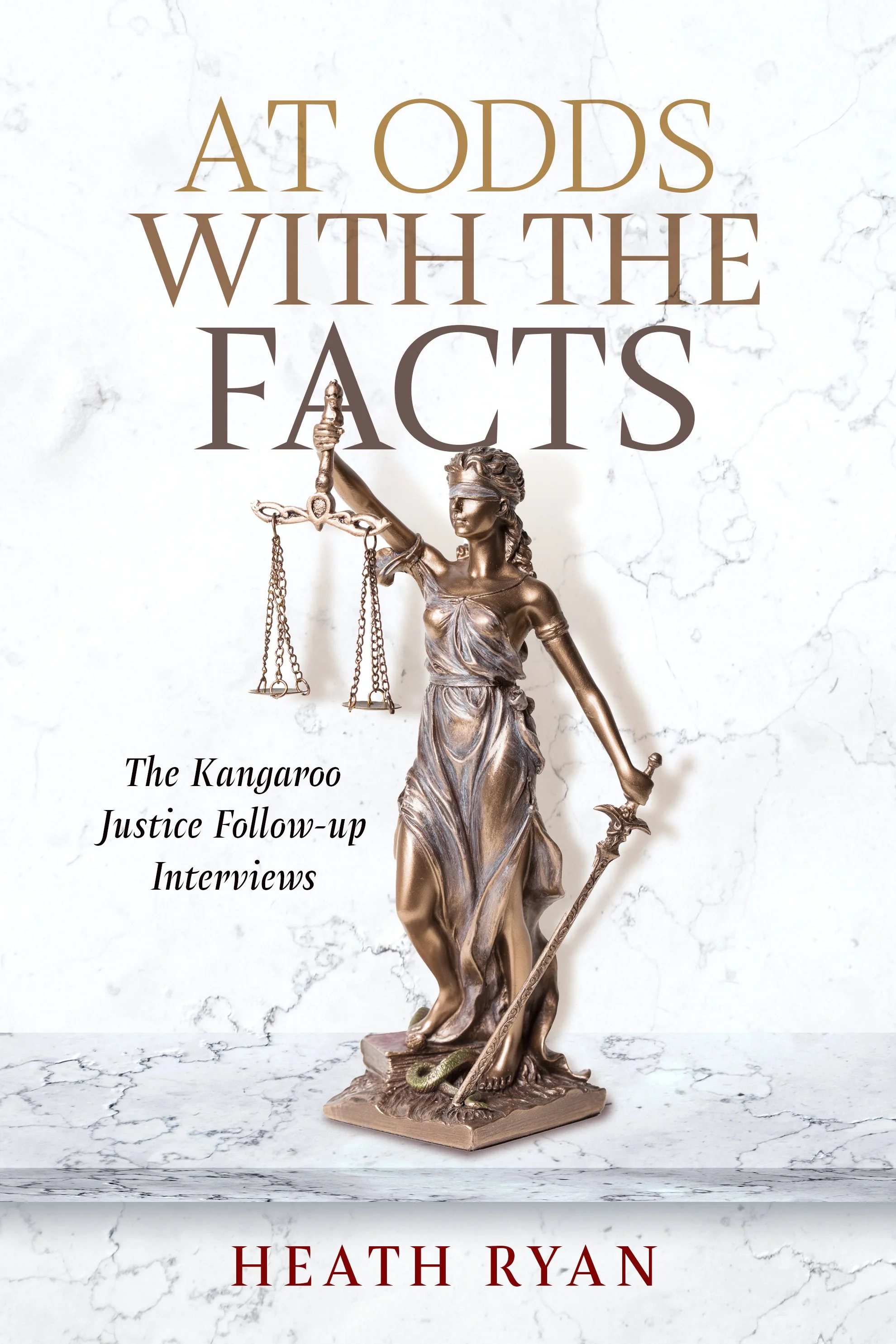
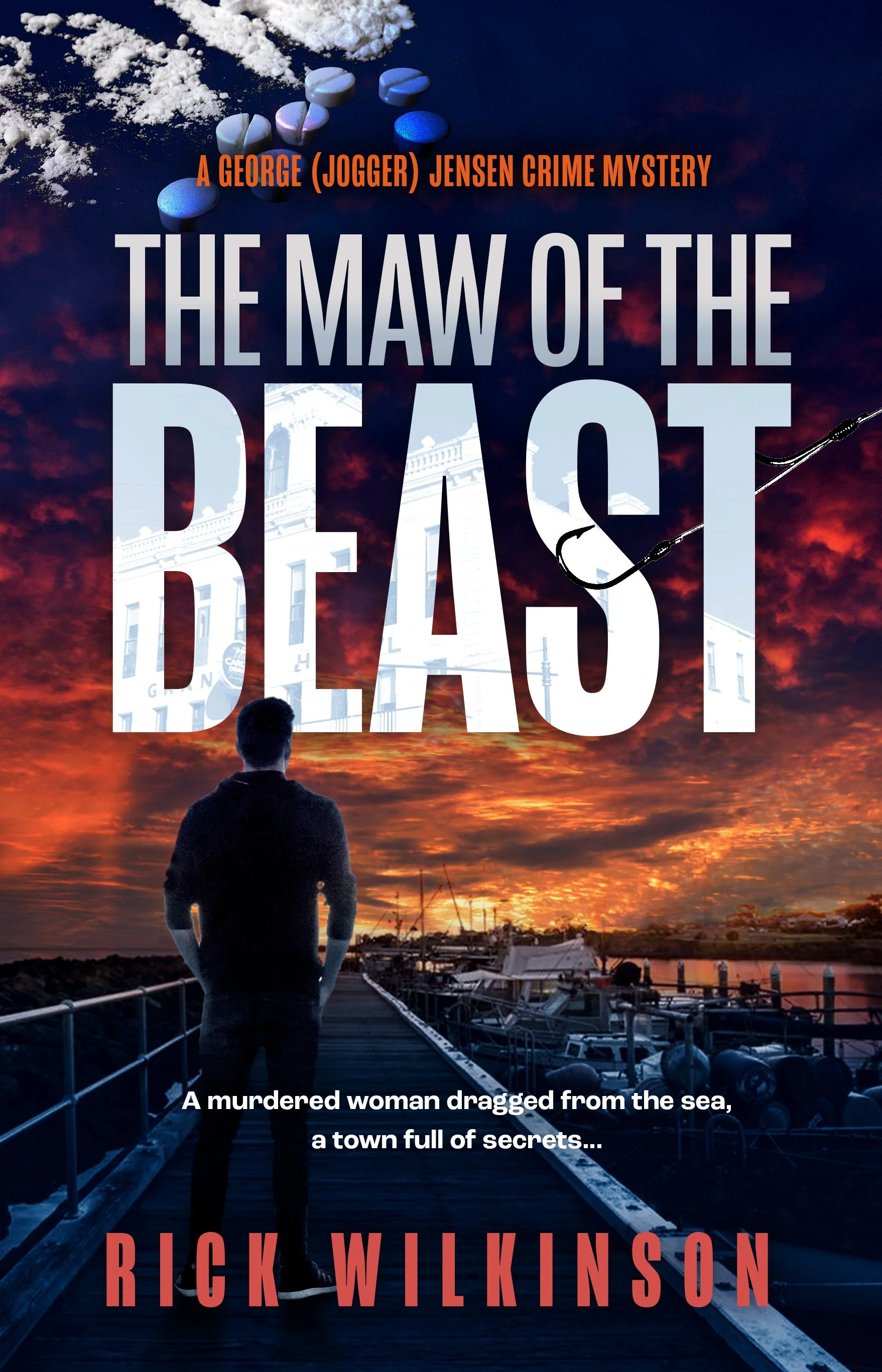
Recent cover designs, from High Fantasy to Colonial History, Real Estate to Middle Eastern Politics


5 Typesetting Tips for Enhanced Accessibility

Typesetting is crucial in book design because it determines how readers engage with the text and absorb information. A well-designed layout enhances readability, making it easier for readers to focus without distractions. When accessibility is prioritized, books become more inclusive, catering to individuals with visual impairments, dyslexia or other reading challenges.
The Importance of Accessible Typesetting
Accessible typesetting refers to the practice of designing text layouts in a way that accommodates as wide a range of readers as possible, including those with visual impairments — which affect at least 2.2 billion people worldwide — and dyslexia. The approach ensures all readers can enjoy your writing without unnecessary strain or discomfort.
Proper font choices, spacing and alignment can significantly impact how smoothly a reader moves through a page. Focusing on accessibility and readability allows authors and book designers to create a more enjoyable experience that immerses readers in the content.
In fact, this type of customization in book design can be vital for authors who hope to drive a loyal following, as 71% of customers expect personalization when deciding on a purchase. This expectation extends to reading materials, where font choices that are directly chosen with a variety of physical abilities in mind can greatly enhance individual reading experiences.
1. Choose an Accessible Typeface
Choosing between serif and sans-serif fonts is essential, especially in print and digital formats. Serif fonts — like Garamond and Georgia — have small strokes at the ends of letters, which help guide the reader’s eye along a line of text. Research suggests that serif fonts can lead to slightly faster reading speeds, particularly in longer-form content like books.
On the other hand, sans-serif fonts, with their clean and simple letterforms, are often easier to read on screens. Regardless of style, font size also matters — 12-point is generally considered large enough for comfortable reading without straining the eyes.
Authors and book designers should avoid decorative or overly stylized fonts, as these can make text harder to decipher and reduce overall readability. Prioritizing classic, well-designed typefaces ensures a smoother reading experience for all audiences.
2. Optimize Line Spacing and Margins
Proper line spacing can greatly influence readability as it helps readers move effortlessly from one line to the next. Tight spacing can make text feel cluttered, while too much space disrupts the reading flow. Generous margins also prevent paragraphs from feeling cramped and give the eyes room to rest.
Moreover, white space guides the reader’s focus and makes content easier to digest. A well-structured page encourages readers to stay engaged. Balancing spacing, margins and white space creates an inviting, stress-free reading experience.
3. Ensure Proper Line Length and Paragraph Width
The ideal line length for readability falls between 45 and 75 characters per line, striking the right balance between comfort and efficiency. When lines are too long, the eye has to work harder to track from the end of one line to the beginning of the next, leading to fatigue and slower reading speeds. On the other hand, shorter lines create frequent breaks in the reading flow, which makes the text feel choppy and disconnected.
Adjusting paragraph width based on the format is crucial. Print layouts can afford slightly wider columns, while digital content benefits from narrower widths to accommodate different screen sizes. Optimizing line length lets authors and book designers engage readers without unnecessary strain.
4. Use Hierarchy and Contrast for Readability
Font size, bolding and italics guide readers through content and improve readability. Larger font sizes make the text easier to process while bolding highlights key points without disrupting the low. Italics can add emphasis but should be used sparingly to avoid visual clutter. A well-structured hierarchy with clear headers and subheaders makes navigation seamless, especially for readers with cognitive impairments or low vision.
Headings break up information into digestible sections, which makes content easier to scan. High contrast between text and background is just as important. Dark text on a light background (or vice versa) enhances visibility, reduces eye strain and ensures an inclusive reading experience for all audiences.
5. Avoid Justified Text and Hyphenation Overuse
Left-aligned text is easier to read than justified text because it maintains consistent spacing between words. Full justification — while visually neat — often creates uneven letter and word spacing. This leads to what’s known as “rivers” of white space running down the page. This inconsistency complicates distinguishing between individual words, slows reading speed and causes unnecessary strain.
Excessive hyphenation — often used to balance justified text — further disrupts the reading flow by forcing the reader to pause and piece words together across line breaks. A better approach is to use left-aligned, ragged-right text, which maintains natural spacing and avoids awkward word breaks. If justification is necessary, adjusting word spacing within a reasonable range can help improve readability without sacrificing aesthetics.
Creating an Inclusive and Engaging Reading Experience
Thoughtful typesetting transforms a book from simply readable to truly engaging. This makes it easier for readers to absorb and enjoy the content without distractions. Prioritizing accessibility lets authors and designers create a more inclusive experience that reaches a broader audience and immerses readers from start to finish.
Eleanor Hecks is a writer and web designer who is passionate about helping other writers grow their online presence. Her work can be found on her site Designerly, as well as publications such as IndependentPublishing.com and I Need a Book Cover.
Edge Printing Design by Selina Fenech

Illustrator and writer Selena Fenech is offering an interesting embellishment technique for authors (see image above)
“Popular paper edge design accessible for indie authors! With this technique, designs are printed into the page formatting, not sprayed after printing. Can be applied to any print on demand title in black and white or colour. BYO design or custom illustration available.”
Recent cover designs
Memoirs, Genre Fiction, Current Affairs, Science Fiction and Business: always plenty of variety and interest in the world of cover design. Here are some recent examples designed for our clients.


Writing a Simple Design Brief
A good cover design brief should include the following elements (along with any additional information you might consider important for the designer to know)
What your aims are for the book
What place it will occupy in the book publishing landscape (ie. subject matter, genre etc)
The kind of feel or mood you would like the design to inspire or provoke. Give examples of existing titles – as many as you want, and what you found compelling about them – or other non-book material that is heading in the right direction – a ‘mood board’ can be quite helpful
A rough idea of how you plan to market your book, and whether it will be mostly promoted online or via bookstores, and what kind of additional marketing materials will be needed (posters, graphics for social posts, email headers, banners etc)
Examples of type design or font combinations that might set the designer on the right path
Examples of colour combinations, or the dominant colour
The blurb and a reasonably detailed synopsis, even a couple of key scenes in the book if you want them to be the basis of the cover
Character descriptions if they are to feature on the cover
Many authors are content to leave everything to the designer, but at least a little bit of guidance can be extremely helpful and prevent wasted time and the designer creating iterations that are wildly off-track.
Be open to unexpected solutions – sometimes a designer will come up with a solution that you might not have considered and showcases your title in an interesting, marketable way.
If the first round of cover versions are not hitting the mark, be specific with your suggestions – the more the designer has to work with, the more chance they have of creating something memorable and useful
There is a post on the WorkingType blog that goes into some related detail.
Visual Storytelling for Authors

How to Engage Readers Through Graphics and Design
Eleanor Hecks discusses the importance of graphic design in enhancing the reader experience:
Authors live in an age where attention spans are dwindling and competition for readers is fiercer than ever. Today, readers crave stories that capture their imagination while captivating their senses.
For writers and book designers, this is where visuals become a must-have tool for deepening engagement and enhancing the storytelling experience. Whether through a book cover or carefully crafted book opener, graphics and design can amplify a narrative’s impact, making it linger long after the final page.
What Visual Storytelling Is and Why It Matters
Visual storytelling is the art of conveying a narrative through images, typography and design. It goes beyond the written work, enhancing a story’s emotional impact and immersing readers in its world. For authors, visual storytelling is the connection between content and experience. It creates a richer, more engaging passage for readers.
In publishing today, this system has become increasingly important. Consider that publishers and independent authors sold over 767 million print books in 2023. When you factor in e-books, the figure climbs even higher. With so many options available, authors must find ways to stand out, and designs are one way to achieve that.
Visual storytelling is crucial because it fits the human brain’s natural preference for visuals. Humans prefer graphics over text because of a phenomenon called picture superiority, which psychologist Allan Paivio studied. According to Paivio’s dual coding theory, humans store visuals in two ways — as an image and as a word or phrase that describes the image.
In contrast, humans only store words as verbal representations. This means images are inherently more memorable, making visual storytelling better for capturing and holding readers’ attention. By integrating visuals into books, authors can create more relatable narratives on multiple levels.
Key Components of Visuals in Books
When adding images to content, authors create an experience that complements and enhances the narrative. Understanding the key components of graphics can create lasting impressions on readers. Success depends on the type of experience created, as 80% of consumers now consider it to be just as important as the quality of the product when making future purchasing decisions.
To give readers what they want, the visuals must contain various components, including:
Typography
Illustrations and graphics
Color theory
Layout and white space
Cover design
Carefully combining each of these elements enables writers to produce books that are visually appealing and emotionally impactful.
How Authors Incorporate Graphics and Design
Today's authors find creative ways to weave graphics and design into their storytelling, making books more dynamic and engaging. In fiction, many successful authors add maps to orient readers in complex fantasy worlds or use character illustrations to breathe life into protagonists.
In nonfiction, authors leverage images like infographics, charts and diagrams to simplify complex ideas and present data in a digestible format. For memoirs and biographies, authors typically include personal photos or handwritten notes to add authenticity and emotional resonance. By incorporating visuals strategically, they can enhance the reader’s connection to the content while making their books distinctive.
Ways to Engage Readers Through Graphics and Design
The following strategies offer ideas for authors and designers to use graphics and design elements to captivate readers.
1. Leverage Beautifully Illustrated Covers
An evocative cover is a great way to capture potential readers at first glance. The new Game of Thrones covers’ design perfectly exemplifies this. The series “A Song of Ice and Fire” uses traditional linocut art to create intrigue about the world the reader is about to enter. The covers perfectly capture Westeros and the danger that lurks within it, garnering attention and setting the tone for the epic narratives.
2. Design Immersive Chapter Openers
Whimsical chapter headers or illustrations can provide readers with visual cues. Such elements offer a glimpse into upcoming events, building anticipation and enriching the storytelling experience.
3. Add Visual Easter Eggs
Inconspicuous visual elements that follow the story’s plot or characters can delight attentive readers. These hidden gems encourage deeper engagement, as readers feel rewarded for their attention to detail.
4. Use Pull Quotes and Decorative Elements
Impactful lines with elegant designs draw the reader’s eye to significant moments. This technique spotlights key passages, amplifying their emotional connection and making them more memorable.
5. Experiment With Text Layouts
Creative typography can accentuate pivotal moments or emotions within the narrative. Authors can deliver intensity, urgency or tranquility by varying text placement and style, adding another dimension to the reading experience.
Turning Stories into Immersive Reading Experiences
Authors must use visual storytelling through graphics and design to connect with today’s readers. Visual storytelling elevates a book from a story to an unforgettable reading experience. As readers increasingly value the experience a book provides, investing in visual storytelling is a strategic creative choice. Start experimenting with visuals to convert stories into ones that readers will cherish.
Eleanor Hecks is a writer and web designer who is passionate about helping other writers grow their online presence. Her work can be found on her site Designerly, as well as publications such as IndependentPublishing.com and I Need a Book Cover.
Working With Accessible Typefaces

An interesting article posted by Apple on using accessible, readable typefaces. Many of the suggestions are worth considering, though following them all might feel a little constricting.
“Legibility is an informal measure of how easy it is to distinguish one letter from another in a particular typeface. Several aspects of a typefaces’ (font’s) design significantly impact how legible it will be.
This is a basic guide for anyone who is looking to choose typefaces that will increase legibility in any document.”

Tips and Resources for Independent Authors, 2025

WorkingType Design’s resources booklet has been updated with more author advice and resources. The booklet can be downloaded here. If you’d like to add your own experiences, advice or warnings, please let us know. The case studies in the booklet show that there are many ways to promote a new or existing book, on or offline.
Playing Cards at the Poles

Recently we were commissioned to design a set of playing cards featuring legendary Antarctic explorers. The card set was well received and they have made their way to surprising locations at extreme north and south…
Per my client Lewis Levitz:
I received this letter from Sarah.
Our cards are now being sold at a camp in Antarctica and also in Svalbard
Kind regards
Lewis
They have also been used to while away the time during flights over the Antarctic ice cap.

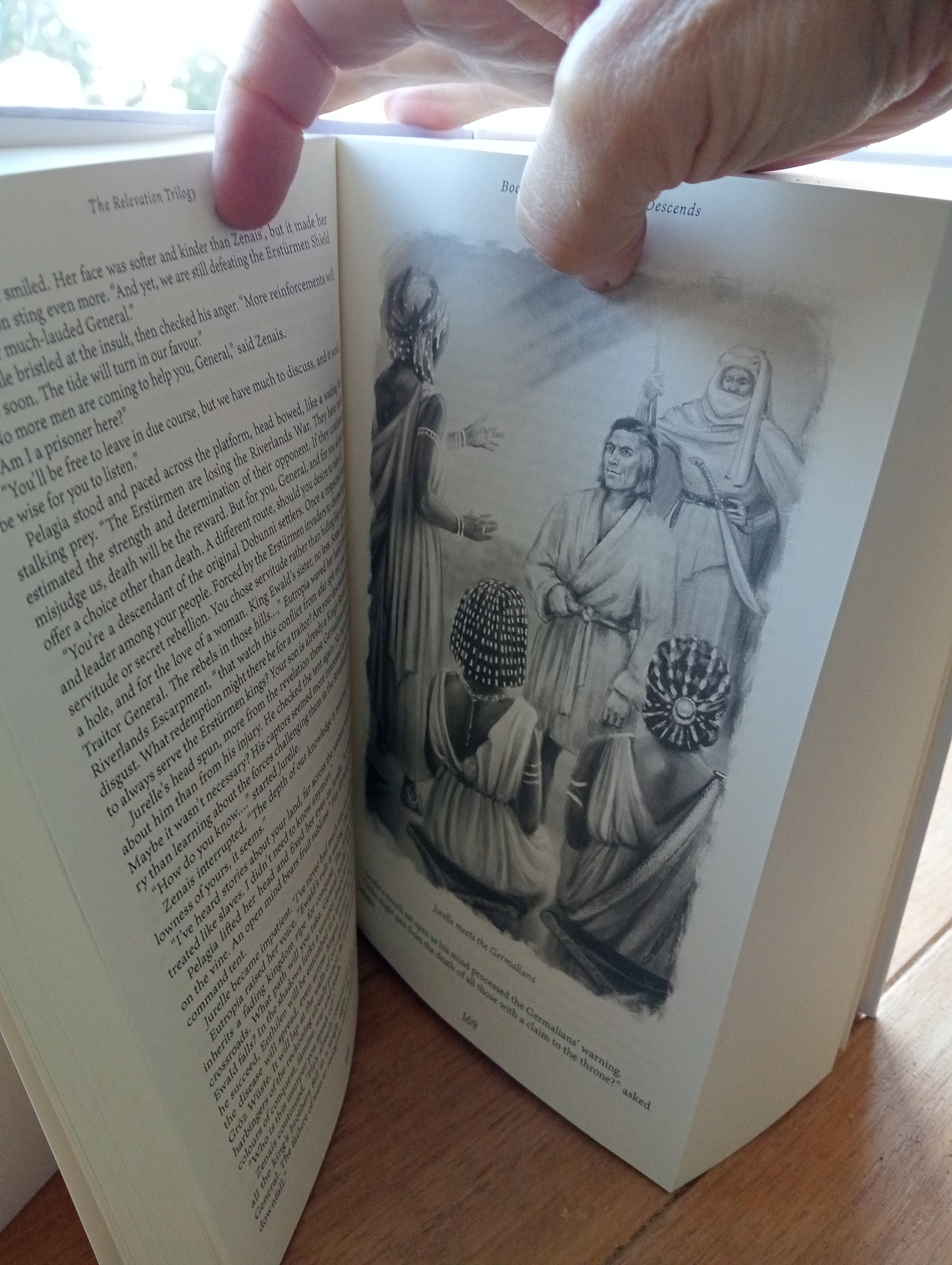
Three Books in One...
Author client G.W. Lucke asked us to find a way to typeset his recent Relevation Trilogy into one single massive volume (1000+ pages). It was a challenge, but we got there in the end, and the illustrations he commissioned for this special edition look great! The hardcover pictured below was printed by Ingram Spark. Check out the width of the spine — only just short of the maximum allowed.


Advice to Myself That I do not Necessarily Take
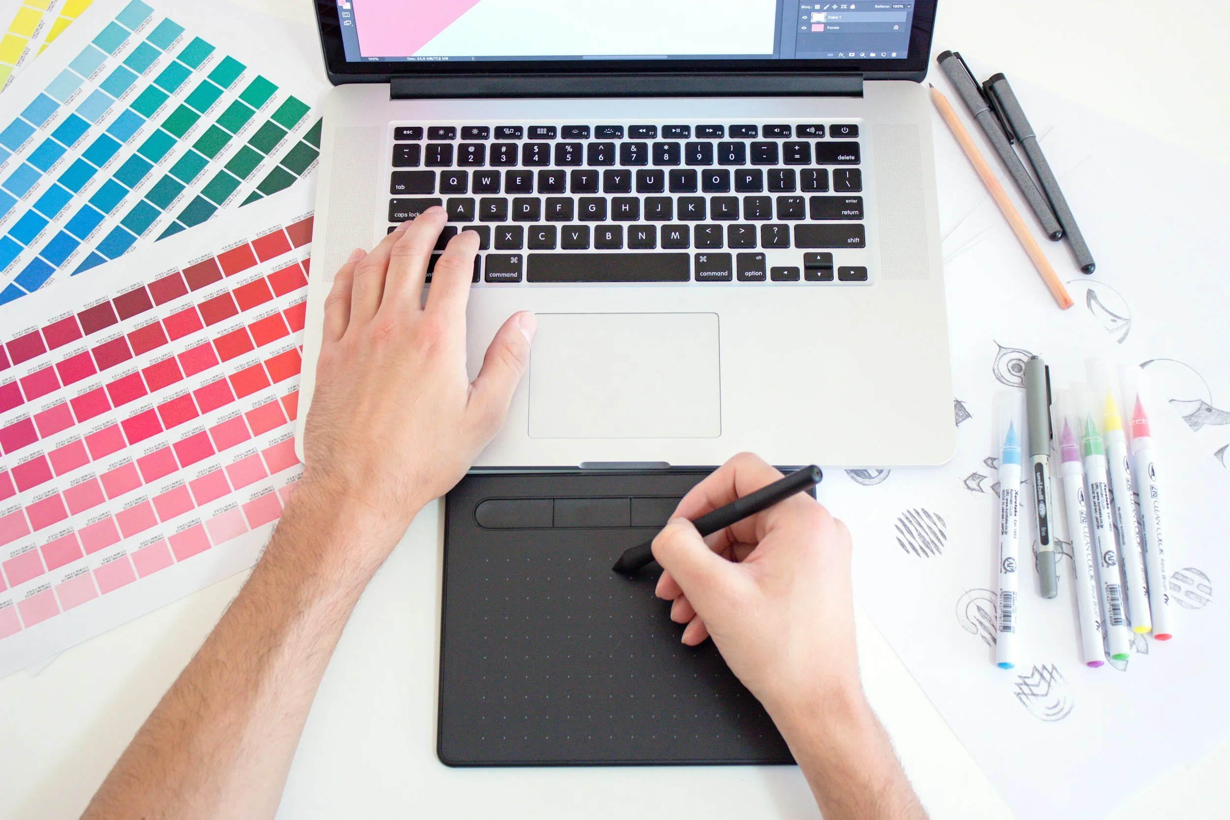
An acquaintance recently asked me to write some advice for her just-staring-out graphic designer daughter. This was my take, and I am not sure how good it is, or if I missed something important.
Make sure you put aside at least one quarter to one third of incoming payments to cover future tax / GST obligations. Super important to do this from the beginning, or you will be forever in the stressful position of playing catch-up.
Consider operating as a company – there are some tax advantages to this, but also more paperwork and accounting expenses. And you will have to pay the state workplace insurance fee each year, which has jumped to almost 1K per year.
Referrals are very, very useful, and they keep working for years. The bigger your network of contacts, the more chances that new jobs keep coming up. A client is much more likely to accept a quote from a business to whom they have been referred. You are in a sense a known quantity to them
Every author is a potential source of future work. It may be years in the future, but an author often writes a second or third title – if they had a good experience with you, they will come back. I have found it good practice to keep in touch with them by emailing newsletters with useful information for authors, new tools, author news etc.
Keep every testimonial / positive review you receive. Post them to your website, and ask satisfied customers to leave reviews on your google profile
Consider joining the Australian Book Designers Association or the Small Press Network
Make sure you refer your clients to other trusted suppliers – in your case, to printers, editors, proofreaders, illustrators, photographers etc. They will often repay your referrals in kind and if your clients have a good experience with one of your referrals, your status as a trusted provider will be enhanced. I have heard this referred to as the ‘honest broker’ role, and it is definitely worth aspiring to
Consider finding a compatible business partner or partners. Being a sole practitioner has its benefits, but also costs – difficult to have down time, difficult to grow past a certain point, becoming stuck in the same role, potentially unable to take on very large jobs or multiple large projects. Perhaps your business partner might specialise in web design, or assisting authors online or some other complementary service. There are services like Fiverr that connect you with typesetters, people who run amazon ads, ebook conversion etc, but I have always preferred to work directly with suppliers rather than through a third party. That said, I have found fiverr very useful for performing one off specialist tasks – creating a 3D rendered object, or a bit of specialist accounting
Consider offering a package service – authors or publishers often have several requirements and it is a ‘pain point’ for them to have to juggle multiple contractors to do them – eg. they may want a print version, ebook version, banners and ads, assistance with online advertising, a round of proofreading, an audiobook version etc.
If you prefer to go it solo, then consider employing an assistant as your business grows – either as a contractor or actual employee, remote or in-house.
Book design is easy to do from home / a home office, so it can be very low-cost. However, it can be good to separate home and work, or the latter will tend to take over the former. I had an office for many years, and it definitely had its pluses. My best setup has been a home office, but in a standalone building. So you leave the house to go to work, and when you are in the house, you are not working.
I got my first client by writing to publishers, and doing some occasional work for them, and then some design projects for councils and libraries, then some printers started referring authors to me to get their books set up properly (it is very important to have good contacts with printers) and it rolled on from there. It took a while to build up enough, and I was also working a day job for a few years.
I had to take on as many jobs as possible, as book projects can suddenly halt while the author messes around with proofreading, or runs out of money for a while, etc.
In terms of pricing – I have always tried to be mid-range, to get as many clients as possible and to give very reasonable prices to independent authors. I have seen designers who charge much more than me and obviously put a great deal more work into each project. That’s a valid approach, but my client base would definitely not bear those kinds of costs.
The book industry is changing fast, and who knows where AI is going to go. I already use it a lot for image generation, but it will no doubt get into layout and design as well. Hopefully there will still be plenty space for human-led design.
You will need to be someone who solves a lot of author or publisher problems in the one service, and to be super reliable and personable, thus justifying your rates. Most authors want to deal with a person, and especially to meet up with them and feel they are being listened to.
Doing Your Comp Research

Serious independent authors spend time checking out their competitors, the so-called ‘Comps’ or comparable titles. It is a great way of getting a sense of a particular genre, prevalent trends, the key cover design elements that signal a particular fictional niche. A writer should have a good idea of their specific target readers — and, spoiler alert, it is not ‘anyone who can read’. If you have read a lot in the genre you are writing in (always a good idea), you will already have a fairly good idea of how your title/s relate to the existing literary landscape. Making a list of comparable titles, whether bestsellers or midlist, can also be helpful for book cover designers looking to get a more specific feel for your title. At the same time it gives the author a better sense of the overall commercial literary landscape.
Typographic Illusions and Type Design

A very interesting article on the optical illusions that type designers must take into account when designing a new typeface. Written by Jonathan Hoefler, type designer extraordinaire, designer of superstar typefaces such as Gotham, Archer and Sentinel.
DragGAN Drops

Another ‘AI is functionally equivalent to magic’ post. DragGAN is an experimental AI App that allows for extensive intuitive photo editing on the fly, including changing perspective, facial features, hair colour and length.
“the results are mesmeric. DragGAN is an interactive way of editing photos or works of art by tagging points on an image and just… dragging. The AI does all the hard work.”
Book cover designs and drafts April 2023


Playing Cards over the South Pole

A client recently emailed to inform us that a pack of Antarctic explorer-themed cards designed at WorkingType Studio made it all the way to the first one-day commercial flight over the south pole. Presumably, he was too busy gazing at the forbidding scenery below to play Texas holdem with other adventurers…


Book Cover Designs for September 2022
An interesting variety of topics covered in the latest round of cover designs in progress…


Book Cover Designs for June 2022
A few recent book design offerings from WorkingType Studio. A variety of topics and treatments…


Why Do Publishers Still Use Half Title Pages?
Though somewhat rarer than they used to be, half title (or bastard) pages sometimes appear at the beginning of books, followed by a blank verso page and then the full title. The practice of half title pages arose as a means of protecting the full title page from the wear and tear of the printing and binding processes. Of course, an alternative solution would be to simply add a blank page, and indeed, some book designers do exactly that. When books have to lose a couple of pages to fit into a certain page signature, the half title is the first thing to go. Personally, I think some publishers like the extended throat clearing involved in blank pages, half titles, full titles, endless prefatory pages and so on because it distinguishes their work of literature from other less exalted works that get down to business within half a dozen pages. It is a bit like those high art movies that start by listing all the nested organisations responsible for the production of that particular masterpiece — the list is sometimes startlingly long.
WorkingType Design Samples Online

To view many and varied samples of our cover and book design work, try some of the links below:
Print folio by category: http://workingtype.com.au/index
Book Folio: http://workingtype.myportfolio.com
Full design archive: https://goo.gl/photos/6dzV55fEW6GgGVE59
Reedsy: https://reedsy.com/luke-harris
Recent Design Work and Blog Posts: http://www.workingtype.com.au/blog
Twitter: workingtype