A thoughtful and detailed take on the very different world of planning and executing a large modern website. First, a thorough inventory of planned content, second a content planning matrix where the site architect learns to "match content with your website's users, their needs, and your purpose", then finally a content production matrix where "you can get into the tactical work of figuring out how that content is going to be produced". Proof that web design is a very different beast than print design, though designers such as Erik Spiekermann would argue that the fundamental constraints of readability and typographic restraint are universal.
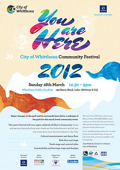
Festival for the Community
 Our client stages a community festival once a year, and tries to appeal to everyone within the city boundaries. They wanted an open, friendly design with a sense of inclusiveness and place. We used the beautiful Mrs Shepperds (Alejandro Paul) for the flourishes of the title, and Archer (Hoefler, Frere-Jones) for the rest. Aerial images of the city helped give the design local context.
Plotting a way forward for Libraries
This fascinating article depicts a very dynamic public library system (even in hard economic times). For any who claim the library is no longer an essential cultural institution, the New York Public Library would stand as a rebuttal.
