
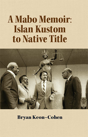
 Bryan Keon-Cohen AM QC played a key role in the legal maneuverings that led to the High Court of Australia recognising the existence of native title in 1992. His intimate knowledge of that series of events has been brought to bear in Mabo in the Courts: Islander Tradition to Native Title: a Memoir. We assisted with the design and typesetting of this fascinating volume, and got a sense of the attention to detail and sheer persistence required to push through such a controversial reform. Dr Keon Cohen has created a website to cross-promote his book, and it has been favourably reviewed by various publications.
Blogging on the Run
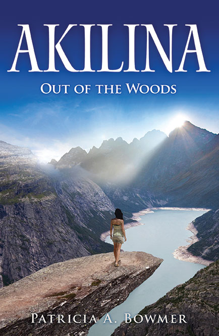 Patricia Bowmer maintains an active and engaging blog featuring almost essay length posts. The posts are contemplative and blend humour and observations on life and running with some well-chosen images. They are very much in keeping with her book Akilina, which she also promotes on the blog and an earlier memoir, In Pursuit of Joy. So the blog functions in at least three ways — to promote Patricia's books, to provide her existing readers and potential readers with additional content and maintain an ongoing link with them, and as a motivational tool to continue writing and thinking about issues important to her. An excellent model for authors wanting to build their own community and 'brand'.
Local Author Launches "Scent of Belonging"
 Rosie Abbott will be launching her excellent book "The Scent of Belonging" at Readings Hawthorn on 20 February 6.30pm. Her book is set in country Victoria on the eve of World War Two. Free event, bookings not required.
"The dominating physical presence of the countryside makes her feel small – a hill country landscape scarred with dark-green fissures of hidden valleys, suffused with cloying smells lurking in the heat. She shrinks back into the bedclothes, away from the penetrating curiosity of people whose everyday conversation is loaded with unfamiliar directness and unsettling silences."
From Cover to Cover
 Recent cover design work has been varied, and the demands on typeface use and composition always engaging. Subject matter has ranged from literary fiction to memoir, and spirituality to medieval history. Some titles have been ebook only, while others were destined for offset print runs.
Recent Cover Designs
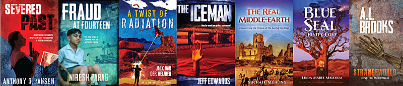 Spy stories, real life drama, history, fantasy and science fiction have all been on the design menu recently. Seeing them collated, one sometimes notes the over-enthusiastic use of current font favourites. In few months, fashions will change and new font families take over.
Printing in the People's Republic
Many, if not most, Australian publishers and plenty of individual authors have books printed in China. The printing prices on offer are very attractive, and the quality often excellent. However there is a dark side to printing in the People's Republic: censorship. You might think that a book being printed for an Australian (or any other non-Chinese audience) would be simply printed and shipped back to the client. This is only partially correct: it is checked by Chinese censors to make sure the book in question conforms to certain Chinese sensitivities — even if not a single Chinese citizen is destined to read it. Such sensitivities include drugs, sexuality and references to China and Chinese history. If your book mentions Taiwan, for example, you had better make sure it reads as "Taiwan (China)". If your book discusses Chairman Mao in anything but the most glowing terms, better find another country to print it. The Chinese government interest in content is a salutary reminder that the country is burdened with a dictatorship, with all the stifling, anti-democratic and bureaucratic impulses that go with that kind of government.
Book, Meet Internet...
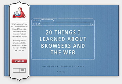 A neat little primer on the contemporary Internet, comissioned by Google Chrome, illustrated by Christoph Nieman and (oddly enough) designed to look like a printed book (old metaphors die very hard). Learn about TCP/IP, web standards, the cloud, html5, plugins, extensions and more, all in straightforward, non-technical language.
Waders of Australia
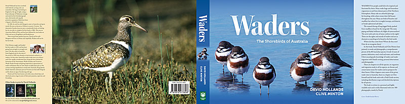
Soon to be printed/published, Waders: the Shorebirds of Australia has been an epic labour of love for its author David Hollands. He has travelled to almost every corner of Australia to photograph and document every single species of endemic and visiting wader. The result is both informative and evocative, with strong arguments for habitat conservation. We have tried for a transparent design and layout -- letting the content and images speak for themselves.
Chip Kidd Talks About Books
TED Talks tend to be equal parts inspiration and irritation. Inspiration for presenting talented scientists and creatives at the peak of their game, and irritation at a sometimes messianic and overblown tone. Chip Kidd is one of the most celebrated book designers in the USA, but his recent TED talk shed very little light on his design process, influences and interaction with authors. His stage mannerisms tended to distract from rather than accentuate his message. Nonetheless, he does have a particular talent for finding iconic images that seem to capture the essence of a book.
Cassian Brown: Content is King
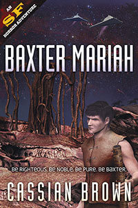 Author of two classy science fiction novels (covers designed by Chameleon), Cassian Brown has put together a website to showcase his work. Apart from excerpting an exciting sequence from Baxter Mariah, he links to the many ebook and print purveyors of his work, offers signed copies, a newsletter signup and biographical information. A next step might be to link to other writers and science-fiction oriented websites, to locate himself in the online sci-fi ecosystem. A link to his twitter account (EllameinePress) might also be useful.
Elephants as Myth
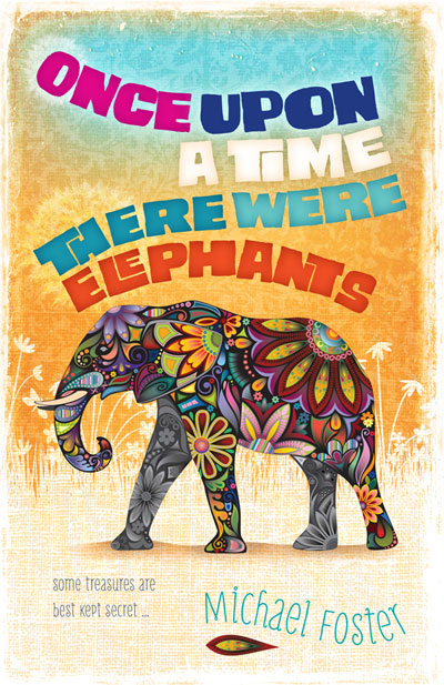 Our client had written a story set in a future earth where animals such as the elephant were long extinct and considered mythical. We wanted to depict the elephant of the title as a fabulous, almost imaginary beast, and as the book was aimed at younger readers, to give the type treatment and background a playful, energetic feel.
Author website for Amanda Stuart
 After recently writing The Longest Journey, Amanda Stuart wanted to showcase her book online. The website she commissioned is extremely clean and easy to navigate. As the book garners more attention, she will add reviews and reader comments. Possible enhancements might include a sample passage or chapter, a press release and a list of bookstores stocking her book.
Roman Zenith
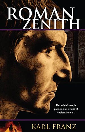 Roman sculptors were sometimes very honest in their depictions of the great and the good. They showed sunken cheeks, wrinkles and other flaws. We took advantage of this by using a Roman sculpture for the cover of "Roman Zenith". The stark contrasts and psychologically acute depiction make for a surprisingly modern feel. The subtle backdrop of the Pantheon makes the setting and era clear.
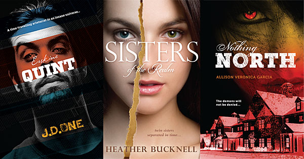
On the Face of it: three recent covers
Our publisher client prefers us to design covers as a single unit -- back, front and spine all part of the same artwork. This encourages the use of large, bold images and prominent use of type. The three front covers featured here all focus on a single face challenging the viewer, a naturally strong composition.
Word
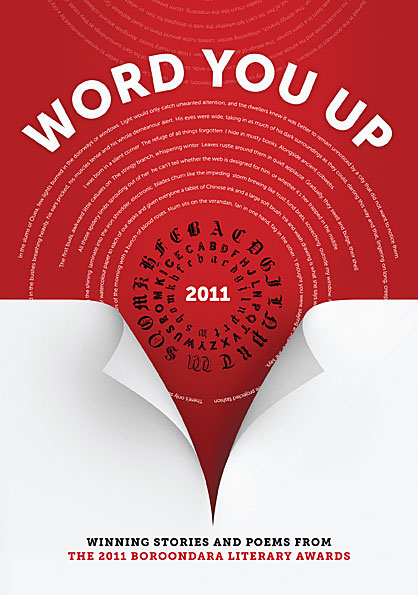 Our client wanted a high-impact type-based design. We used contrast, intense colour and a line of text from each of the stories featured in the anthology. The page curl gives a hint of depth and serves to direct attention from the title down to the subtitle. Typefaces used were Museo Sans and Museo Slab by Jos Buivenga.
Noun Project
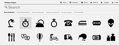 A simple idea, well executed: the Noun Project is a catalogue of symbols covering everything from the mundane to the sublime. They are available free of charge, and the web interface is as simple, clean and monochrome as the symbols themselves.
Lions and Lillies
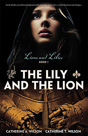 A well-written and tightly plotted historical drama, Lions and Lillies: Book 1 covers affairs of state and love during the Hundred Year War between England and France. We were tasked to design a cover that created a sense of the intensity of the story, and combined military and personal aspects. In other words, the entry to "a world of passion and intrigue". The authors have created an informative website to accompany the publication of their book.
Neat Freaks United
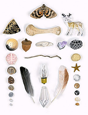 File under: people with way too much time on their hands, or: how to make your fetish into a business. Austin Radcliffe spends his days shooting and curating images of objects arranged in aesthetically pleasing ways. In some ways his obsession is quite old school — collectors have long organised their finds by all sorts of esoteric criteria. While the neat aspect will probably irk messy people, the various collations, coteries and concatenations are often quite pretty, fun, and interesting for the sheer variety of things revealed in the world.
Type with soul
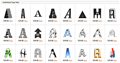 If precise typefaces with mathematically determined curves put together on a computer leave you a little cold, there is a tiny corner of the typosphere that is embracing a hand made alternative. The Organic Type features hand-drawn, painted, sketched, rubbed and eroded typefaces, achieving warm and charming effects impossible with standard type. Their typefaces cannot be installed via a font manager. Instead, each letter is supplied as a separate layered image file, and needs to be manually placed and kerned. Perfect for arresting and highly individual headers, and capable of heavy lifting in almost any design context.
Corporate Predators
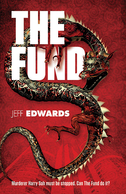 This thriller features a sociopathic CEO with a sideline in hands-on murder. We wanted to depict the milieu (Hong Kong), the scent of blood, and the rampaging spirit of unbridled, unprincipled ambition (enter the dragon).