
Our client is an authority on project management software. We needed to convey the practical nature of this particular book and make it extremely clear that it was based on the latest version of Microsoft Project. Fresh, bright colours were combined with images of contemporary architecture.
Lousy Book Covers
Hilariously bad book covers paraded for the amusement of jaded designers. Shooting fish in a barrel, but nonetheless compelling entertainment. Misguided typeface selections, bizarre image use and juxtapositions, and primitive Photoshop skills abound, often on the same cover.
Cold War Neon
Ideological fervour was not the only thing that glowed brightly behind the Iron Curtain – the Communist-era Poles had a surprising love of neon signs. Neglected since the breakup of the Eastern Bloc, a museum has been set up to preserve what is left.

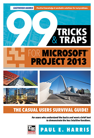
Recent cover design
One of a series of four textbook covers. Bold, simple, picking up on the tool theme without going too far over the top.

Vintage Poster Bliss
For print-oriented graphic designers, posters are an opportunity to abandon restraint and strive for high impact. While still a lively area of contemporary practice, some of the most striking and memorable poster design graced walls many decades ago and is now in the public domain. This site has curated hundreds of very high quality vintage posters, most of them suitable for print. Every single one was created without the aid of computers and collectively they are a testament to very high levels of craftsmanship and imagination.

A Book to a Page
Much of our literary heritage is in the public domain by virtue of its age. Certain enterprising businesses mine this cultural resource for commercial gain. One particularly interesting example is All the World's a Page, where entire great works are printed on a single poster. From Don Quixote to Ulysses and Macbeth to Pride and Prejudice, armies of words are marshaled with great skill and typographic flair. Even at 1000mms in height, you will need keen eyesight or a magnifying glass to take it all in.

Hitting the Mark
To get an idea of the amount of time that goes into the design of a large font family, check out this promotional site. FF Mark is the result of a long-term collaboration between some of the brightest lights in modern European typography. The designers are intimately aware of typographic history and prepared to slog through the minutiae of sketching, adjusting and kerning thousands of characters in ten weights.

Trends in Graphic Design
Like all creative fields, graphic design continually lusts for the new while cannibalising and recycling the old. Trend List catalogues aspects of designers' eternal search for novelty and a fresh look. Depending on your perspective, its discoveries are an index of things to emulate, or approaches to avoid.

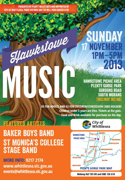
At the Mercy of the Elements
We've been designing for this event for some years — when the weather gods are benign, a good time is had by all...
Keeping it Clean
Sometimes the design is all about the information...

Digital Design Processes Explained
Newfangled are a web development firm at the bleeding edge of their field. They are quite generous with sharing some of their thinking on designing for the Internet. An interesting recent article suggests that a key part of working towards a new site is the development of 'personas', detailed profiles of prospective users. These personas help the developer to see things from the user perspective. As the author notes "Creating web personas prevents us from mistakenly building websites for ourselves rather than those we want to serve". After interviewing prospective users of a client website, the developer tries to anticipate how the user will view the site and with what aims. The personas make it clear that users with different agendas often visit a given site, and that different triggers / calls to action may be required for those different audiences.
Crazy Little Heaven

Mark Heyward has made a new life in Indonesia, achieving immersion in a culture that clearly fascinates him. In Crazy Little Heaven , Heyward writes insightfully about his adventures in Kalimantan (Indonesian Borneo) and eventual marriage to a local. The cover is a composite of a beautiful hornbill and the (sadly threatened) forests of Borneo. To be launched in both Jakarta and Hobart, the author's home town. Published by Transit Lounge.
Book Trilogy
 Our client had written three books that followed a largely linear narrative, and were strongly tied to a single location in Africa (the Rift Valley in Kenya). Our cover designs used that landscape as a reference, bringing in additional images specific to the particular volume in the trilogy. The title typeface is Fairfield and supplies a framework for all three covers.
Making Word for Windows Work (sort of)
Designers love to hate Word for Windows. They are accustomed to layout packages that do as they are told. Word is packed with features that are rarely used and hides those which should be front and centre. It tries to think for the user (applying styles automatically, for example) and loads documents with unwanted character and paragraph level styles. Precise placement of an element on a page is often difficult, if not impossible. When imported into layout packages such as InDesign, a designer's first task is to clean out all of the crud. This includes removing unused styles, special effects, embedded objects and images and more, while taking care not to disturb necessary items such as footnoting, italicisation, bolding and indents.
In short, the best Word document is one constructed with simplicity in mind. Just the essentials and nothing more. For the daring, Google's stripped down cloud based word processor might be a good alternative way of achieving this end. For those utilising Track Changes, Indexing and Footnoting, perhaps Open Office might be another option.
Catalogue versions
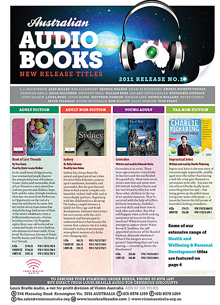 We design three catalogues per year for Vision Australia. Each edition is released by three different distributors. By running the distributor information in black only at the base of page one, we are able to swap the black plates only during the run, keeping printing costs to a minimum.
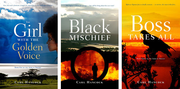
Composite covers
 Financial constraints sometimes mean that we are unable to acquire a 'perfect' single cover image, but instead need to construct a composite of several less expensive or public domain images. The three titles above are examples of that approach.