
Though it could be an obscure indie band, TFL is actually a website that follows through on the promise (or threat) of its title. America's lawyers produce gargantuan piles of poorly formatted documents and in the process communicate rather poorly. Matthew Butterick makes a persuasive argument for the importance of the considered use of type and page layout (especially using Word or Excel). His website and book are rich in practical examples and of course apply to anyone producing documents, not just the legal set.
Archer Hits Typeface Bullseye
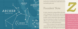 In combining prettiness and practicality, Archer is a rare typeface. With idiosyncratic letterforms and cute little ball terminals, this friendly slab serif has been spotted all over the web and and in hundreds of publications. As with other HF&J typefaces (especially Gotham), it has been (over)used, but in the right caring hands, it still has the capacity to give shine and personality to many kinds of print and web design.
Em and En Dashes
The typographically aware know that em dashes are preferable to hyphens in text, and en dashes are handy as range separators, but how to access them when emailing or posting to the web? Fortunately there is a handy shortcut. Instead of using -- or --- in lieu of the correct symbols, for em dashes paste — in the appropriate spot in your html editor or key in alt 0151 (on the numerical keyboard) in emails. En dashes are – for html or Alt 0150 for emails. Much more comprehensive discussions to be found here and here.
Typefaces in the Wild
Looking through online type libraries is easy enough, but making a selection is somewhat harder. Some typefaces may look promising in preview, but unsuitable when actually put into action. Fonts in Use bridges that gap, showing both designers (and clients) high quality design examples, and explaining why the particular typeface (or combination of typefaces) works in that specific context. The site features some of the workhorses of the type world: Franklin Gothic, Chapparal, Futura, Verlag and Trade Gothic, but no doubt the authors will add a deeper selection over time.
No Times for Us
Why we do not use Times New Roman for (virtually) anything:
- TNR was designed for newspaper use, not modern offset print work or websites
- Its preeminent position as a system font on all PCs arose by historical accident (installed by corporate fiat), not through its superior virtues
- It is everywhere, like Arial. As such, it lacks a distinctive voice. Why not choose from a host of fine serif faces (Caslon, Fairfield, Garamond, Arno, Palatino, Warnock and so on) ?
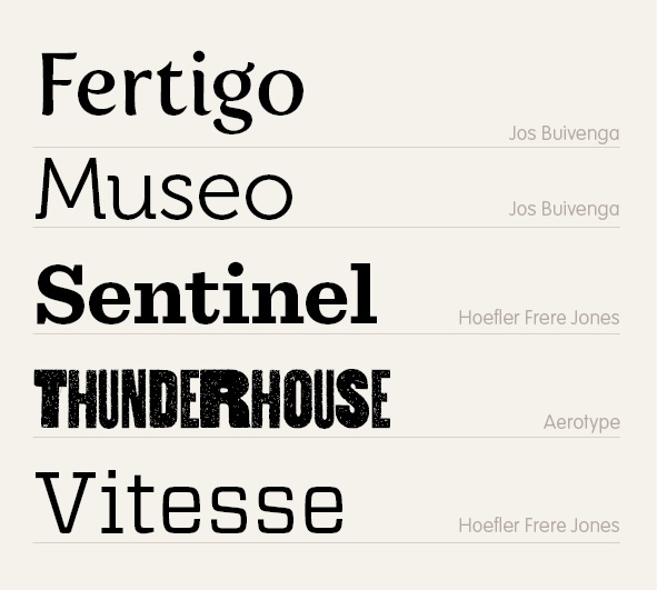
Beautiful Faces of 2010
With unlimited resources, I'd buy pretty much every typeface released. In the real world, Fertigo, Museo, Sentinel, Thunderhouse and Vitesse were my favourite purchases... all available from www.myfonts.com
Composite covers
 Financial constraints sometimes mean that we are unable to acquire a 'perfect' single cover image, but instead need to construct a composite of several less expensive or public domain images. The three titles above are examples of that approach.
Writers Resources from AWM
A very useful list of resources originally found here: http://www.awmonline.com.au/
Industry blogs for Australian Writers: AWMonline Guide
Industry News and Views
Australian Book Review
http://australianbookreviewblog.blogspot.com/
Contributors include editor Peter Rose and other ABR staff, and guest bloggers from the world of letters.
Barista
http://barista.media2.org/
A personal blog by screenwriter David Tiley, featuring filmmaking and culture news and views.
Booksller and Publisher
http://www.booksellerandpublisher.com.au/articles/
Bookseller and Publisher magazine's online news covering the Australian book industry.
Read moreIndustry blogs for Australian Writers: AWMonline Guide
Industry News and Views
Australian Book Review
http://australianbookreviewblog.blogspot.com/
Contributors include editor Peter Rose and other ABR staff, and guest bloggers from the world of letters.
Barista
http://barista.media2.org/
A personal blog by screenwriter David Tiley, featuring filmmaking and culture news and views.
Booksller and Publisher
http://www.booksellerandpublisher.com.au/articles/
Bookseller and Publisher magazine's online news covering the Australian book industry.
An Enlightened Book Cover
 Our client wanted a cover that encapsulated the iconoclastic spirit of the Enlightenment -- the birth of skepticism, secularism and the full flowering of the scientific method. The natural candidates for this were Voltaire, the great French thinker and Emile du Chatelet, his intellectual equal and lover. We selected three period-appropriate typefaces for the title: p22 Declaration, based on the penmanship on the American Declaration of Independence, Bodoni, designed in 1798 and Requiem Text, based on the humanist typefaces of Renaissance Italy. The typefaces and painting formed a harmonious combination, and Voltaire stares out at the viewer with a frank air of challenge.
Give Me Your Hand (writing)
'Handwritten' typefaces are a popular area of computer-based typography. The too-perfect edges and shapes created by layout and design packages often seem to need humanising, softening, a touch of variety and irregularity. The OpenType format has enabled the emergence of a new generation of typefaces with hundreds or even thousands of alternate characters, ligatures and other typographic goodies. For example, Liza Pro inserts a variety of different ligatures and alternate characters as the user types, giving text a warm and idiosyncratic feel.
If you'd like to go a step further and personalise a document with your very own inimitable handwriting, www.fontcapture.com allows users to print out a special form, then pen an instance of each letter of the alphabet, numbers and other special characters. When scanned in and uploaded, Font Capture uses the sheet to automatically digitise your handwriting and save the result as a typeface. If you like what you see (and the results can be somewhat erratic), the typeface can then be installed.
Read moreType Radio
Europe is the mecca of print design. In countries like Germany, the Netherlands, Sweden, Italy and France, typography and the practice of design is a topic for serious discussion. And serious discussion is what you will get with Type Radio. Their motto conveys something of the air of endearing earnestness that surrounds them: "Type is speech on paper. Typeradio is speech on type." With over 400 episodes available for downloading through Itunes, or directly through their site, a great deal of information awaits potential listeners. The members of the Dutch based collective spend a lot of time attending design conferences and talking to established and emerging designers, so their show is an excellent way of tapping into the design Zeitgeist.
Read moreBuild it, and they will kern
 You've visited all the type vendors and searched in vain. There's nothing that quite matches up with the search image in your head. 'I could do a better job myself!' you cry.
Fortunately for you. Fontshop has recently added an interesting functionality to their website: a typeface constructor. The FontStruct site equips you with an array of basic font shapes that can be moved arround lego-like on an underlying grid to form letters. Although the basic shapes are simple, when used in concert, the results are quite sophisticated. A gallery shows the variety of effects achieved by contributors. Once you have put together your masterpiece (and that might just be an uppercase set of letters, or an extended character set), your typeface can be saved as a truetype font and used out in the 'real' world. Over 160,000 people have signed up with FontStruct and 7,000 typefaces have been saved for public use. At the very least, the site is a worthy educational tool for those interested in typefaces, and reinforces the notion of an underlying grid over which the letterforms are arranged/organised. Oh, and it is completely free.
You've visited all the type vendors and searched in vain. There's nothing that quite matches up with the search image in your head. 'I could do a better job myself!' you cry.
Fortunately for you. Fontshop has recently added an interesting functionality to their website: a typeface constructor. The FontStruct site equips you with an array of basic font shapes that can be moved arround lego-like on an underlying grid to form letters. Although the basic shapes are simple, when used in concert, the results are quite sophisticated. A gallery shows the variety of effects achieved by contributors. Once you have put together your masterpiece (and that might just be an uppercase set of letters, or an extended character set), your typeface can be saved as a truetype font and used out in the 'real' world. Over 160,000 people have signed up with FontStruct and 7,000 typefaces have been saved for public use. At the very least, the site is a worthy educational tool for those interested in typefaces, and reinforces the notion of an underlying grid over which the letterforms are arranged/organised. Oh, and it is completely free.The Colour of Type
- type size
- type colour
- type clarity and contrast
- the ratio of the x-height to the overall letter height
- letterspacing
- kerning
- line length
- average word length
- frequency of hyphenation
- justified or set ragged left
- number of and space between columns
- leading (interline spacing)
- paper colour and thickness
- margins
- paper dimensions