

An interesting survey of the best typefaces available via Adobe fonts. Google fonts are also worth visiting, as are Font Squirrel and Lost Type.
Principles for Combining Typefaces

From the great online Smashing Magazine, an old post (but a goodie) on combining typefaces in a layout. An interesting table rating type combinations for 22 commonly used typefaces.
“The fact that there are no hard and fast rules about combining typefaces can make the process of making good choices time-consuming and maybe even a little exhausting. But it’s also nice to have a handy set of principles, as well as an understanding of certain typographic situations to avoid, to guide the process as quickly as possible to a pleasant typographic result.”
Free and Nearly Free Fonts

Hundreds of websites cater to the Internet's limitless appetite for free typefaces. Only a few restrict themselves to high quality fonts. Font Squirrel is one such, and Lost Type allows users to pay what they want for their font of choice. Some of the Font Squirrel offerings have multiple weights, and a few are issued by commercial type designers, such as Plex, a huge font family commissioned by IBM.
Waterfalls of Type Colour
Made possible by recent innovations in type software, live chromatic type is creating a bit of a furore in type design. Here's an interview with one of the field's passionate proponents. Of course, Chromatic typefaces are not new -- the spectacular original versions were cast in metal and set by hand.

Chromatic typeface specimens from the 19th Century
Type Lovers United

The creator of this website doesn't post often, but when he does, he makes up for the lack of quantity with sheer quality. He has an eye for interesting new type design plus a deep knowledge of design history. His enthusiasm is infectious. Well worth visiting for ideas and inspiration, unexpected combinations of type and strange tales from the dawn of typography.
Makerbook Showcases Quality Free Resources
Free is the new black on the Web. Free digital resources of surprising quality are available for photographs, typefaces, illustrations, web wireframes and much more. Makerbook brings together some of the higher end sources of free material and organises them in a simple and visually attractive way.

Re-starting an Important Social Debate
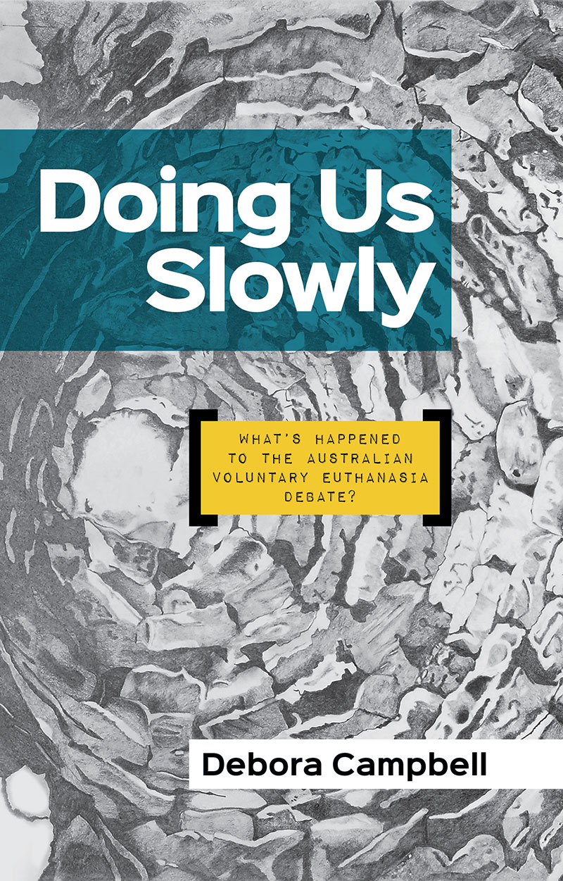
Deb Campbell is a passionate advocate for voluntary euthanasia. She believes that risk averse politicians have quietly kept the issue out of the public debate, despite broad public support for greater patient control over the end of one's life. We used a bold, highly visible sans typeface with a touch of personality for the title and author name (Sinkin Sans) and used Impact Label Reversed for the subtitle. The delicately shaded background artwork was supplied by the author.
Font Use Across the Internet

Despite the advent of web-served type, Arial is still Queen of the Internet. 616,000 of the Web's top million websites use this rather unexceptional typeface. Fontreach gives an useful snapshot of font use.There are several old standards originally commissioned by Microsoft, a few freebies served by Google and finally, further down the list, some interesting new typeface designs.
Displaying Your Fonts in a Browser
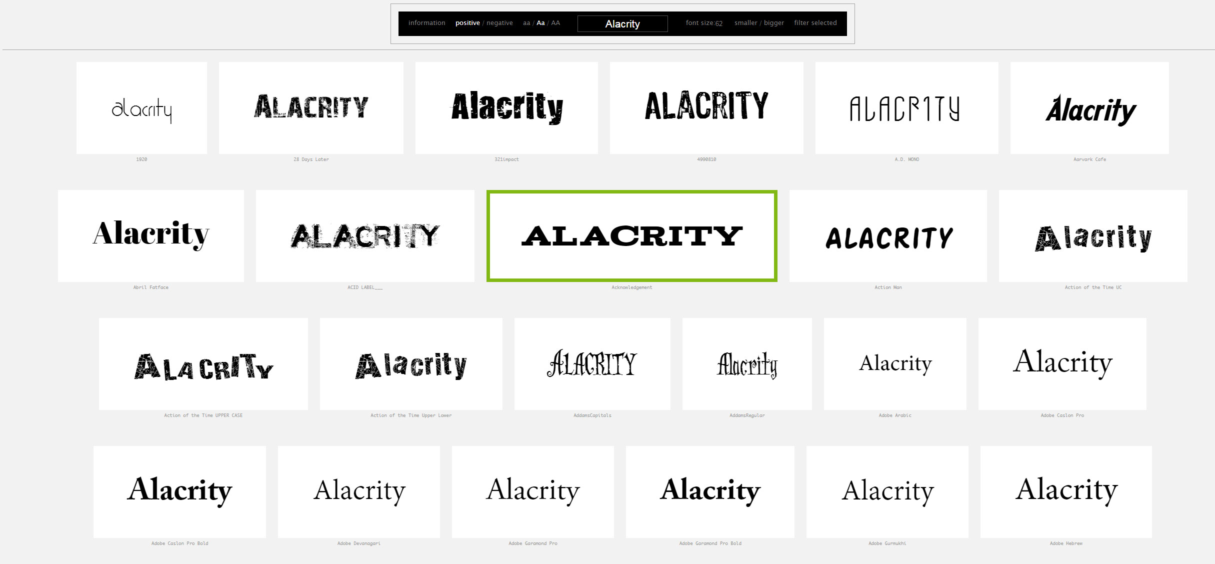
Wordmark gives users a way of displaying the fonts resident on their computer. You can enter your own text string, display black on white or reversed, increase the font size. An excellent way to make font selection a bit easier.
The Road to Follow — Book Cover
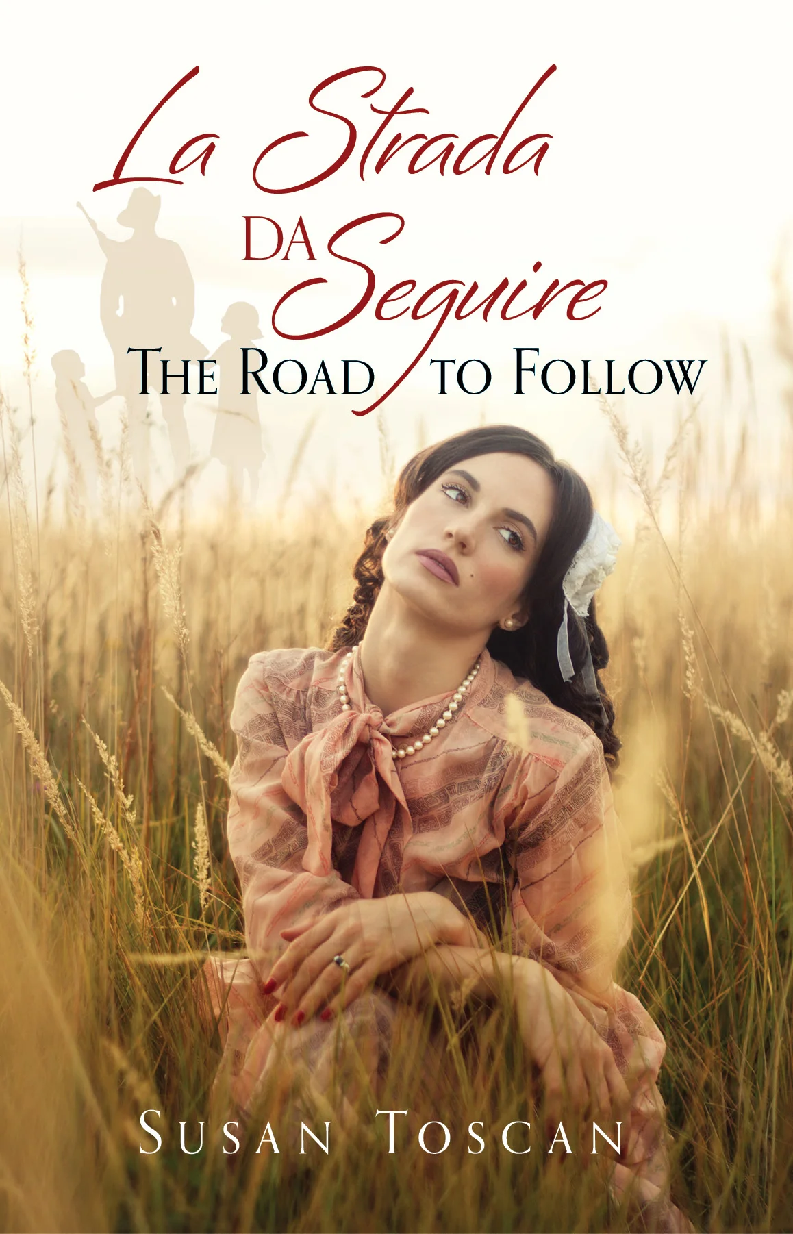
A multi-generational tale of Italian-Australian family life. We wanted to convey the feel of the story through a single image. The story focuses on the female members of the family. Typefaces used: Bianca, Orpheus.
Fonts on Fire — Tinder for Typefaces

With the Ashley Madison hack in the news, comparing a font matching service with a dating service is probably not a great move. Fontflame brings the matching aspect of Tinder to typefaces. At present all of the typefaces matched are from the Google stable. This means they are free for any use, but the overall selection is rather limited. Also, the type sample shown on screen is rather small, making it difficult to make an informed selection. A more full-featured service would be great, with typefaces from large and small foundries and the ability to input one's own text string. That would be very useful for designers looking for inspiration.
Wok Logo Ideas
Our client seasons woks for lovers of Chinese cooking and sells them online. "There should only be one wok you need for the best Asian cooking results, and that is a professionally seasoned wok. All traditional Chinese restaurants use seasoned woks." We designed several options involving the shape of the wok and colours associated with heat and Chinese cuisine. The current header choice is very bold and bright.

Guide to Proper Use of Typographic Characters

A beautifully designed page designed to assist with the correct use of apostrophes, dashes, accents and other mistreated characters. Downloadable PDF version here.