

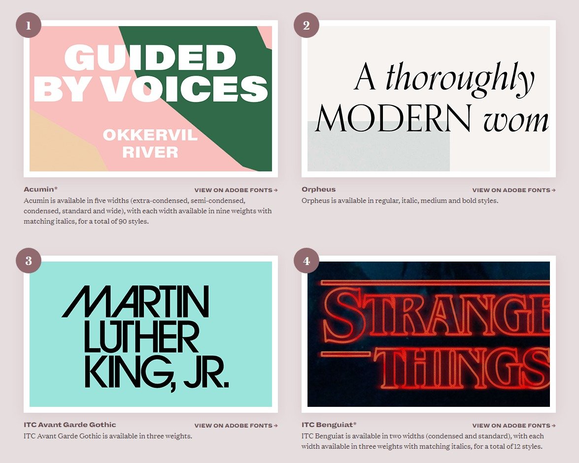
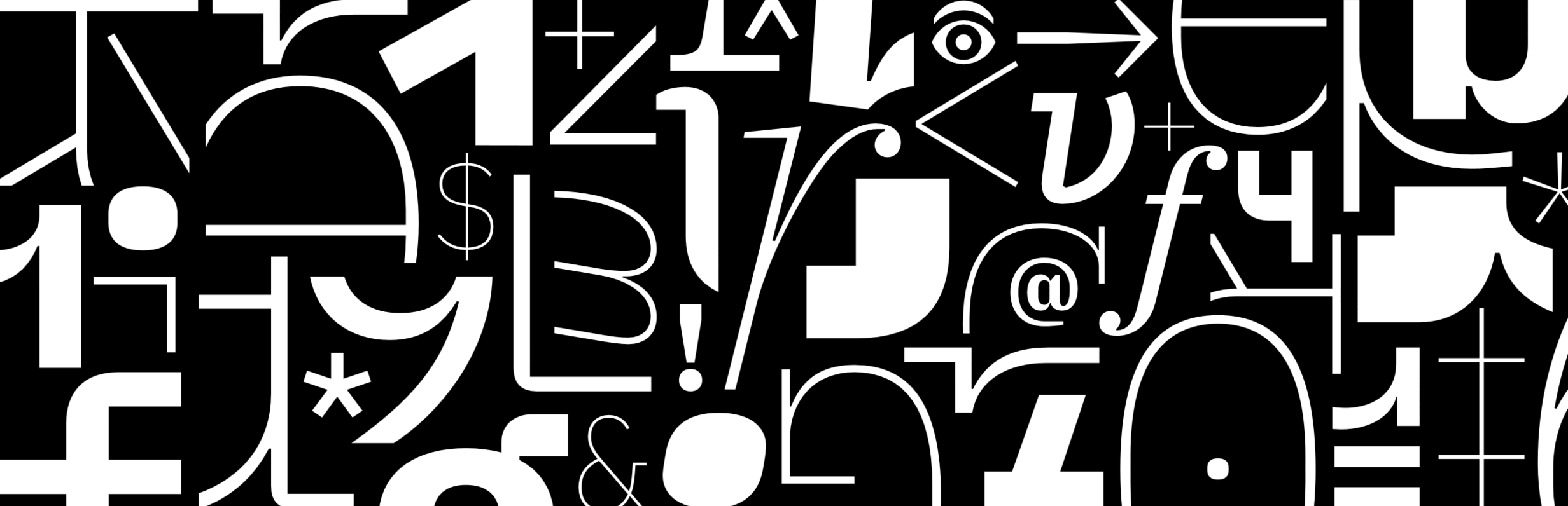
An interesting survey of the best typefaces available via Adobe fonts. Google fonts are also worth visiting, as are Font Squirrel and Lost Type.
July 2021 Cover Designs from WorkingType Studio


The usual variety of subject matter — book cover design is never boring. Literary fiction, crime fiction, children’s books, business advice and local history. “Fragile Power” uses variable typefaces (Acumin), which is a powerful new design tool.
Recent Cover Designs
The usual wide range of subject matter and design treatments. Never a dull moment…


Recent Cover Concepts
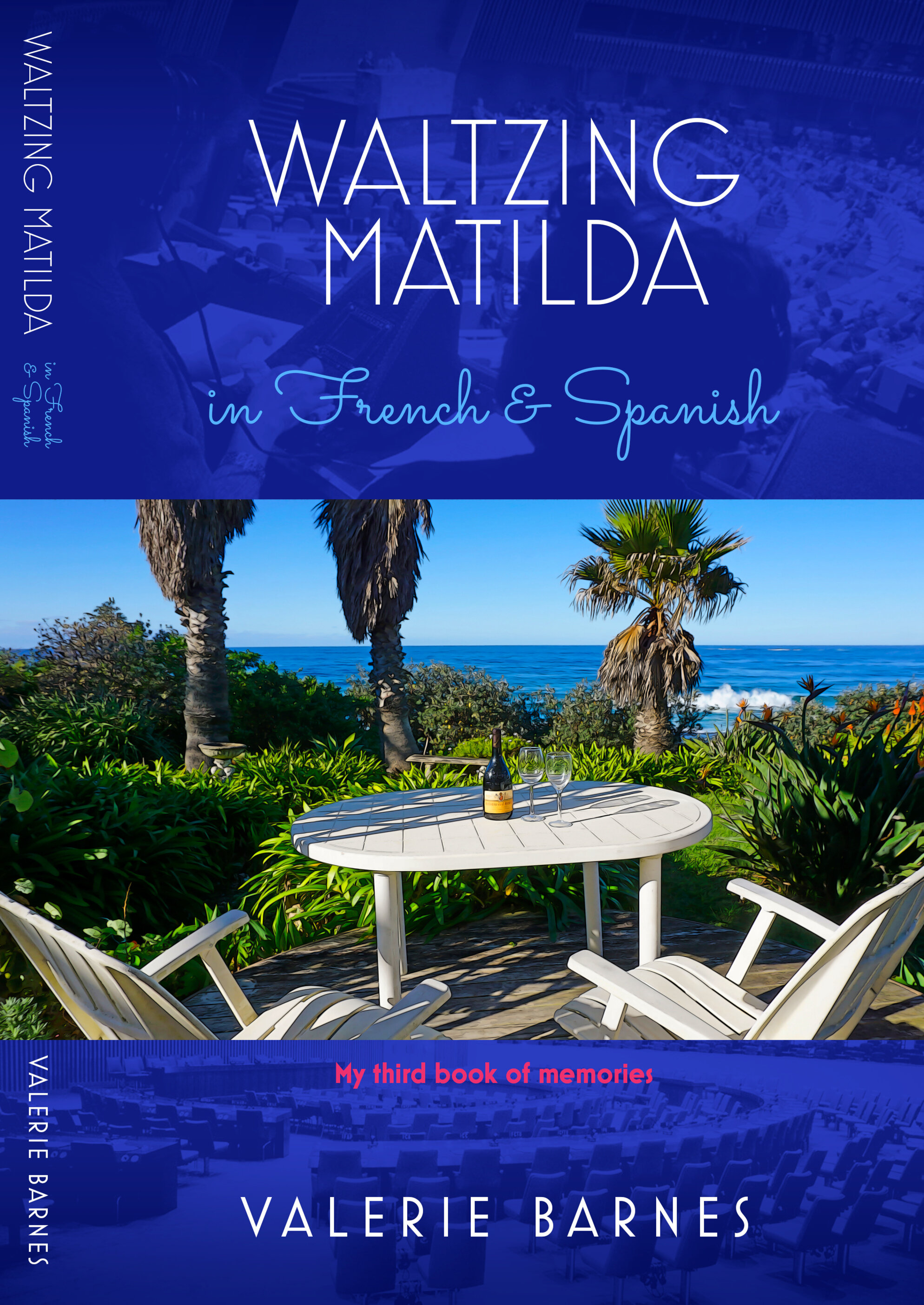
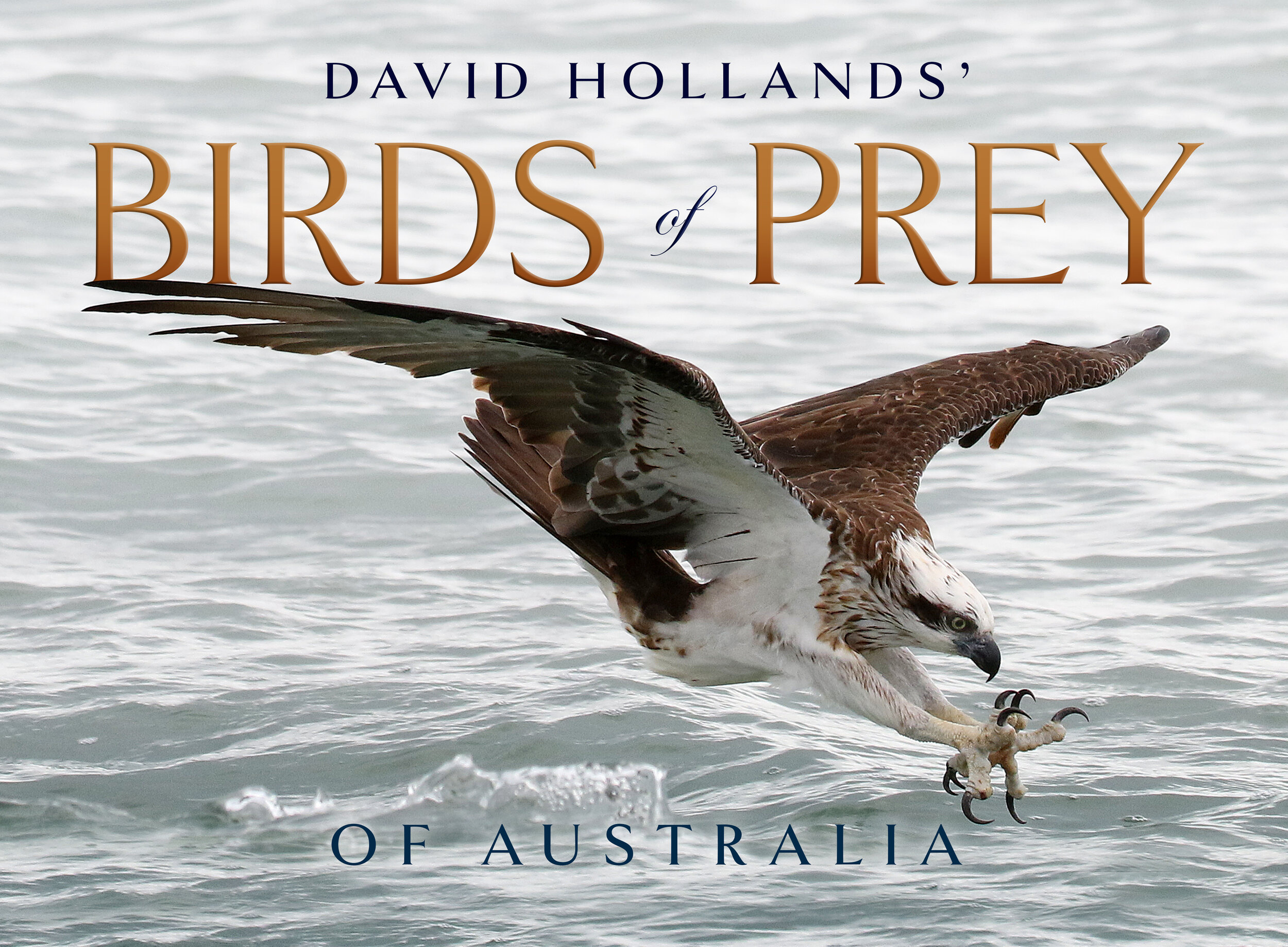
A wide range of topics and treatments in our recent cover work, from Vienna to Byron Bay, outback tall tales to environmentally sound tips.


Covering the Grim Reaper...

Our client’s author wished to use an existing artwork. so we worked in two panels of text with the art just showing through, keeping it clean and letting the rather odd couple speak/rattle for themselves… Typefaces used include basic sans and Taberna Serif.
Troubled Times in East Timor — Cover Design
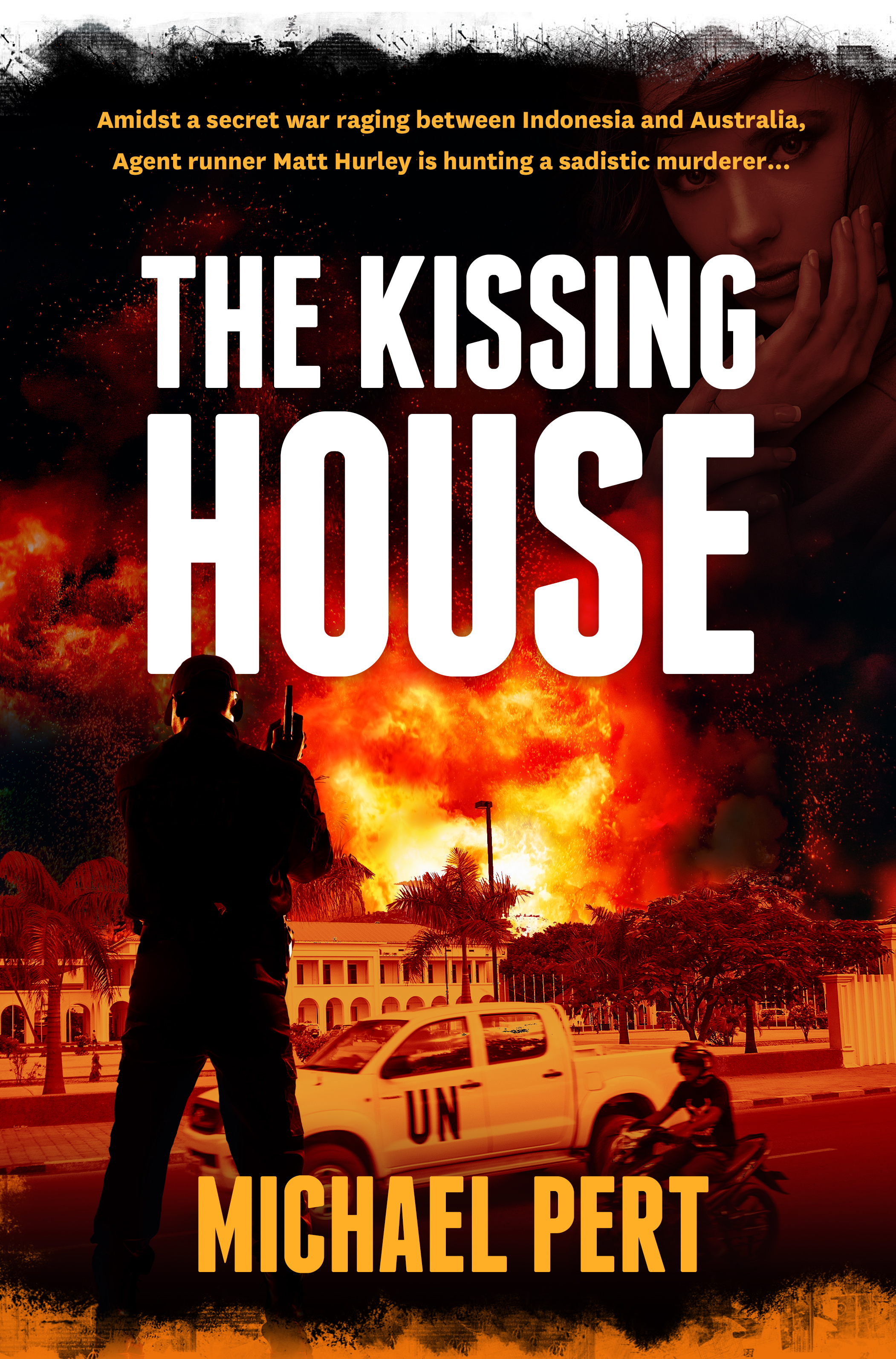
Michael Pert has written a taut, intelligent thriller based on Australia’s role in the troubled birth of East Timor. In the above draft cover, we blended images of Timor and a stark colour palette, and used the striking Franchise for the title typeface.
Copies of copies of copies

New Zealand type designer Kris Sowersby (National, Tiempos, Caliber) has some interesting things to say about type design and originality in this talk, given at TypeCon in 2018. He vigorously rejects any suggestion that type design is played out, and that new versions of old standards are a bad thing.
“And it made me realise this is what we are all doing. We’re taking the planks from masters, and building our own ships. We are making ships in our own image, in our own languages, in our own accents.”
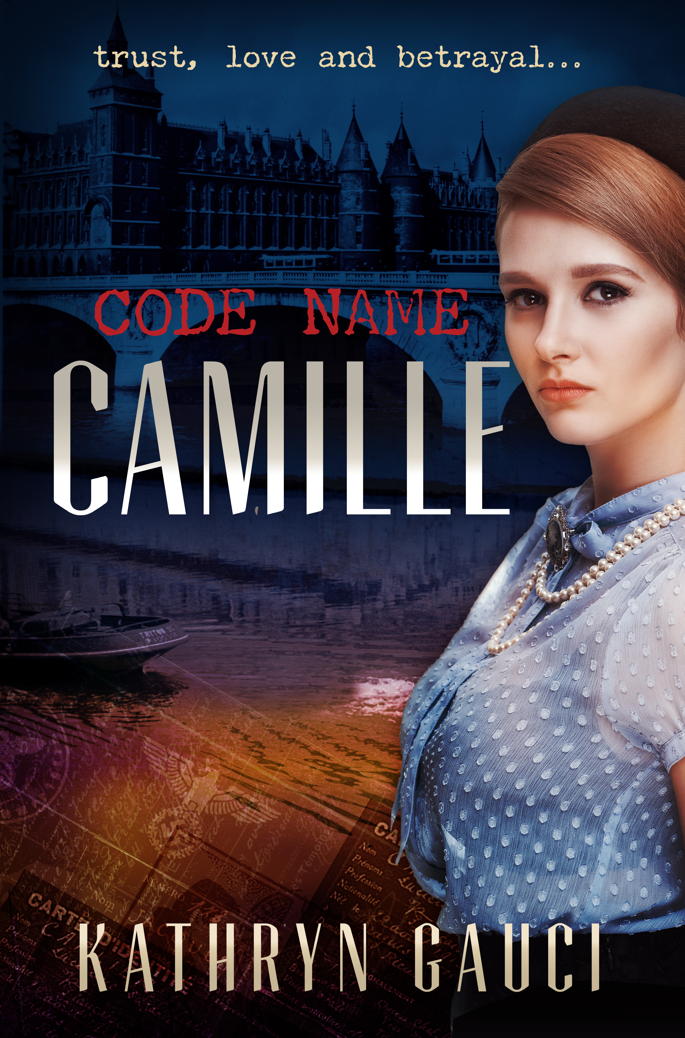
Carpet Weaver of Usak and Code Name Camille — Cover Designs
Kathryn Gauci writes with insight and sensitivity about the difficult and intertwined histories of Greece and Turkey, and also about the great drama of the Second World War. Her characters are caught up in the flow of events, and often forced to deal with great tragedies and make impossible choices. The Carpet Weaver of Usak depicts Greeks living alongside Turks in Asia Minor, a circumstance almost unimaginable today. Typefaces used: Orpheus Pro and Playfair italic. Code Name Camille explores the world of the Resistance in France, and the attendant dangers and betrayals.

Principles for Combining Typefaces

From the great online Smashing Magazine, an old post (but a goodie) on combining typefaces in a layout. An interesting table rating type combinations for 22 commonly used typefaces.
“The fact that there are no hard and fast rules about combining typefaces can make the process of making good choices time-consuming and maybe even a little exhausting. But it’s also nice to have a handy set of principles, as well as an understanding of certain typographic situations to avoid, to guide the process as quickly as possible to a pleasant typographic result.”
Two Fine Free Font Offerings
When IBM commissioned a typeface family for their own internal use, they also released it for general use. Clean and practical, Plex also has some style and warmth. With sans, serif and monospaced subfamilies and many weights, one might wish that many businesses relying on dull typefaces such as Arial and Times New Roman might make the switch and use something much better for free.
“With four subfamilies, eight weights, two styles (roman & italic), and 100 Languages, IBM Plex™ can do just about anything you need it to. Just download, add to your font manager, activate and enjoy.”

Another free offering, Overpass is not quite a grand as Plex, but with eight weights and true italics, it is a fine and generous offering. Very smart and highly readable, and more space efficient than Plex.
Export Driven Cover
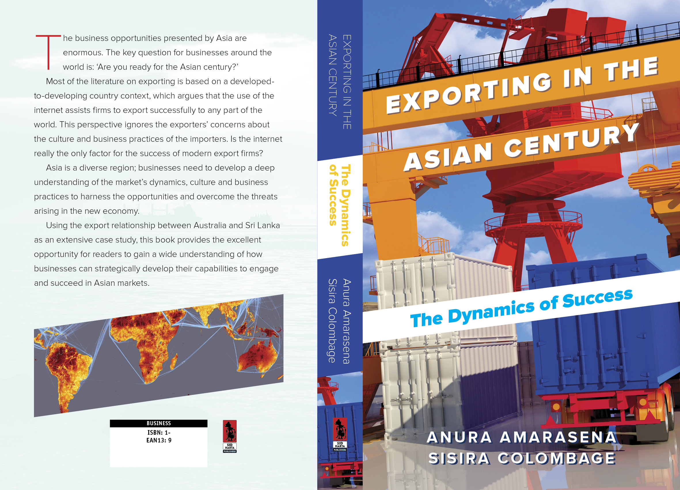
Anura Amarasena and Sisira Colombage have written a practical guide to trading with the rapidly expanding Asian economies, using Australia-Sri Lankan trade as a case study. We opted for a bold, colourful design with type conforming to the angles of the image. Typeface used: Proxima Sans.
Waterfalls of Type Colour
Made possible by recent innovations in type software, live chromatic type is creating a bit of a furore in type design. Here's an interview with one of the field's passionate proponents. Of course, Chromatic typefaces are not new -- the spectacular original versions were cast in metal and set by hand.

Chromatic typeface specimens from the 19th Century
Noto — A Typeface for Every Language

Google has an endearing penchant for quixotic projects. Noto is that, but also a noble effort to construct a completely inclusive set of typefaces — covering all of the world's major scripts but also most of the minor ones. The name is derived from 'no tofu' — the little white squares that pop up when one attempts to type a character outside the character set of the font in question. The font itself is fairly vanilla, but highly readable and comes in four sans and four serif weights, and is free from Google.
Type Lovers United

The creator of this website doesn't post often, but when he does, he makes up for the lack of quantity with sheer quality. He has an eye for interesting new type design plus a deep knowledge of design history. His enthusiasm is infectious. Well worth visiting for ideas and inspiration, unexpected combinations of type and strange tales from the dawn of typography.
Font Use Across the Internet

Despite the advent of web-served type, Arial is still Queen of the Internet. 616,000 of the Web's top million websites use this rather unexceptional typeface. Fontreach gives an useful snapshot of font use.There are several old standards originally commissioned by Microsoft, a few freebies served by Google and finally, further down the list, some interesting new typeface designs.
Visual Communication — A Cover Concept
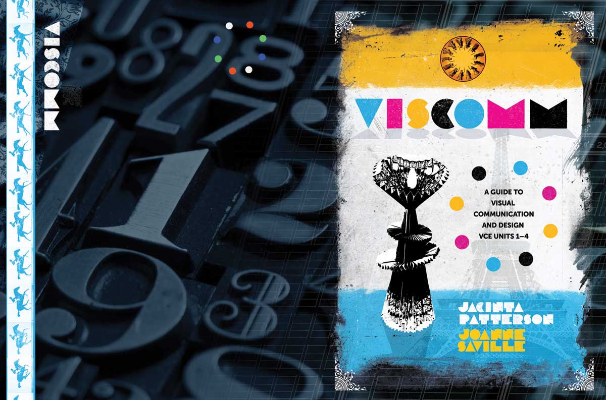
A cover concept for a Visual Communications textbook for Cambridge University Press. I used an old experimental French typeface for the title — each letter is as minimal as possible, but still quite readable. The strange object featured at centre left on the front cover is a student artwork. This concept didn't make the final cut, but it was my personal favourite.
Variations on a Theme — New Book Cover

A few iterations on a two book series (non-fiction) for a local author. At the time of posting, covers 1 and 2 are favoured, though further modifications are likely. As ever, selecting, manipulating, kerning etc. type is more than half the fun. Typefaces used include Trajan Sans, Trade Gothic, Alternate Gothic, Museo and Plume.
Displaying Your Fonts in a Browser
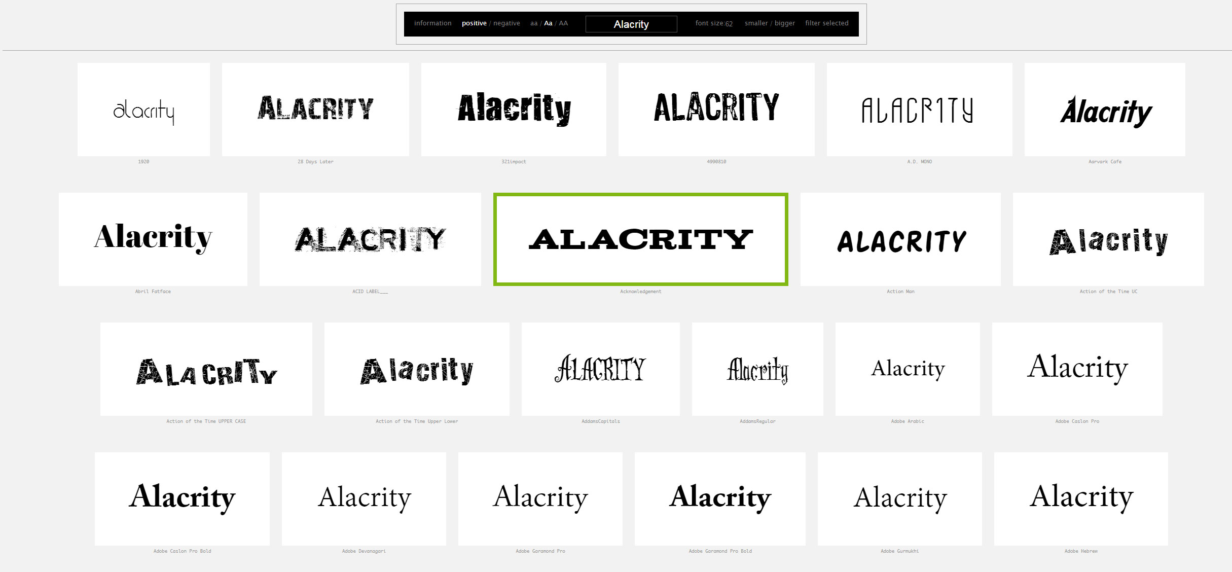
Wordmark gives users a way of displaying the fonts resident on their computer. You can enter your own text string, display black on white or reversed, increase the font size. An excellent way to make font selection a bit easier.
The Road to Follow — Book Cover
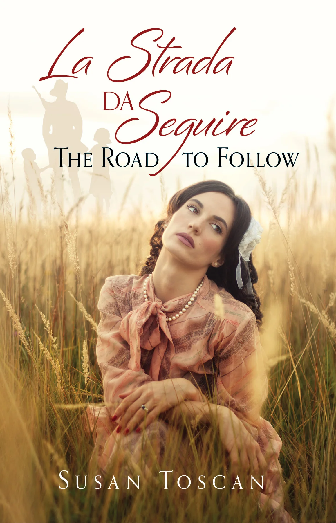
A multi-generational tale of Italian-Australian family life. We wanted to convey the feel of the story through a single image. The story focuses on the female members of the family. Typefaces used: Bianca, Orpheus.
Fonts on Fire — Tinder for Typefaces

With the Ashley Madison hack in the news, comparing a font matching service with a dating service is probably not a great move. Fontflame brings the matching aspect of Tinder to typefaces. At present all of the typefaces matched are from the Google stable. This means they are free for any use, but the overall selection is rather limited. Also, the type sample shown on screen is rather small, making it difficult to make an informed selection. A more full-featured service would be great, with typefaces from large and small foundries and the ability to input one's own text string. That would be very useful for designers looking for inspiration.