
A giant in the world of quality type, the FontShop can now tout its wares from inside Photoshop. Install their plugin, and you can preview any of the thousands of typefaces on offer. If you like what you see, click through to their online store, buy the typeface and start using it. Many are the ways a designer can be parted from their money.
100 Best Typefaces
It's a big call, but someone has to make it — Fontshop has listed the 100 typefaces it considers the 'best of all time'. Their ranking system includes both subjective and objective criteria, and takes into account sales figures. The top ten contain no surprises, indeed, the top twenty is pretty predictable. All the workhorse typefaces are there — Times, Helvetica, Univers, Garamond, Gill Sans, Frutiger and Franklin Gothic, so the list isn't a way of discovering new and interesting typefaces. It is more a ranking of those typefaces that have survived the vagaries of fashion and have been used over many decades (or centuries in some cases).
Elephants as Myth
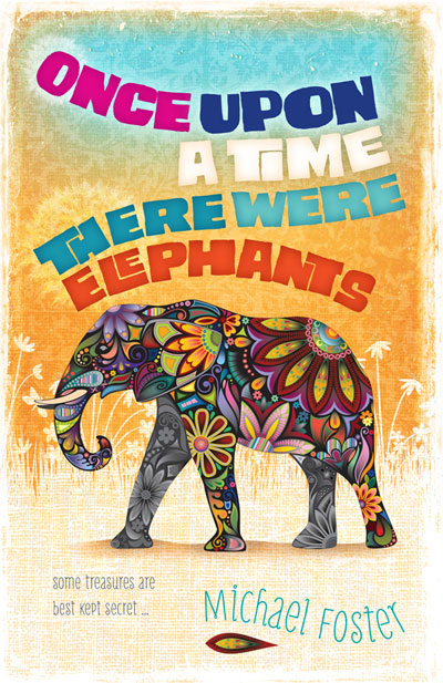 Our client had written a story set in a future earth where animals such as the elephant were long extinct and considered mythical. We wanted to depict the elephant of the title as a fabulous, almost imaginary beast, and as the book was aimed at younger readers, to give the type treatment and background a playful, energetic feel.
Roman Zenith
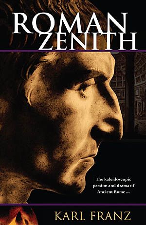 Roman sculptors were sometimes very honest in their depictions of the great and the good. They showed sunken cheeks, wrinkles and other flaws. We took advantage of this by using a Roman sculpture for the cover of "Roman Zenith". The stark contrasts and psychologically acute depiction make for a surprisingly modern feel. The subtle backdrop of the Pantheon makes the setting and era clear.
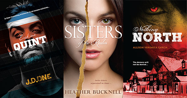
On the Face of it: three recent covers
Our publisher client prefers us to design covers as a single unit -- back, front and spine all part of the same artwork. This encourages the use of large, bold images and prominent use of type. The three front covers featured here all focus on a single face challenging the viewer, a naturally strong composition.
Symbolism in Type
Signs and symbols is a useful blog highlighting infographics/dingbat/wingding/symbol resources across the web. Almost everything linked to is free. In a world where much information is viewed via tiny phone screens, simple symbols help cut through the clutter and communicate effectively.
Sins of a Certain Type
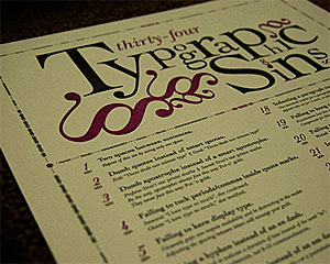 Just like grammar, typography attracts pedants. Some of their gripes are legitimate, while others seem rather trivial. One such perfectionist has put together all of his pet peeves on one poster. Ironically, the website showcasing this poster was rather hard to read, both in Chrome and Firefox.
Festival for the Community
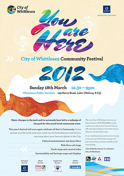 Our client stages a community festival once a year, and tries to appeal to everyone within the city boundaries. They wanted an open, friendly design with a sense of inclusiveness and place. We used the beautiful Mrs Shepperds (Alejandro Paul) for the flourishes of the title, and Archer (Hoefler, Frere-Jones) for the rest. Aerial images of the city helped give the design local context.
Word
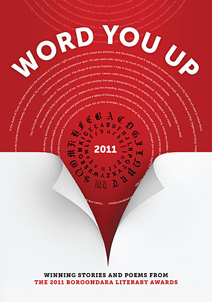 Our client wanted a high-impact type-based design. We used contrast, intense colour and a line of text from each of the stories featured in the anthology. The page curl gives a hint of depth and serves to direct attention from the title down to the subtitle. Typefaces used were Museo Sans and Museo Slab by Jos Buivenga.
Noun Project
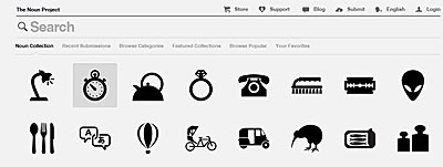 A simple idea, well executed: the Noun Project is a catalogue of symbols covering everything from the mundane to the sublime. They are available free of charge, and the web interface is as simple, clean and monochrome as the symbols themselves.
Lost Worlds of Graphic Design
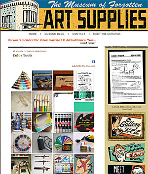 Personal computers and the Internet have opened up new worlds for millions of people, but they have also remade or destroyed dozens of professions and made hundreds of specialist skills obsolete. The Museum of Forgotten Art Supplies chronicles the items used by professionals in the graphic design and advertising industries. They seem very distant and quaint, but once they were essential tools for serious professionals, and the making of them was an entire industry in itself.
Anatomy of a Typeface
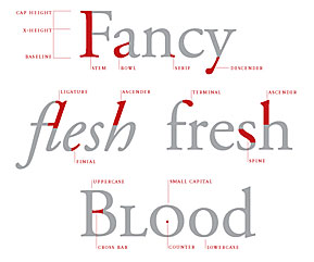 If you thought a stem belonged to a flower and a bowl was what you put the flower in, then visit Thinking with Type for a typographical education. The site is a well designed tour of type design, units of type measurement, classification and use, and hints on mixing typefaces, all written in plain English and elegantly illustrated. The site makes a good case for considering typography as the core of most graphic design, even on the web.
Neat Freaks United
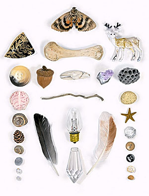 File under: people with way too much time on their hands, or: how to make your fetish into a business. Austin Radcliffe spends his days shooting and curating images of objects arranged in aesthetically pleasing ways. In some ways his obsession is quite old school — collectors have long organised their finds by all sorts of esoteric criteria. While the neat aspect will probably irk messy people, the various collations, coteries and concatenations are often quite pretty, fun, and interesting for the sheer variety of things revealed in the world.
Type with soul
 If precise typefaces with mathematically determined curves put together on a computer leave you a little cold, there is a tiny corner of the typosphere that is embracing a hand made alternative. The Organic Type features hand-drawn, painted, sketched, rubbed and eroded typefaces, achieving warm and charming effects impossible with standard type. Their typefaces cannot be installed via a font manager. Instead, each letter is supplied as a separate layered image file, and needs to be manually placed and kerned. Perfect for arresting and highly individual headers, and capable of heavy lifting in almost any design context.
The Information
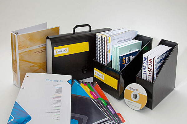 Our client provides an integrated service to people in the building trade. She wanted her documents to look attractive, but not overdesigned. Her clientele are mostly male and are looking for practical, no-nonsense assistance. Our solution involved generous amounts of white space, strong colours, clear imagery and bold, spare typography.
Corporate Predators
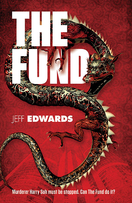 This thriller features a sociopathic CEO with a sideline in hands-on murder. We wanted to depict the milieu (Hong Kong), the scent of blood, and the rampaging spirit of unbridled, unprincipled ambition (enter the dragon).
Table for Eight
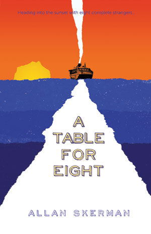 An elderly man takes a cruise to re-start his life after the death of his wife. He discovers that he cannot escape from the reality of his situation, but gains some solace in the company of often fractious strangers. We wanted to convey the basic concept of 'sailing into the sunset' with a simple geometric composition, torn edges, informal type and bright contrasting colours.
Beautiful Type Samples from Emigre
 Digital type design pioneers Emigre have released some of their old printed type sample sheets in PDF form. The sheets are beautiful examples of graphic design in their own right and many of the spreads would make excellent posters. Several of the typefaces designed by the Emigre founders are still used, such as Mrs Eaves, Triplex, Filosofia, Template Gothic and Vista Sans. Some of the experimental typefaces have had their run, but they did help create the wide open field that is modern typography. Emigre was one of the first independent digital foundries and was responsible for the hugely influential Emigre magazine, which ran from 1984 to 2005.
A Tale of Modern Japan
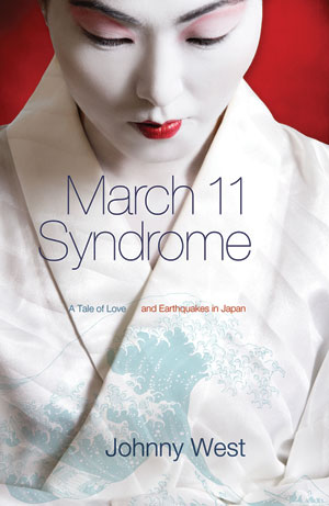 Our client's novel was set in tsunami-hit modern day Japan and he wanted to evoke both the modern and traditional aspects of Japanese culture. We used an ultra-light sans for the title typeface and a faint image from Hokusai's Views of Mt Fuji. The subtitle text plays with the earthquake theme, separated along a rift that is also a fold in clothing.
Inklings
Wacom seem to have come up with an intuitive way of melding the hands-on beauty of drawing on paper with the world of digital design. Using a special pressure-sensitive pen, an artist/designer can draw directly and intuitively onto paper (with real ink) and all marks will be recorded by the pen for later uploading. Wacom's promotional text claims that Inkling "bridges the gap between traditional, freehand sketching and digital development".