
An interesting attempt to make a case for paper, and to point out the environmental implications of an entirely digital world. Hint: massive storage and network requirements require huge real-world resources and significant energy consumption.
Printing in the People's Republic
Many, if not most, Australian publishers and plenty of individual authors have books printed in China. The printing prices on offer are very attractive, and the quality often excellent. However there is a dark side to printing in the People's Republic: censorship. You might think that a book being printed for an Australian (or any other non-Chinese audience) would be simply printed and shipped back to the client. This is only partially correct: it is checked by Chinese censors to make sure the book in question conforms to certain Chinese sensitivities — even if not a single Chinese citizen is destined to read it. Such sensitivities include drugs, sexuality and references to China and Chinese history. If your book mentions Taiwan, for example, you had better make sure it reads as "Taiwan (China)". If your book discusses Chairman Mao in anything but the most glowing terms, better find another country to print it. The Chinese government interest in content is a salutary reminder that the country is burdened with a dictatorship, with all the stifling, anti-democratic and bureaucratic impulses that go with that kind of government.
Old School Type Specimens
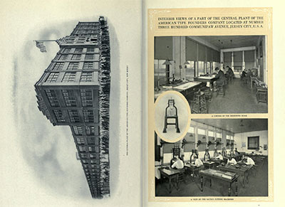 A long time ago, type was embodied rather than digital. Skilled craftsmen working for large companies laboriously designed and cut letters from metal and sold them across the world. The American Typefounders Company was one such outfit, and it regularly produced an exhaustive catalogue of their wares. Not only did the catalogue include hundreds of beautifully set sample pages of their type, it featured an extensive corporate introduction extolling the modernity of their facilities and sales outlets. It really was a 'gold mine for the progressive printer', digitised beautifully by The Internet Archive.
Poster Calling for Young Writers
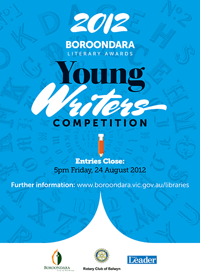 Our client requested a bold and attention-grabbing poster to attract entrants to their short story writing competition. The design needed to echo design elements used in an earlier anthology of short story winners (also designed by Chameleon). We used the flowing, high contrast Mrs Sheppards (designed by Alejandro Paul) in conjunction with the clean lines of Museo Sans. With a big block of solid colour and the sharp page turn curves at the base of the poster, we gave the poster enough muscle to communicate effectively.
Author website for Amanda Stuart
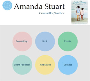 After recently writing The Longest Journey, Amanda Stuart wanted to showcase her book online. The website she commissioned is extremely clean and easy to navigate. As the book garners more attention, she will add reviews and reader comments. Possible enhancements might include a sample passage or chapter, a press release and a list of bookstores stocking her book.
On the Face of it: three recent covers
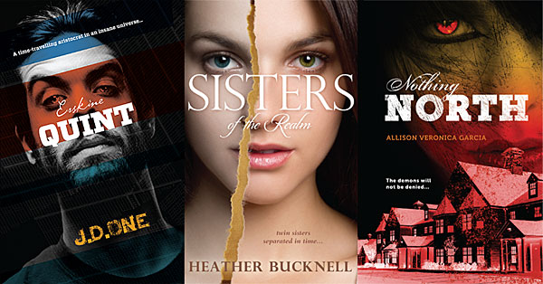
Our publisher client prefers us to design covers as a single unit -- back, front and spine all part of the same artwork. This encourages the use of large, bold images and prominent use of type. The three front covers featured here all focus on a single face challenging the viewer, a naturally strong composition.
The Information
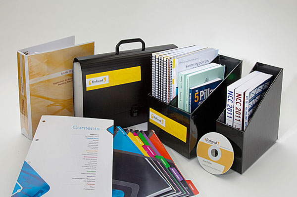 Our client provides an integrated service to people in the building trade. She wanted her documents to look attractive, but not overdesigned. Her clientele are mostly male and are looking for practical, no-nonsense assistance. Our solution involved generous amounts of white space, strong colours, clear imagery and bold, spare typography.
Inklings
Wacom seem to have come up with an intuitive way of melding the hands-on beauty of drawing on paper with the world of digital design. Using a special pressure-sensitive pen, an artist/designer can draw directly and intuitively onto paper (with real ink) and all marks will be recorded by the pen for later uploading. Wacom's promotional text claims that Inkling "bridges the gap between traditional, freehand sketching and digital development".
A Great Ocean Road
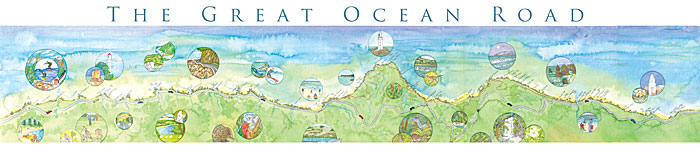 Drivers have a hard time on the Great Ocean Road — torn between vistas of forest and sea and keeping their vehicles on the road. The Road runs from just south of Geelong, past Apollo Bay and Cape Otway, alongside the Twelve Apostles and on into the windswept cliffs and beaches of Western Victoria. Our client painted a panorama of the Road and its attractions, and wanted to sell it at information centres in the region. We scanned and stitched together the metre long artwork, adding circular images of attractions and trying not to obscure any important information.
Typography for Lawyers
Though it could be an obscure indie band, TFL is actually a website that follows through on the promise (or threat) of its title. America's lawyers produce gargantuan piles of poorly formatted documents and in the process communicate rather poorly. Matthew Butterick makes a persuasive argument for the importance of the considered use of type and page layout (especially using Word or Excel). His website and book are rich in practical examples and of course apply to anyone producing documents, not just the legal set.
Diamonds are Forever
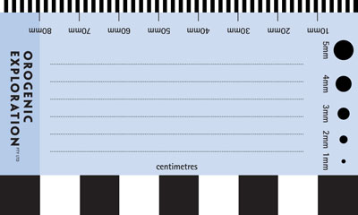 Our client prospected for diamonds, and even diamond-hunters need a business card. Aside from the usual contact details, he was keen to give the reverse side of his card additional utility as a way of measuring objects and providing scale in photographs. He also intended to use it for jotting notes to include with samples. After ten years of use, he returned for an update and reported that the card/ruler had been very handy.
D is for Dragon
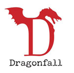 Dragonfall Press is bravely dipping a toe into the turbulent waters of modern publishing, showcasing fantasy and science fiction by Australian authors. We were commissioned to craft a logo suitable for use on book spines and readable at quite small sizes. With the famous Slovenian dragon bridge as source material, we melded a wing, a head and an elegant 'D' (Filosofia Grand by Zuzana Licko) to create a logo that will hopefully help give Dragonfall a distinctive brand.
Vaudeville in Australia
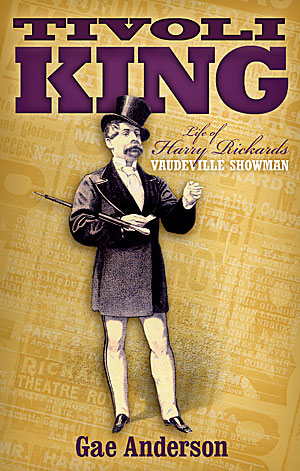 Harry Rickards was a nineteenth century show business entrepreneur and performer who made a risky move from Britain to Australia. His business doings were colourful to the point of criminality and he died a rich man. We wanted to convey something of the swagger of the man and the constant chatter of the material produced to promote his shows. We used typefaces appropriate to the time.
Catalogue versions
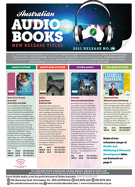 We design three catalogues per year for Vision Australia. Each edition is released by three different distributors. By running the distributor information in black only at the base of page one, we are able to swap the black plates only during the run, keeping printing costs to a minimum.
Full Colour Cover
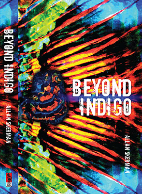
When "Beyond Indigo" was published twenty years ago, the author was unhappy with the book's cover, feeling it was conventional and stodgy. With a new publisher, he finally had the chance to remedy the errors of the past.
The book deals with an elderly opal miner and an extraordinary opal strike. We took full advantage of the dramatic colours of that gem. With a gem specimen overlaid against a close-up opal pattern, the composition might also be a wing, a sunset or a landscape — almost abstract, but concrete enough to tie the book to its subject matter.
Lonely for My Land sells well
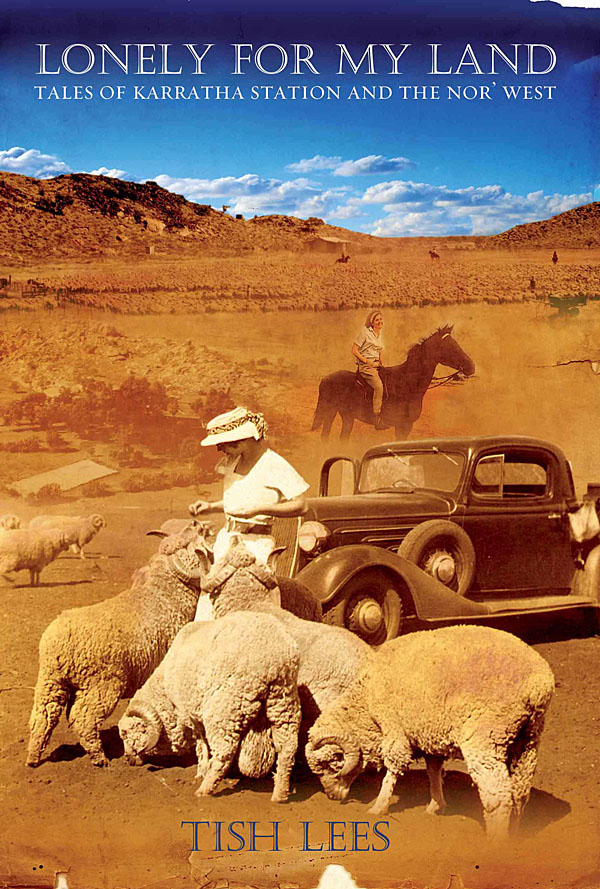 Tish Lees grew up on a remote and beautiful cattle station called Karratha. An accident of geology put her parents' station at the heart of Australia's iron export industry. Tish chronicles in her book a vanishing way of life. She wanted us to capture the feel of the WA outback, the dust and blue skies, and to integrate the best of her family snapshots. The result has sold extremely well and is into its third printing.
Getting Your Portfolio Online
Artists, photographers, illustrators, cartoonists and designers all need to get their work seen by as many eyeballs as possible. Many do not have specialist web design skills, and balk at the cost of having a web designer put together a customised folio for them. Fortunately in the new world of free cloud services, several businesses offer simple but elegant online folio solutions. My personal favourite is Behance, a business best known for offering services and conferences to "creatives". Their folio service has a strong social media focus, encouraging users to follow other designers, rate their work, give detailed feedback and generally promote themselves. The upload process is very detailed and offers a reasonable amount of customisation. The whole experience is slick and the aesthetic is pared back and very readable.
Read moreAn Enlightened Book Cover
 Our client wanted a cover that encapsulated the iconoclastic spirit of the Enlightenment -- the birth of skepticism, secularism and the full flowering of the scientific method. The natural candidates for this were Voltaire, the great French thinker and Emile du Chatelet, his intellectual equal and lover. We selected three period-appropriate typefaces for the title: p22 Declaration, based on the penmanship on the American Declaration of Independence, Bodoni, designed in 1798 and Requiem Text, based on the humanist typefaces of Renaissance Italy. The typefaces and painting formed a harmonious combination, and Voltaire stares out at the viewer with a frank air of challenge.
Bright, Bold Brochure Design
Located on the rural/suburban edge of Melbourne, the City of Whittlesea works hard to present an extensive series of cultural events, ranging from music festivals to heritage walks and a huge community festival. Chameleon Design was set the task of presenting this diverse range of activities in a bold, colourful and highly readable fashion. Our design incorporated images of festival performances, art installations and fireworks displays, against a graphic motif suggesting the roof of the big tent in which many of these events were held.

Read moreDynamic Live Brush
 LiveBrush is one of the more fully featured programs available in the Adobe AIR format (see earlier post). While nowhere near as precise and powerful as programs such as Illustrator or CorelDRAW, it does have a few interesting aspects and the virtue of being free. Users select a brush from a fairly extensive list, and apply to a new page. The brush stroke is governed by the velocity and direction of the mouse, and the result is often very smooth, spontaneous and gestural -- far from the quavery line many of us manage when drawing freehand. The brushstroke has a mind of its own -- only notionally following the path you lay out for it. Each succeeding stroke has its own layer, and the artwork can be saved and exported at any time. Despite the many customisation options, Livebrush feels more like an interesting feature of a larger program than a standalone entity. It's most obvious use is as a means of producing some loose, interesting brushwork and importing same into a drawing or layout package.