
A thoughtful and detailed take on the very different world of planning and executing a large modern website. First, a thorough inventory of planned content, second a content planning matrix where the site architect learns to "match content with your website's users, their needs, and your purpose", then finally a content production matrix where "you can get into the tactical work of figuring out how that content is going to be produced". Proof that web design is a very different beast than print design, though designers such as Erik Spiekermann would argue that the fundamental constraints of readability and typographic restraint are universal.
Flat is the New Black: How Google Designs Itself
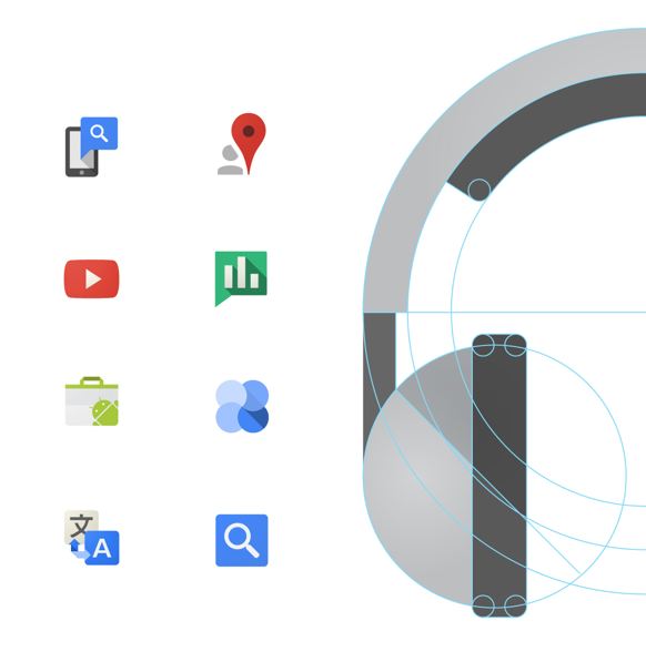 Users of Google (is that now officially everyone?) will have noticed in recent times a distinct improvement in the visual presentation of their various services. Use of white space is more sophisticated, icons eschew drop shadows and embrace unadorned flatness, and the typography is much more refined and readable. One of the people responsible for this design sea change at Google has posted at some length on the topic at Behance.
A Thousand Words
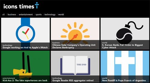 Icons Times features cleverly designed icons that attempt to encapsulate a specific news story. It's a fun idea, and interesting for design types, but pretty limited. Every icon requires an explanatory line just to make sure we know what the story is.
Cloud of Words
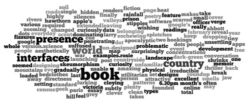 Generate a cloud of your own words online at Wordle. Not sure what any given word cloud reveals (beyond one's tendency to overuse certain terms). Too many polysyllabic words might be a prompt to use plainer language. Or not.
Source Sans for the Masses
 Adobe Systems are best known as the company behind Photoshop, Adobe Acrobat and InDesign. They also have been involved in the design and sale of typefaces for many years. In an unusually generous move, Adobe have released Source Sans —a very accomplished sans serif type family, for the price of absolutely nothing. Available in 6 weights, Source Sans is elegant, practical and suitable for portable devices, the web and print. A real workhorse typeface that designers will return to again and again, but useful for nondesigners who want to go beyond the usual defaults of Arial and Times.
Flatland on the Internet
Down with faux fur, ersatz stone, chiselled letters and imitation wood! Designers rise up against illusion and visual misdirection! A designer makes a good case against the current vogue for making interfaces look like physical objects. Pare it back, leaving only the absolutely essential .
"Remove the unnecessary embellishments and keep stripping until you’ve almost gone too far. We believe that elegant interfaces are ones that have the most impact with the fewest elements."
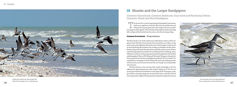
Waders of Australia
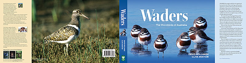
Soon to be printed/published, Waders: the Shorebirds of Australia has been an epic labour of love for its author David Hollands. He has travelled to almost every corner of Australia to photograph and document every single species of endemic and visiting wader. The result is both informative and evocative, with strong arguments for habitat conservation. We have tried for a transparent design and layout -- letting the content and images speak for themselves.
Old School Type Specimens
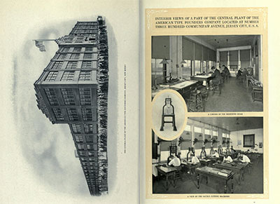 A long time ago, type was embodied rather than digital. Skilled craftsmen working for large companies laboriously designed and cut letters from metal and sold them across the world. The American Typefounders Company was one such outfit, and it regularly produced an exhaustive catalogue of their wares. Not only did the catalogue include hundreds of beautifully set sample pages of their type, it featured an extensive corporate introduction extolling the modernity of their facilities and sales outlets. It really was a 'gold mine for the progressive printer', digitised beautifully by The Internet Archive.
Scrabble for Typophiles
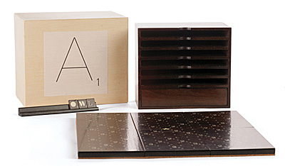 For lovers of design and typography — an elite Scrabble set to set you above the design-starved masses. Produced as a limited edition set, the board and tiles employ a variety of quality typefaces, are signed and numbered and constructed of stained walnut. Type lovers may find it difficult to concentrate on the game when so many typefaces await identification.
Photoshop Plugin is Just Their Type
A giant in the world of quality type, the FontShop can now tout its wares from inside Photoshop. Install their plugin, and you can preview any of the thousands of typefaces on offer. If you like what you see, click through to their online store, buy the typeface and start using it. Many are the ways a designer can be parted from their money.
100 Best Typefaces
It's a big call, but someone has to make it — Fontshop has listed the 100 typefaces it considers the 'best of all time'. Their ranking system includes both subjective and objective criteria, and takes into account sales figures. The top ten contain no surprises, indeed, the top twenty is pretty predictable. All the workhorse typefaces are there — Times, Helvetica, Univers, Garamond, Gill Sans, Frutiger and Franklin Gothic, so the list isn't a way of discovering new and interesting typefaces. It is more a ranking of those typefaces that have survived the vagaries of fashion and have been used over many decades (or centuries in some cases).
Symbolism in Type
Signs and symbols is a useful blog highlighting infographics/dingbat/wingding/symbol resources across the web. Almost everything linked to is free. In a world where much information is viewed via tiny phone screens, simple symbols help cut through the clutter and communicate effectively.
Sins of a Certain Type
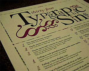 Just like grammar, typography attracts pedants. Some of their gripes are legitimate, while others seem rather trivial. One such perfectionist has put together all of his pet peeves on one poster. Ironically, the website showcasing this poster was rather hard to read, both in Chrome and Firefox.
Festival for the Community
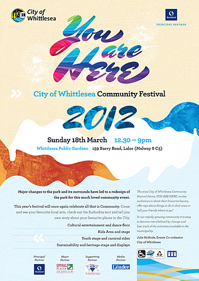 Our client stages a community festival once a year, and tries to appeal to everyone within the city boundaries. They wanted an open, friendly design with a sense of inclusiveness and place. We used the beautiful Mrs Shepperds (Alejandro Paul) for the flourishes of the title, and Archer (Hoefler, Frere-Jones) for the rest. Aerial images of the city helped give the design local context.
Dingbats want to be Free
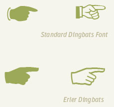 More than just an old-fashioned insult, dingbats are pictorial typefaces packed with symbols useful in a wide variety of design contexts. FontFont have released a sampler typeface (not the full complement of symbols, but a wide variety nonetheless) for free downloading. Erler Dingbats were first released some forty years ago and have now been updated for the digital era with new symbols. Each symbol has been designed to integrate with its fellows. In the usual way of European type, the result is slightly bloodless but eminently useable.
Anatomy of a Typeface
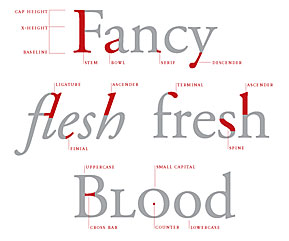 If you thought a stem belonged to a flower and a bowl was what you put the flower in, then visit Thinking with Type for a typographical education. The site is a well designed tour of type design, units of type measurement, classification and use, and hints on mixing typefaces, all written in plain English and elegantly illustrated. The site makes a good case for considering typography as the core of most graphic design, even on the web.
Typography and Numbers
Follow this link at FontFont for a very detailed and accessible post dealing with the correct way to set numbers in tables, text, as super and subscript, and as fractions. The differences between poorly and elegantly set numbers is quite stark, and has implications for readability and sheer aesthetic enjoyment of the text.
Beautiful Type Samples from Emigre
 Digital type design pioneers Emigre have released some of their old printed type sample sheets in PDF form. The sheets are beautiful examples of graphic design in their own right and many of the spreads would make excellent posters. Several of the typefaces designed by the Emigre founders are still used, such as Mrs Eaves, Triplex, Filosofia, Template Gothic and Vista Sans. Some of the experimental typefaces have had their run, but they did help create the wide open field that is modern typography. Emigre was one of the first independent digital foundries and was responsible for the hugely influential Emigre magazine, which ran from 1984 to 2005.
Typography Times Ten
A solid list of both classic and contemporary books about typography, from the folks at Brain Pickings. Each book demonstrates the richness and complexity of the field, and how much typographers in their unobtrusive way contribute to artistic and literary culture.
Drive-by Fonts
 The last couple of years have seen a quiet revolution for web designers. Once limited to the small number of typefaces that 'everyone' had installed on their machines, designers have been completely liberated from that restriction by web-served typefaces. Now it no longer matters what the user has installed -- the website renders typefaces from a remote server. If you'd like to see what your website (or someone else's) would look like using the new web font services, try this neat little demonstration from type purveyor FontFont. Instead of bland patches of Arial or Verdana, imagine your site decked out with typefaces designed for the screen.