
The urge to design typefaces is a universal one, not just the province of traditionally design oriented cultures. Some of the most interesting recent work is coming out of Latin America and Spain. The surge of interest in type design has led to increased demand for type design tools, many of which are relatively expensive. Font Forge is free and quite capable, and supports all of the major font formats. The author of the program is continually improving and updating the source code.
Fontology
fonts.com has put together an excellent resource for those interested in learning more about type design and typographers. An exacting, precise craft, high-level type design requires extreme attention to detail and the ability to slog through endless iterations, individual kerning pairs, multiple weights, extended character sets and nowadays, the promotion of one's work. The best type families combine beauty and workaday functionality, and if admired and appreciated, will often enjoy a life far longer those that of their creators.

Hitting the Mark
To get an idea of the amount of time that goes into the design of a large font family, check out this promotional site. FF Mark is the result of a long-term collaboration between some of the brightest lights in modern European typography. The designers are intimately aware of typographic history and prepared to slog through the minutiae of sketching, adjusting and kerning thousands of characters in ten weights.

Typography Times Ten
A solid list of both classic and contemporary books about typography, from the folks at Brain Pickings. Each book demonstrates the richness and complexity of the field, and how much typographers in their unobtrusive way contribute to artistic and literary culture.
Drive-by Fonts
 The last couple of years have seen a quiet revolution for web designers. Once limited to the small number of typefaces that 'everyone' had installed on their machines, designers have been completely liberated from that restriction by web-served typefaces. Now it no longer matters what the user has installed -- the website renders typefaces from a remote server. If you'd like to see what your website (or someone else's) would look like using the new web font services, try this neat little demonstration from type purveyor FontFont. Instead of bland patches of Arial or Verdana, imagine your site decked out with typefaces designed for the screen.
Archer Hits Typeface Bullseye
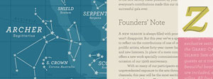 In combining prettiness and practicality, Archer is a rare typeface. With idiosyncratic letterforms and cute little ball terminals, this friendly slab serif has been spotted all over the web and and in hundreds of publications. As with other HF&J typefaces (especially Gotham), it has been (over)used, but in the right caring hands, it still has the capacity to give shine and personality to many kinds of print and web design.