
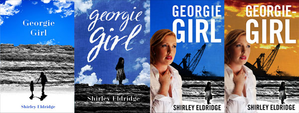
 Sometimes a book cover evolves through several versions, keeping some elements and losing others. Clients can change their minds or come up with new ideas. Whilst sometimes time consuming, design iteration has the virtue of being unpredictable and therefore interesting.
Sacred Space
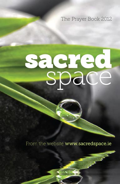 Our task was to convey the contemplative mindset of prayer without resorting to overt displays of religious symbolism. Sacred Space is a book of prayer published each year by the Irish Jesuits. After a long search through uninspiring imagery, we finally found a beautiful, tonally balanced photograph ready for the addition of type. We used Museo Slab at a variety of weights for both impact and delicacy.
Face Book
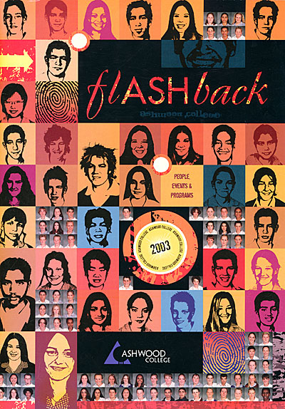 For departing Year Twelve students, their yearbook has sentimental significance — the last memento of thirteen long K-12 years of education. We tried for an unusual effect — the face of every single student in the entire school (the back cover had another few hundred faces), some converted into black and white and others still in colour. The layout took quite a while, but our clients were happy with the result.
The World's Best Pop-up Books
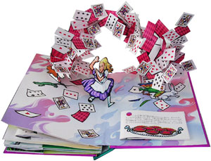 One area of print will linger longer than any other — children's books. More than any other books, texture, colour and real interactivity matter. And within children's books, pop-ups are the most resolutely three dimensional of all. Matthew Reinhart and Robert Sabuda are preeminent in this field. Together and individually, they have created some of the most amazing (and reasonably priced) books I have ever seen. They marry really high quality illustrations with bogglingly complex pop-ups. One can't even begin to figure out how each trick is achieved -- a man turning into a wolf, a Chinese dragon composed of intricately folded crépe paper, a massive T-Rex head with jaws that open, and so on. Although incredibly complex, their books are also quite durable. That said, it is probably a good idea to keep them out of the hands of smaller/destructive toddlers.
Book Trilogy
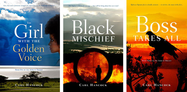 Our client had written three books that followed a largely linear narrative, and were strongly tied to a single location in Africa (the Rift Valley in Kenya). Our cover designs used that landscape as a reference, bringing in additional images specific to the particular volume in the trilogy. The title typeface is Fairfield and supplies a framework for all three covers.
Vaudeville in Australia
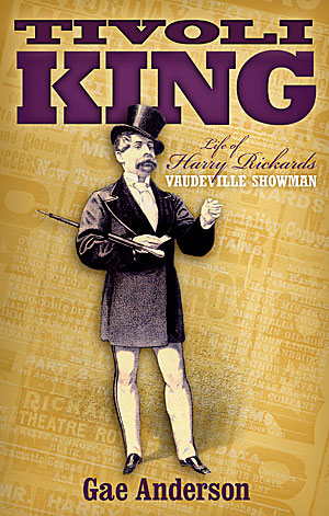 Harry Rickards was a nineteenth century show business entrepreneur and performer who made a risky move from Britain to Australia. His business doings were colourful to the point of criminality and he died a rich man. We wanted to convey something of the swagger of the man and the constant chatter of the material produced to promote his shows. We used typefaces appropriate to the time.
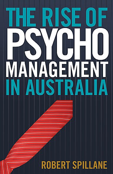
Taking Care of Business
Our client wanted a bold, typography based cover. We used Trade Gothic, a pinstripe background and a tie standing in for a red arrow and achieve a high impact result.
Self-Publishing Author hints: Part 1
Self publishing or small press publishing does not have to be a royal road to obscurity and crates of unsold books. Active, savvy authors can drive healthy book sales. Here are a couple of tips from a multi-thousand selling Australian author:
Jacqueline Dinan, author of "A Woman's War", a work of fiction dealing with World War One, has focussed on giving talks about her book to interested groups. She says that:
- The book came about because I married a history buff and realised that other than watching ‘The Sullivans’, my knowledge of Australia’s war history, was very limited. So, we set out to write a book for women like me.
- Writing the book was the history lesson that I never received at either girls’ school that I attended.
- I present to groups – Rotary, Probus, View, U3A, Legacy, War Widows, Educational, Shrine, RACV Club (they are all keen for speakers)
- The power point presentation is about the research I did into Women on the Home Front & Men on The Western Front
In addition, Jacqueline was very active in soliciting reviews for her book prior to print publication. Reviewers included the Herald Sun, the Weekly Times and Dame Elisabeth Murdoch.
Stay tuned for further practical tips for authors.
Full Colour Cover
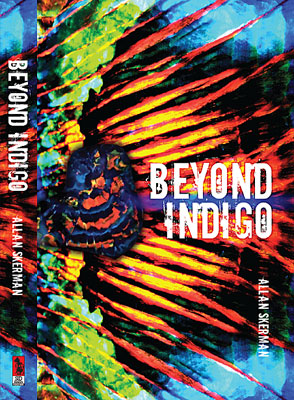
When "Beyond Indigo" was published twenty years ago, the author was unhappy with the book's cover, feeling it was conventional and stodgy. With a new publisher, he finally had the chance to remedy the errors of the past.
The book deals with an elderly opal miner and an extraordinary opal strike. We took full advantage of the dramatic colours of that gem. With a gem specimen overlaid against a close-up opal pattern, the composition might also be a wing, a sunset or a landscape — almost abstract, but concrete enough to tie the book to its subject matter.
Lonely for My Land sells well
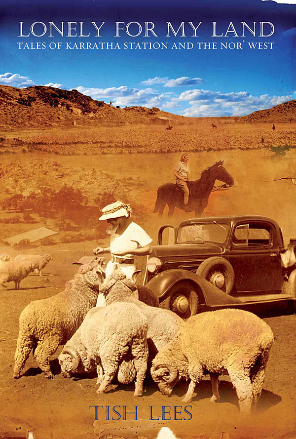 Tish Lees grew up on a remote and beautiful cattle station called Karratha. An accident of geology put her parents' station at the heart of Australia's iron export industry. Tish chronicles in her book a vanishing way of life. She wanted us to capture the feel of the WA outback, the dust and blue skies, and to integrate the best of her family snapshots. The result has sold extremely well and is into its third printing.
Composite covers
 Financial constraints sometimes mean that we are unable to acquire a 'perfect' single cover image, but instead need to construct a composite of several less expensive or public domain images. The three titles above are examples of that approach.
An Engineered Solution
Our client wanted a bright contemporary cover for their software handbook. We used a combination of Vitesse and Myriad Pro allied with strong colours and bold geometric forms.

Read moreArt in the public domain
One of the best aspects of working on cover designs for histories and historical fiction is the removal of copyright as a limiting factor. Although the photograph of the artwork is sometimes copyrighted and requires permission, the artworks themselves have long been in the public domain. Being able to use a brilliantly executed portrait or landscape gives the designer access to nuances of tone and form very hard to find in contemporary photo libraries. The three covers below were designed for local publishers in 2010.

Read moreFour new book covers
One of the joys of book cover design is diversity. In the small batch below, authors tackle vampires, historical drama, financial advice and job hunting for travellers. We welcome esoteric topics and unusual requests -- they make designing life a lot more interesting.
 Four new cover designs
Read more Four new cover designsGetting Your Portfolio Online
Artists, photographers, illustrators, cartoonists and designers all need to get their work seen by as many eyeballs as possible. Many do not have specialist web design skills, and balk at the cost of having a web designer put together a customised folio for them. Fortunately in the new world of free cloud services, several businesses offer simple but elegant online folio solutions. My personal favourite is Behance, a business best known for offering services and conferences to "creatives". Their folio service has a strong social media focus, encouraging users to follow other designers, rate their work, give detailed feedback and generally promote themselves. The upload process is very detailed and offers a reasonable amount of customisation. The whole experience is slick and the aesthetic is pared back and very readable.
Read moreCover for Nannies
 Our client wanted a cover design that emphasised the positive aspects of nannying. We used clear, direct typography, simple, child-associated colours and a large area of saturated colour to attract attention. Our design aims to reinforce the idea of a no-nonsense, practical, take-anywhere guide for real-life nannies. Besides, we have a small weakness for book covers within a book cover.
A Life in Cinemas
 Brian McFarlane has spent a lifetime watching and writing about movies, and interviewing many leading directors and actors. We were given the task of encapsulating that past in designing a cover for his light-hearted memoir. A red carpet leads the reader's eye towards the cinema as promised land, flanked by posters depicting key figures in Brian's cinematic and personal life. The result has colour, depth and a sense of fun, accurately representing the text of the book.
Book Cover Design Extraordinaire
 As someone who designs a lot of book covers, it can be inspirational (and rather challenging) to gaze upon the work of the masters of the field. Many of them are attractively displayed at the Book Cover Archive. Evocative, startling, confrontational, joyful, spare, ornate, saturated: the covers on display are all that and more. Many of them do a really remarkable job of capturing the zeitgeist of a particular time and place. With its constant fixation on the current moment, will the Internet ever produce such persistent and influential artefacts?