


Ganga Powell’s lovely children’s book “Do Mutton Birds Have Maps and Other Poems” (brilliantly illustrated by Eileen Curd) has been selling very well at Blarney Books and Art in Port Fairy. Here’s the Facebook post from the bookstore in question. If you can’t make it all the way to Port Fairy, the book is also available on Amazon and Booktopia.

How to Write a Good Cover Design Brief

The benefit of a good cover design is that it has the potential to turn a curious or potential buyer into a purchaser. For the author, a striking book cover is the most powerful marketing tool which can mean the difference between the success or failure of a book.
Approaching a designer
When considering having a cover design created by a professional graphic artist the author must have a clear idea of what would be the ideal finished product. However, that is not to say that the designer's flair should be constrained. By paying for expertise in graphic design, a certain amount of freedom is granted to the artist to be 'creative'. Constant communication throughout the design process will mean that feedback can be exchanged which should allow for the author to receive a finished cover design that will be fit for purpose and not merely what the designer wanted to produce.
It should be remembered that the role of a 'brief' should be to provide succinct instructions while allowing the designer the freedom to be creative. A creative brief will provide a useful framework in which the designer can work within margins without having creativity compromised. The author should provide guidance only, regular and honest feedback will be the secret to developing a successful cover design. The author must make clear to the designer any information regarding items which 'must' appear in the design.
For the designer to be able to use his creative skills to the full it will be necessary for the author to provide a precis or synopsis of the contents of the book to allow the designer to 'get a feel' for the content and style of the work. The genre and target audience should be discussed to enable the designer to select the correct styles and fonts for the cover. The demographic, gender and age of the target audience should be made clear. If the book is part of a series, the author should provide details of fonts, colour schemes and any famous logos as part of branding already in use. Precise details of sizes, resolutions and file formats should be provided to the designer to allow for continuity in the finished product.
Dealing with technical issues
Throughout the process of designing the cover, it will be important for the author to remain in contact with the designer. At this stage it will be necessary for the size of the cover to be discussed along with its utilization; will it be used as an e-book cover, for a traditional printed book or both. This information will be necessary as the designer will need to know the dimensions and the amount of space there is to work with.
The wise writer will utilize the designer’s expertise, creativity and experience to produce the most appropriate artwork for the book cover. Try not to be too rigid in requirements and give the designer freedom to work without the author indulging in micro-management of the project. There are various colors and fonts which will appeal to the different reader groups and genres. Give any information concerning specifying colors or any preferred fonts. These elements will set the tone of the cover and should reflect the content of the work as close as possible. Constant communication between author and designer can build trust and bring about high-quality results.
By looking at other, similar books already published it will be possible to understand what colour schemes, images and fonts are used on the most successful titles. As previously mentioned, a carefully crafted cover can turn potential purchasers into buyers, particularly in the case of e-books, where the cover is the thing that will, hopefully, attract the interest of potential buyers.
Conclusion
When consulting a graphic designer to provide a cover for a book the designer must be given a complete oversight of what the subject matter and content of the book concerns. This would be achieved in an ideal world by the designer reading the complete text, unfortunately, it is generally impractical. The author should therefore provide a synopsis of the text contained in the book to allow the designer to get 'a feel' for the project.
The author and designer must agree on terms regarding consultation during the development of the cover so that any modifications can be made before the project has advanced too far. There must be a very high level of trust between the two parties if the project is to be a total success. When evaluating the progress of the project, the author should be 'firm but fair' in any criticism of the work provided by the designer. Conversely, when the work is considered to be of a high standard and entirely acceptable to the author, praise should be forthcoming and positive feedback given regarding working with the designer.
Providing the designer with an accurate precis of the subject matter, offering support and assistance during the process and allowing the designer to 'do his job' will result in a final cover which will be a huge asset. The promotion and ultimate sales of the book will benefit and it will be a useful addition to the portfolio of the designer. This will be a win-win situation for all concerned.
Author Bio: Kieran Fallon is the owner of a Dublin Graphic Design Agency Éire Graphic Design. We are here to help your organisation become more memorable through designing striking logos, eye-grabbing flyers, posters that pop, exciting animated emails and dynamic lightweight digital advertising campaigns – always backed by flexible and insightful support.
How to Promote Your Book—5 Strategies for Authors

Guest article from Chloe Harris
Books with compelling content are often passed over due to ineffective promotion. Convincing people to read a book is quite different from convincing them to buy clothes, cars, and houses.
We’ve gathered a few useful strategies to promote your book:
Choose a Professional Book Cover
The old saw runs “Don’t judge a book by its cover.” But people do judge a book by its cover. A 2017 study revealed that a whopping 52% base their decision on the jacket artwork.
Work with professional book cover designer in conveying the right message, attracting the right audience. Your ideas will be the basis of the design, while the artist manipulates the elements to arrive at a professional, attention-getting result.
Author-designed covers run the risk of potential readers identifying the work as self-published, and therefore passing over it.
Use Social Media Effectively
“As of January 2020, over 3.8 billion people are using social media. This means that by simply introducing your book through Facebook, Instagram, and Twitter, you could stir the interest of many. However, you will have to optimise social media use for this happen.”, said Alistaire Clare, Credit Capital’s business consultant.
Social proof is vital in earning recognition. With an official page, it will be easier for potential readers to find your book. Make sure to include the following:
A high-resolution photo of the book
A photo of yourself with a short biography
A snippet about the book
Some testimonials from those who’ve read your book already
Facebook ads are also useful in reaching specific targets in terms of location, gender, age, and preferences.

Organise an Event in Local Bookstores
Avid book buyers visit local bookstores to hunt for old and new masterpieces. So, make sure not to miss this fanbase. Here are 21 charming bookshops in Australia.
Many local bookstores regularly feature new authors. Often, they also have a relationship with local book clubs that could review your book.
Prepare a good pitch, explaining how the bookstore can benefit from your book.
Ask if you could display promotional banners and posters.
Plan an entertaining presentation
Hold a live Q&A
Sign books for free or hold small contests
If things go well with local bookstores, you might contemplate further events in larger venues.
Reach out to Book Reviewers
It’s essential to gather as many reviews possible, mainly if you’re selling online. Books with more reviews get more visibility. They also create an impression that the content is promising.
Search for book reviewers who are interested in your genre. Ask them to leave an honest review. You might have to send a free copy, but that’s totally worth it, especially if the reviewer has a large following. Here are some great choices:
Aussie Reviews
Booktopia
Ragamuffin Books
Readability Australia
Lost in a Good Book
Goodreads
Also. try sending a letter to Australian Book Review. ABR is an independent, non-profit magazine that publishes book reviews.
Are you an independent author who wants to have a professionally-designed book? Working Type offers design, layout, and print solutions that can transform your manuscript into a best-seller. We also assist in e-book publishing and digital and print promotions. Contact us now for more information!
From the Far East to Fantasy — new cover designs
A few recent cover drafts from Working Type Design, covering the usual range of genres and subject matter.


An Independent Author Talks About Getting Her Book Right and the Process of Designing the Cover

Jacqueline Hodder, author of the fine historical drama “The Sentinel” has some kind words about the cover design process at WorkingType Design, and also some very interesting thoughts overall on the process of bringing out a work of fiction and getting all of the elements right.
Five New Cover Artworks
The usual range of topics, with typefaces ranging from Alternate Gothic to Molde to Bourton Layered and ITC Avant Garde.


Cover to Cover to Cover
We have been working on the usual variety of book covers, covering everything from world championship athletes to an 18th century convict fleet. We strive for impact, high contrast and uncluttered design.


The Sentinel book cover design
Jacqueline Hodder’s excellent book The Sentinel is out now. She reports satisfaction with the cover design, which was a very interesting task involving lighthouses and persons in period attire. And who doesn’t like working with louring skies and dramatic storm-torn coastlines? Here is the bliurb for Jacqueline’s book:
“Escaping from a disastrous relationship, Kathleen Devine flees to an isolated lighthouse off the Victorian coastline. Taking up the position of Head Teacher to the lighthouse keepers' children, she is ensnared in the lives of those marooned on the lonely outpost and soon realises no-one can escape their past. When the fearsome Head Lightkeeper, Mr Johannsson forms an unlikely friendship with the daughter of one of the keepers, it threatens to destroy their fragile peace. Can Kathleen find the strength to survive and answer the question that haunts them all: what happened to Isabella and why?”
Available here: https://www.amazon.com/Sentinel-Jacqueline-Hodder/dp/0648899403/

Recent Cover Concepts
A wide range of topics and treatments in our recent cover work, from Vienna to Byron Bay, outback tall tales to environmentally sound tips.


Dancing Between the Opposites — Exploring daoist Practices
Craig Mallett’s “Dancing Between the Opposites — A daoist guide to balance and self-cultivation” has just been published and is now available online and directly from Craig. The title is available at Amazon and Book Depository in addition to other outlets. An accompanying page has been set up at the author’s website. WorkingType typeset the title, with excellent illustrations and cover design by Pelin Ko.

“Drawing on his extensive experience across traditions in meditation, Daoism, and other forms of self-cultivation, coupled with his background in Martial Arts and many other forms of physical movement and exercise, Craig Mallett brings his readers a guide that is both practical and spiritual. His approach to the Da Xuan tradition of Daoism will help those interested to engage with its ideas and practice their application. ”
June 2020 new cover designs
A variety of new cover designs dealing with a broad range of subject matter.


Shore to Shore cover — Exploring the Mornington Peninsula


Recent Cover Design examples
A few recent cover designs, from high fantasy to Australian railway trips…


Four Covers for 2020
A small sample of recently cover drafts for WorkingType clients, featuring the usual interesting diversity of subject matter and tone…


![July Seventeenth cover_front_05[5].jpg](https://images.squarespace-cdn.com/content/v1/51dc1c1ee4b0c7a76cdb8427/1583867516955-NAY2PXMY5LXUCFZ76WIJ/July+Seventeenth+cover_front_05%5B5%5D.jpg)

5 Reasons Why Book Typography Matters More Than You Think
A Guest Post kindly supplied by Desiree Villena:
Everyone knows that, if you want your book to sell, you need to hire a great cover designer. But many people don’t think about how important your book’s interior design is, as well. I’ve seen too many books, both self-published and traditionally published, that have clearly skimped when it comes to formatting, and as a design nerd, it makes me so sad.
But there’s much more at stake than just hurting artistic souls — think of the practical considerations. You may not realize it, but typography can have a big effect on a reader’s reaction to your book, whether they consciously notice the fonts or not. So today, I’m going to break down the five most important reasons why book typography matters for every book — including yours.
1. Professionalism
While the cover is easily the first thing readers will notice when they’re deciding whether to pick up your book, the typography is the first thing they’ll notice once they open it up. So it’s important that you make a good impression. Seeing a professional cover and a sloppy interior is like meeting someone in person and realizing that their profile picture was a lie.
If you ever doubt the impact that a font can have on your professional reputation, consider this: would you be more inclined to trust someone whose resume was printed in Times New Roman, or Comic Sans?
Similarly, your book will be judged on what kind of font it’s printed in. Perhaps not consciously — not many people can point to a book and go, “Oh, that’s in Garamond,” or “That looks like Caslon” — but the wrong font will make something feel off about the book.
But what makes something the “wrong” font? That’s where the other factors come into play.
2. Genre expectations
This is one of those things that you’ve probably never consciously noticed before, but once you do, you can’t not notice it. Different genres tend to be published in different types of fonts, and you want your font to reflect the contents of the story as much as your cover and title do.
For example, a quick survey of my personal library shows me that speculative fiction uses a lot of Palatino, whereas YA contemporaries are often published in softer, more “playful” fonts like Century Book or Bembo. You can also never really go wrong with Garamond, the most “bookish” looking font of them all. But it’s not always necessarily the perfect font, either.
And don’t forget about typography on chapter headings! Age ranges and genres follow trends here, too, with YA and middle grade among the most creative, and literary fiction setting a high standard for refined understatement.
3. Readability
Of course all fonts are technically readable if they contain all the letters of the alphabet. Unlike handwriting, the letter A will appear the same no matter how tired you are when you hit the key on your keyboard. But the truth is some fonts are just easier to read than others. It’s why we usually publish books in serif fonts instead of sans-serif, and it’s why we make the letters bigger in kids’ books than in novels for adults.
Here, it’s important to consider function over form. Font size, line spacing, and margins are all key factors to making sure that the font you’ve chosen will read well to your target audience.
Some fonts just have a natural size they look best at, but will that make your book too slim or too chunky? If you’re targeting older readers, is the font too thin and “fussy” to be read without squinting? The more you take into account, the better your book will be.
4. Fatigue
Readability plays into this, but it’s important enough that I feel it’s worth a separate mention. Because one of the downsides of poor readability is that readers are likely to tire of reading your work sooner — or even develop eyestrain.
Let’s face it: a lot of things demand our attention these days. From work to families to keeping the house in order to the sweet siren song of social media, it can be hard to find time to read at all. The last thing you want to do is make your book cause physical discomfort. There’s nothing more likely to make people to put it down — and perhaps never pick it back up again.
Good typography, on the other hand, is comfortable on the eyes, and can play a surprisingly significant role in whether readers perceive your book as a slog or a joy to read. That’s why it’s crucial to choose your font wisely.
5. Reader mood
You know the genre expectations we talked about before? A big part of the reason those exist is because different fonts subconsciously convey different “moods.”
These are most noticeable in splashy fonts that you’d use more in titles than in text blocks — a futuristic sci-fi font, an elegant hand-lettering font — but even the fonts you’d format a whole book in can have an impact. Some are stuffy, some soothing, and some just kind of dull. It’s important for your designer to keep these differences in mind and understand how the font of the chapter headings works together with the font of the story, in order to create a professional product.
Remember: choosing good typography is a bit of an art, yes, but it’s also a marketing choice. And marketing is a subtle game. Everything from the layout of your local grocery store to the color of your laundry detergent bottle has an impact on people’s buying choices. Why should books be any different?
Desiree Villena is a writer with Reedsy, a marketplace that connects self-publishing authors with the world’s best editors, designers, and marketers. She's very passionate about helping aspiring authors reach their dreams, and enjoys reading and writing short stories in her spare time.
Recent Book Cover Designs
We’ve been busy designing new covers for lovely author and publisher clients, with a very broad range of subjects. Here are a few of them.


A New Series for Peter Ralph
Writer of financial thrillers Peter Ralph is embarking on a new series featuring Josh Kennelly, a character first introduced in Fog City Fraud. The first book, Deadly Bequests is “set in New Orleans and is a scam about the elderly getting fleeced via their wills.”. The second book is The Guardians . Josh “receives a crazy call from a veteran of the Afghanistan war claiming that his father has been kidnapped by a guardian. Reluctantly, Josh gets involved and discovers the guardianship industry where judges, guardians, lawyers, and doctors, look after themselves, but not their wards. The forces that he’s trying to expose are all-powerful. Has he bitten off more than he can chew?”


We designed all three books to have a consistent identity and repeated elements.
The Legacy of Douglas Grant — Book Cover

John Ramsland often writes about eminent Aboriginal Australians, and in Douglas Grant he has found a fascinating subject. Survivor of an appalling massacre as a baby, raised by Scottish immigrants, then a volunteer for the Western Front, Grant’s life deserves attention and respect. We let his photograph speak for itself, with a faint background of a World War I battle scene. Published by Brolga Publishing.
Italian Bel Canto — Book Cover

Joseph Talia writes about great singers and their teachers, and the science of singing. We populated the cover of his latest book with luminaries from that world. from Dame Joan Sutherland back to Rossini and Farinelli. And in the background, an amazing piece of art from Rococo master Giovanni Tiepolo. Published by Australian Academic Press.
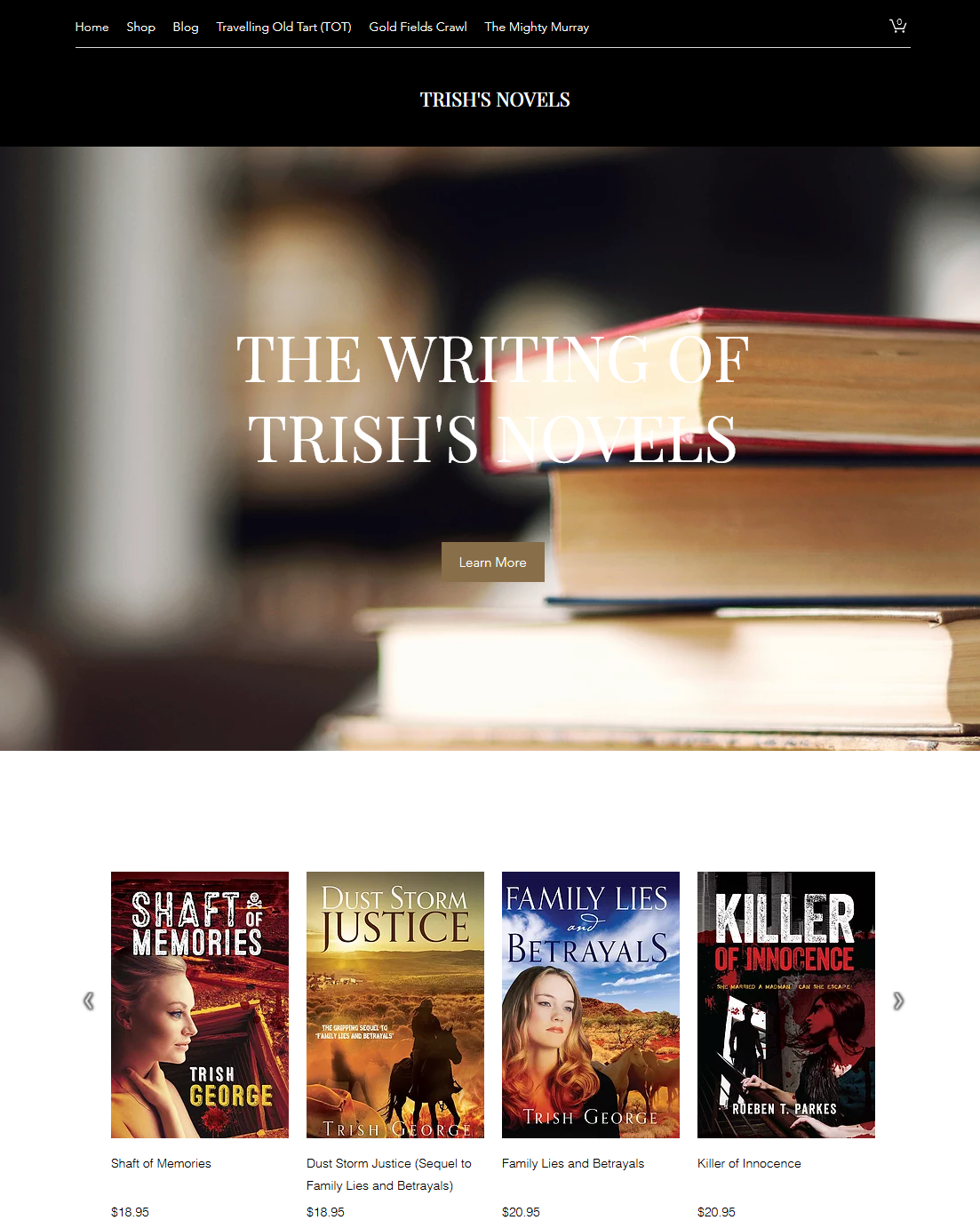
Author Trish George and her website
Independent author and outright character Trish George has an author website up, and it is quite well done. An inveterate traveler, Trish has been all over Australia and promoted her work along the way. Along with her works of fiction, she has also written several travel books and is quite a raconteur.