
Writing in the New Yorker, Tim Kreider explains why he thinks that high end book cover designs are in aesthetic decline. He suggests that the field is afflicted by a degree of conformity probably exacerbated by the Internet. "There’s clearly some brutally efficient Darwinian process at work here, because certain images—half-faces, napes, piers stretching into the water—spread like successful evolutionary adaptations and quickly become ubiquitous". He gives examples and harks back to the inventiveness and frequent weirdness of covers designed for pulp science fiction. Other culprits include the decreasing popularity of hand lettered titles (making something of a comeback, in my opinion). Children's and young adult titles are lauded as an exception to the general malaise.
The World's Best Pop-up Books
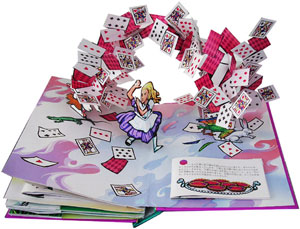 One area of print will linger longer than any other — children's books. More than any other books, texture, colour and real interactivity matter. And within children's books, pop-ups are the most resolutely three dimensional of all. Matthew Reinhart and Robert Sabuda are preeminent in this field. Together and individually, they have created some of the most amazing (and reasonably priced) books I have ever seen. They marry really high quality illustrations with bogglingly complex pop-ups. One can't even begin to figure out how each trick is achieved -- a man turning into a wolf, a Chinese dragon composed of intricately folded crépe paper, a massive T-Rex head with jaws that open, and so on. Although incredibly complex, their books are also quite durable. That said, it is probably a good idea to keep them out of the hands of smaller/destructive toddlers.