

Les Pobijie writes of a vanishing world — a small Australian town with an actual functioning newspaper. The tone of his novel is broad farce, with many mishaps and misunderstandings in store for the callow young journalist at the centre of the story. We combined a masked gunman, explosion, an authentic NSW pub and the intrepid hero. The typeface for the title and author name is Thunderhouse.
By the Book — Cover Design
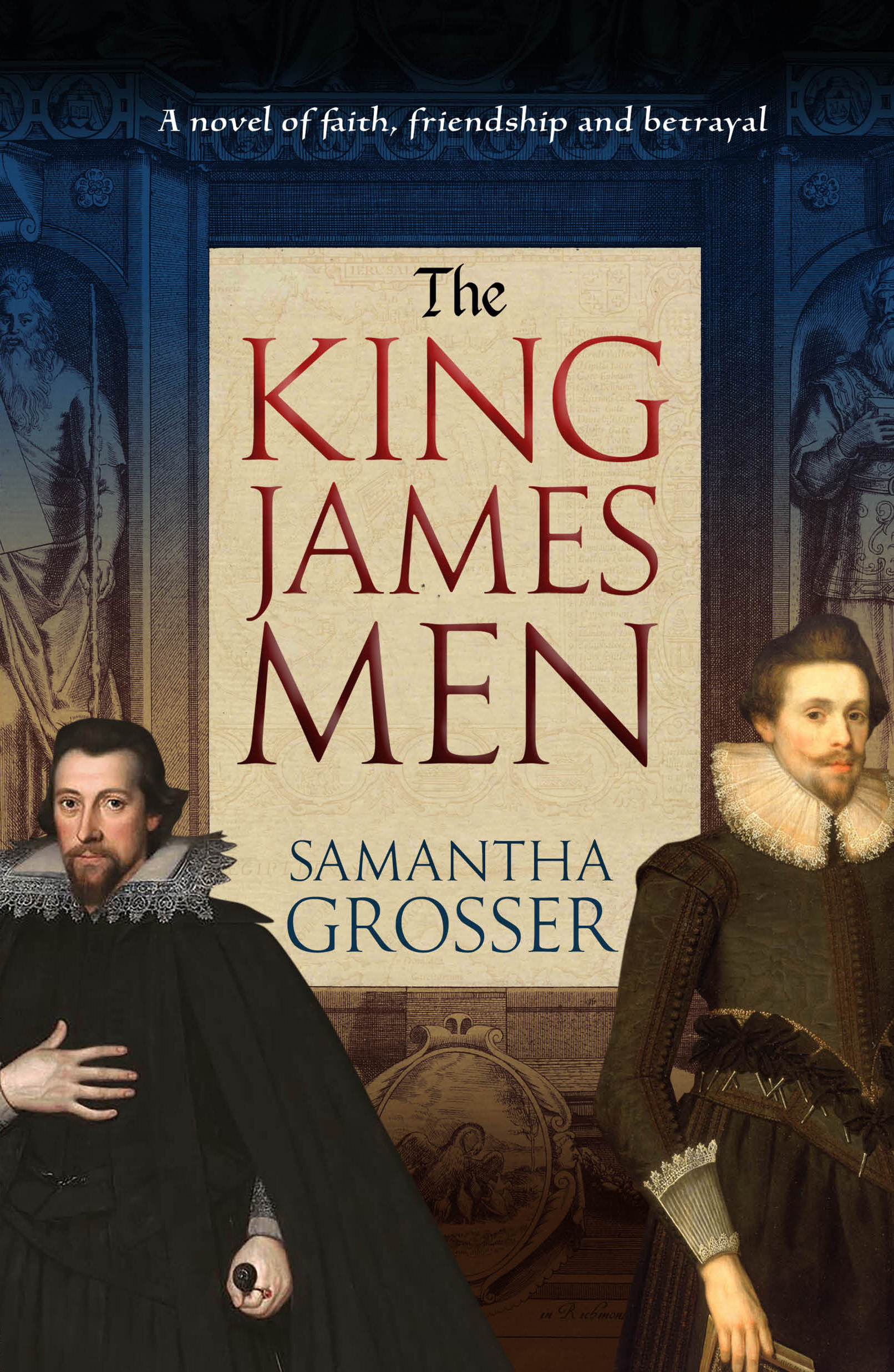
Often described as the only masterpiece ever produced by a committee, the King James edition of the Bible remained influential for several centuries. Samantha Grosser explores the world of the people who created the King James Bible, their aspirations, allegiances and betrayals. We used the frontespiece of the 1611 edition of the bible, along with contemporary portraits and a muted colour palette.
When First We Practice to Deceive — Cover Design

Deceit is a political thriller set in Australia. It depicts a parliament dominated by a deeply shady prime minister and surrounded by ambitious and ruthless supplicants. We wanted the cover to convey an air of foreboding and menace, and also of critical decisions to be made.
Using Images in Blog Posts
At Blogging.com, an interesting deep dive into using images in websites and blog posts, with a focus on the ethical use of creative commons images. The post goes into considerable detail on attribution, modification and sources for free or low cost images. As the page notes, including images in a blog post dramatically improves audience reach.
Making Old ISBNs New Again
If you bought a batch of ISBNs some years ago, and didn't allocate all of them, you may have noticed they are somewhat shorter than the current 13 digit ISBN formulation. Fortunately, new life can be breathed into your old truncated numbers. They can then go on to parent handsome barcodes to assist in the tracking of your magnum opus across the web and bookstores worldwide...
Funny Mistakes — Book Cover
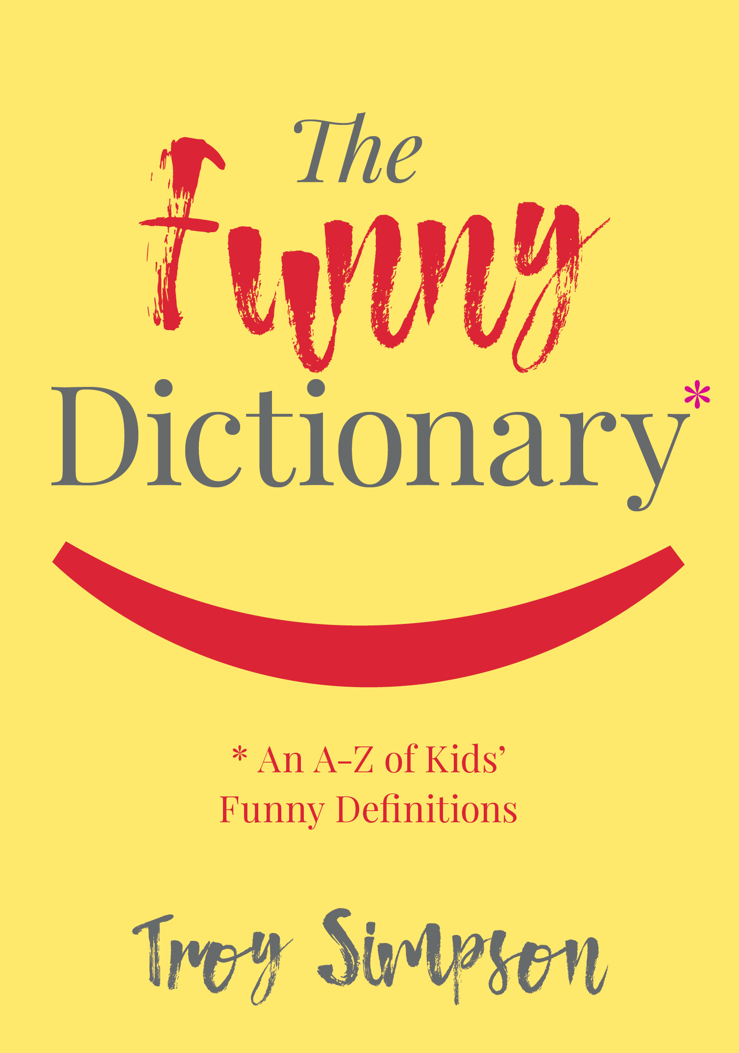
The Funny Dictionary (published by the National Library of Australia) makes gentle sport of inadvertently amusing definitions written by children. Some of the "howlers" are accompanied by thematically aligned images from the extensive National Library photographic archives. The cover below was selected from many options generated by Working Type Design. The book is due for publication in the first half of 2018.
Images With a Yum Factor

An alternative to all the anodyne food images available at typical stock art libraries -- free photographs from www.foodiesfeed.com
Createspace Versus Lightning Source
For self-publishers, choosing between Amazon's Createspace print on demand service, and Ingram's Ingram Spark/Lightning Source service can be difficult. Both services have their pluses and drawbacks. For fence-sitters, here's an article that argues uploading to both services is a good idea. An author client recently indicated this approach was working well for him, and we'd be happy to hear opinions either was other print on demand using authors.
The Big Rort — Noir Fiction from Tasmania
Barry Weston writes entertaining detective novels set in Tasmania. Perhaps Australia's answer to Nordic noir? We wanted a dim, grimy and ambient feel for the cover -- the gumshoe on the cover is none other than the author. The title typeface is Veneer One.

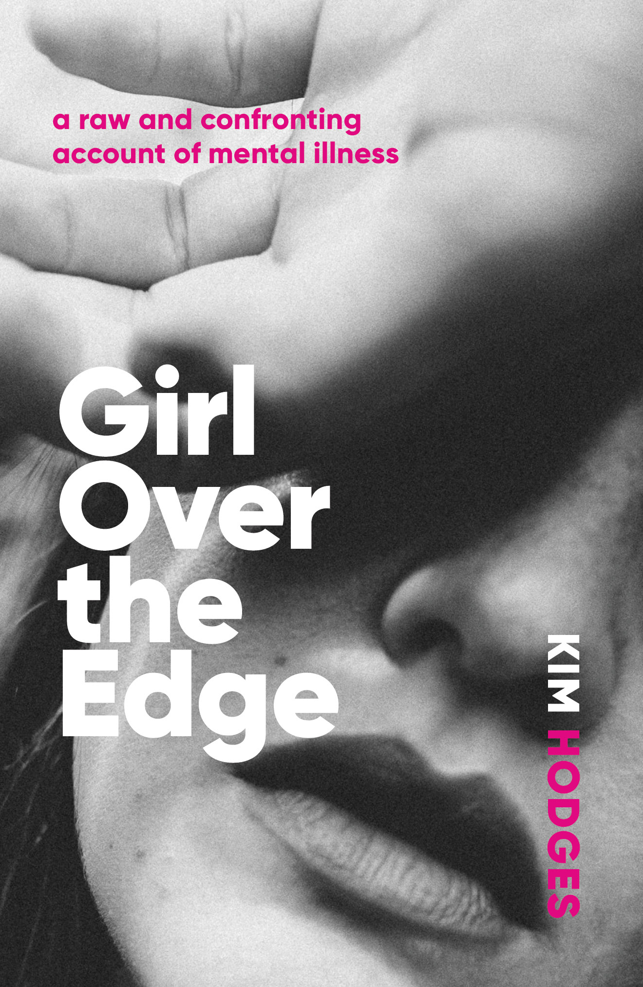
Book cover — Girl Over the Edge
Girl Over the Edge is an honest account of one woman's experience of mental illness. We wanted the cover to look raw and unfiltered, but not melodramatic. The typeface is Gilroy and the image was sourced from www.unsplash.com
Authors and their Digital Presence Explained
A thoughtful and in-depth examination of how authors are not getting the best results from their digital presence. The writer explains why the interests of authors and publishers do not always align, and how a new generation of author-centric services are being created.
“It is ironic that the author brand is foundational — the success of all title marketing depends on it and all publishers depend on title marketing — but how the author brands are developed gets very little professional attention.”
Export Driven Cover

Anura Amarasena and Sisira Colombage have written a practical guide to trading with the rapidly expanding Asian economies, using Australia-Sri Lankan trade as a case study. We opted for a bold, colourful design with type conforming to the angles of the image. Typeface used: Proxima Sans.
Bookbub Explained

Bestselling author Peter J. Ralph has turned his considerable research skills to the secrets behind the most successful promoter of ebooks, Bookbub. Our cover was intended to illustrate the dramatic effect that being selected for the Bookbub newsletter can have on the sales of a particular title. Typefaces used are League Gothic and Marianina.
Waterfalls of Type Colour
Made possible by recent innovations in type software, live chromatic type is creating a bit of a furore in type design. Here's an interview with one of the field's passionate proponents. Of course, Chromatic typefaces are not new -- the spectacular original versions were cast in metal and set by hand.

Chromatic typeface specimens from the 19th Century
It's a Gas Gas Gas

Natural Gas Volume 03
Cover design for Volume 3 in a projected 4 volume series on natural gas. Bright primary colours, bold simple typography and industry-related images.
Banner Year for Author
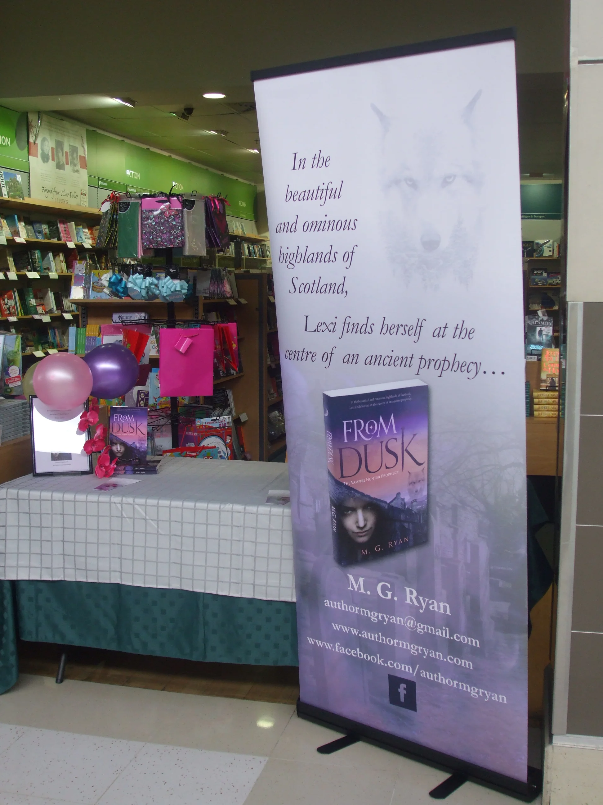
Author M.G. Ryan uses the large banner above for promotional events. She says "it looks great and draws a lot of attention. When I have the second banner made up, they will look awesome next to each other." Her latest book "To Dawn" (sequel to "From Dusk") will be released with the assistance of In-House Publishing.
Grounds for Appeal
Reground is a grassroots initiative to divert the tonnes of coffee grounds generated in Melbourne each week from landfill into people's gardens. I've booked in a consignment, and also pledged their Pozible campaign to help them purchase a van to facilitate collections and delivery. Check out the nicely designed minimalist website and spread the love (and caffeinated compost).
Maps from the Spymasters
The CIA has recently released a large number of formerly classified maps. According to accompanying notes, "The mission of the Cartography Center is to provide a full range of maps, geographic analysis, and research in support of the Agency, the White House, senior policymakers, and the IC at large." In an era of digital online maps and very detaile satellite photography, it is interesting to view these hand-compiled attempts to summarise all known information about a particular area. Many of the maps are rather well designed and aesthetically pleasing.
A Designer's Mantra

The great German designer Erik Spiekermann sometimes hand-prints a series of letterprint posters. The typically clean and pithy example above could be the prayer of all designers for fair recompense, particularly in the era of Fiverr and Ninety Nine Designs.
Classical Poetry — Book Cover Design
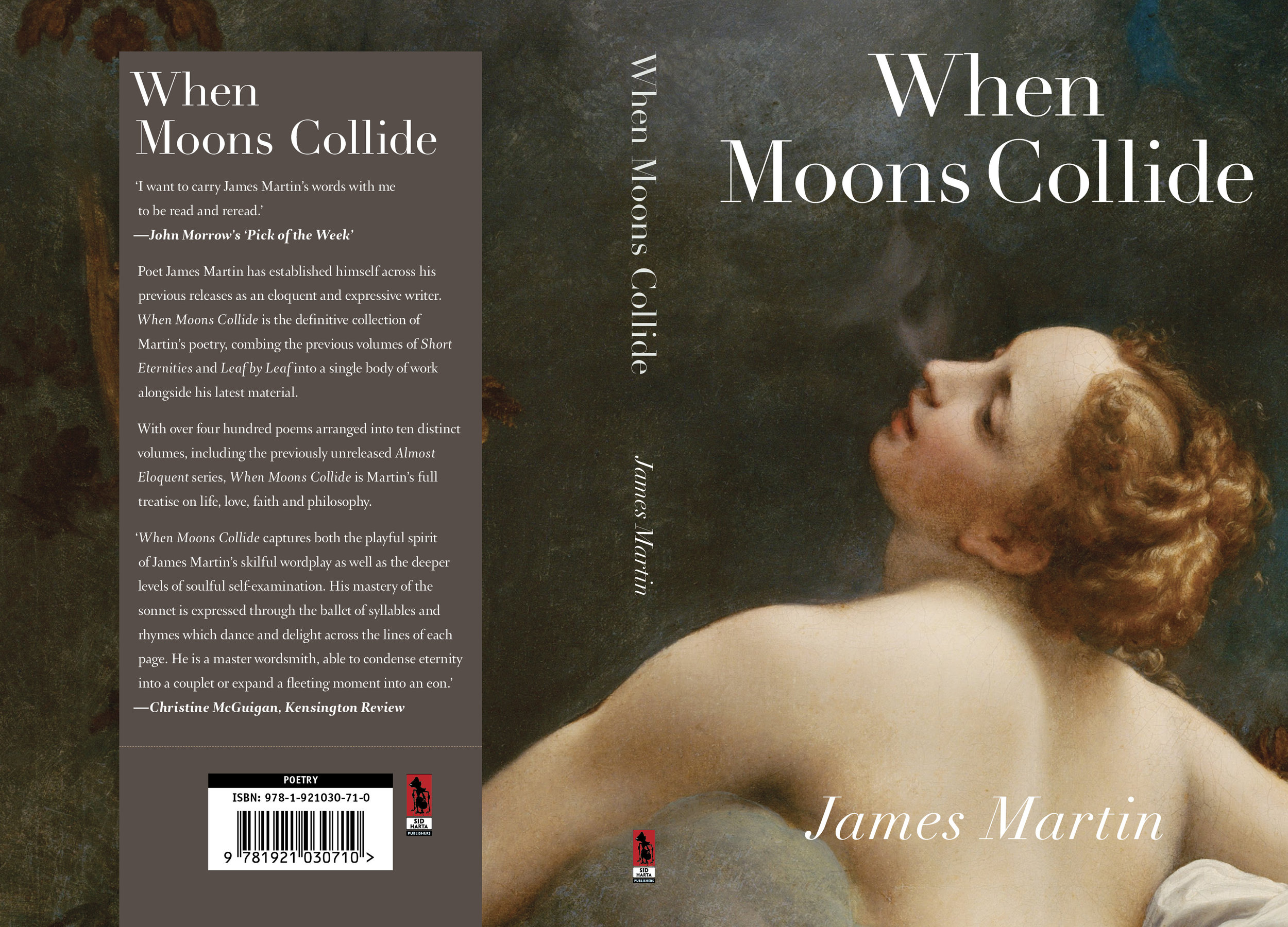
James Martin writes expressive classical poetry about the human condition. His latest book contains 400 poems dealing with life, love, faith and philosophy. Corregio's Jupiter and Io seemed perfect as the cover for this volume. The title typeface is Linotype Didot.